Kids Online Safety & Tech Professional Website Template
The Sprout safe kid social media landing page template is a masonry-style, single-page experience built for a walled-garden creative platform where children aged 6 to 12 share drawings, short stories, and voice notes. Every tile is an interactive demo. Every color choice earns parent trust. The primary call to action guides families toward a safe, free sign-up with zero friction on the page itself.
by Rocket studio
Quick Summary
The Sprout template is a masonry landing page designed to earn parent trust through interactive proof rather than promises. Six self-contained demo tiles let visitors drag posts through a moderation pipeline, toggle parental controls, and watch a dual-approval friendship flow animate in real time. The botanical color system and isometric hero illustration make the page feel as safe as it actually is.
Who This Template Is For
This landing page template serves a specific and important group of people. It speaks directly to anyone who cares about the digital well-being of a child aged 6 to 12, and who wants to see safety demonstrated rather than simply described.
- Parents who have witnessed harmful content on mainstream social platforms and are actively looking for a responsible alternative for their child.
- School counselors who need a digital literacy sandbox that fits naturally into an education setting and satisfies institutional research requirements.
- Grandparents and extended family members who want to connect with a child's creative work without navigating an app they do not recognize or trust.
What Problem This Template Solves
Most landing page designs for family-focused services rely on text claims and stock photos to build confidence. That approach fails the modern parent who has already been disappointed by the internet. This template solves the trust problem at the design level, not the copywriting level.
- Visitors who arrive from social platforms or search engines need to feel the safety logic before they believe it. The interactive masonry grid lets every person operate the actual moderation tools rather than read about them.
- Standard landing page layouts often cause information overload by stacking feature lists and marketing copy in dense columns. This template uses a "less is more" masonry structure to reduce overwhelm and guide each visitor through one discovery at a time.
- The absence of any form field on this page removes the biggest barrier to sign ups. The call to action leads to the next page only after trust has been fully earned through the interactive experience.
What You Get With This Template
This template delivers a fully structured, single-page layout with high interactivity built directly into every section. The design covers everything a business in the child safety industry needs to convert cautious, research-driven visitors into confident sign ups.
- A complete masonry landing page with six interactive demo tiles, a metrics bento trust section, a three-step flow diagram, warm testimonial cards, and a split-layout footer, all ready to customize for your brand.
- A botanical visual identity system with five coordinated colors, two paired typefaces, and an isometric SVG hero illustration with idle animations covering drifting leaves, looping paper airplanes, and a crayon scribble effect.
- A sticky chartreuse call to action button that appears after the first scroll, plus a secondary text link that opens a transparency documentation resource for counselors and compliance-focused parents.
Feature List
This landing page template is built around interactive proof. Each feature below is drawn directly from the template's design brief and serves a specific job in the parent-trust journey.
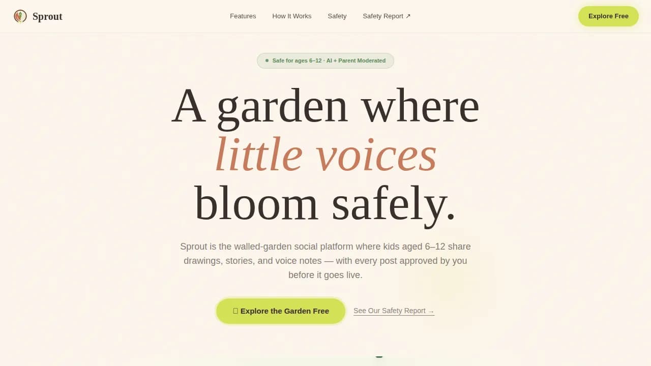
Animated Isometric Hero Section
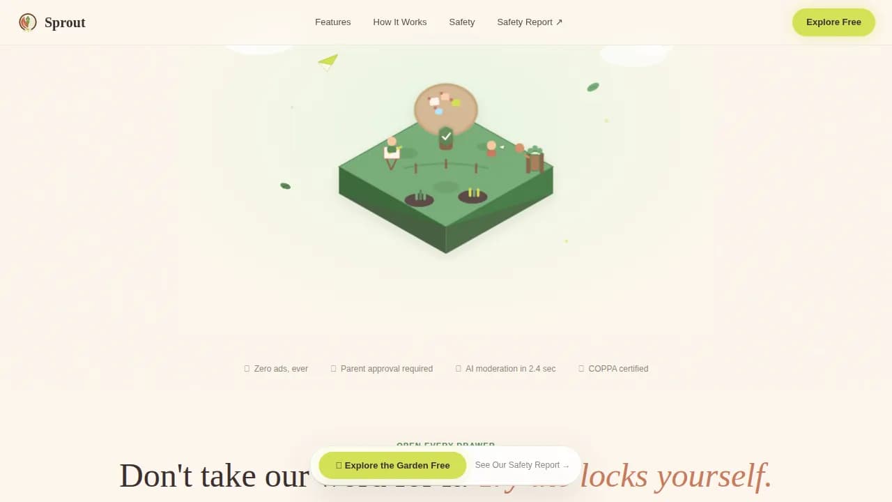
The hero is a soft three-dimensional floating island rendered as an animated SVG illustration. Miniature child figures sit at easels, pin artwork to a corkboard tree, and pass paper notes across a mossy bridge. A gentle parent figure stands at the garden gate. Every element carries a subtle idle animation: leaves drift slowly, a paper airplane loops, a crayon scribbles across a sign. This illustration communicates the product's safety philosophy in a single glance, doing a job that no photograph could accomplish as precisely. It sets the environment for everything that follows on the page.
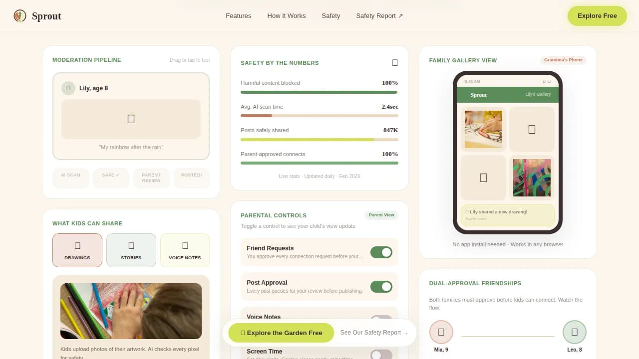
Interactive Masonry Demo Grid
Six self-contained tiles fill the masonry grid below the hero. Each tile is a small, playful demo rather than a static image. Visitors can drag a sample post through the moderation pipeline and watch it get flagged, blurred, or approved. They can toggle parental controls and see the child's view update in real time. They can tap a friendship request and watch the dual-approval flow animate step by step. This is the core innovation of the template. It lets every visitor experience the product's safety logic rather than simply reading about it. The scroll through this section feels like opening drawer after drawer in a well-organized craft cabinet, each tile a small delight that builds confidence in the people who designed the platform.
Sticky Chartreuse Call to Action
A chartreuse call to action button is pinned at the bottom of the viewport after the first scroll. It reads "Explore the Garden Free" and leads to the sign-up flow on the next page. No form fields live on this landing page. The call to action is earned through accumulated proof across the masonry experience. A secondary text link reading "See Our Safety Report" opens a transparency document for the counselor or compliance-minded parent who needs formal documentation before making a decision. Together these two elements create a win win for every type of visitor: the emotionally convinced parent clicks the primary button, while the analytically minded counselor reaches for the safety report.
Trust Signals Metrics Bento
Below the masonry grid, a bento-style trust section presents hard metrics: posts moderated, families served, and approval rate data displayed in clean, large-format tiles. A counselor quote sits alongside these numbers. This social proof section gives the page's claims a real life grounding. Visitors who might have a higher bounce rate sensitivity, meaning those who leave quickly when they sense marketing vagueness, respond to specific data rather than adjectives. The metrics present the platform's track record in a format that is easy to scan and hard to dismiss.
Asymmetric Three-Step Flow Section
A visually asymmetric layout shows the full child to moderation to family process in three distinct visual steps. This is not a standard horizontal timeline. Each step sits in its own visual space, with illustrated characters and short supporting copy. The flow shows exactly how a child's drawing travels from creation through AI moderation and parental approval before any family member sees it. This section serves parents who want to understand the mechanics before they commit, and it does so in a way that feels warm rather than clinical.
Warm Testimonial Card Section
Named quote cards from a parent, a school counselor, and a grandparent appear in a warm, card-based layout. Each testimonial is grounded in a specific real life scenario: a parent who caught something alarming on a cousin's feed, a counselor who needed a safe digital literacy environment for a class, a grandparent who wanted to see artwork from across the country. These testimonials serve as social proof that the platform works for every type of family member who might land on this page.
Page Sections Overview
| Section | Purpose |
|---|---|
| Hero Island | Introduce platform philosophy through animated isometric illustration and primary call to action |
| Masonry Demo Grid | Let visitors interact with moderation pipeline, parental controls, and friendship approval tiles |
| Trust Metrics Bento | Present hard moderation data and counselor quote to reinforce confidence |
| Three-Step Flow | Visualize the child to moderation to family content journey in an asymmetric layout |
| Testimonial Cards | Share named quotes from a parent, a counselor, and a grandparent |
| Split Footer | Display logo, tagline, and navigation links in an Arc Browser split layout |
Design & Branding System
The visual identity follows a Nurture and Care theme built on a botanical color system. Every color decision carries a specific role on the page, and no element uses color arbitrarily. The result feels like a children's book illustrated in gouache and pressed wildflowers: earthy enough for parents to trust, bright enough for kids to reach toward.
- The five-color palette covers fern green (#5B8C5A) for card frames and containers, terracotta (#C67B5C) for warm headlines, soil brown (#3B2F2F) for all body text, chartreuse (#D4E157) for every interactive call to action element, and creamy seed-packet white (#FDF6EC) as the background tile anchor across the full page.
- Typography pairs Fraunces, a warm literary serif, for headlines and display text with DM Sans, a clean and readable sans-serif, for body copy and labels. This combination balances warmth with clarity across all screen sizes.
- The isometric illustration style, the botanical color language, and the gouache-inspired tile textures all work together as a coherent brand system. Every visual element signals the same message: this is a carefully designed, responsible environment for children.
Mobile & Speed Optimization
This landing page template is built desktop-first but delivers an excellent mobile experience, recognizing that most parents browse at night on their phones. A responsive design ensures the masonry grid, interactive tiles, and sticky call to action all adapt correctly to smaller screens without losing functionality or visual quality.
- The masonry layout reflows gracefully on mobile, stacking tiles into a single-column view that preserves the drawer-opening scroll experience on a phone screen. Large, colorful interactive elements remain tappable and clear, following child-friendly design principles that reduce cognitive load across all users.
- Static content sections such as the hero text, trust metrics bento, and testimonial cards use server-side rendering for fast initial loads, while interactive tiles use client-side components only where interactivity is required. This split approach keeps the page responsive without burdening the initial page load.
How This Template Helps You Convert
This landing page is designed around a specific marketing philosophy: trust must be demonstrated, not declared. Every structural decision on the page exists to move a cautious, research-minded visitor from skepticism to confidence to action, with the call to action appearing only after that journey is complete.
- The interactive masonry grid removes the single biggest barrier in this industry: the credibility gap between what a platform claims about safety and what parents actually believe. By letting every visitor operate the moderation pipeline, toggle parental controls, and animate the approval flow themselves, the page closes that gap through direct experience. Visitors who have played with every tile are far less likely to leave before clicking the call to action.
- The sticky chartreuse call to action button, combined with the "See Our Safety Report" secondary link, serves two different visitor mindsets on the same page. Parents who trust their instincts click the primary button. Counselors and compliance-focused clients who need documentation click the secondary link. Both paths lead toward sign ups without requiring any form field on this page, keeping the bounce rate low and the conversion path clear.
Other Information About This Template
This template sits at the intersection of several active areas of digital product design and family-focused marketing. Understanding the broader context helps you get the most out of it for your platform, your agency, or the families you serve.
The landing page design philosophy here reflects well-established best practices for social media marketing campaigns. Landing pages are essential for guiding visitors to take specific actions, and effective templates help businesses build those pages quickly without starting from zero. A good landing page guides visitors from point A to point B while keeping them engaged and moving toward the call to action. This template applies that principle rigorously: every section is a deliberate step toward the final click, and the page never wastes a visitor's attention on elements that do not serve that journey.
The template also reflects current standards in child safety and kid-friendly platform design. A walled-garden approach restricts access to pre-approved content for children, and this template demonstrates that concept visually and interactively rather than stating it in paragraph form. Responsible templates in this space default to private account settings, minimize data collection, and avoid requesting personally identifiable information such as full names, schools, or locations. This template's design supports those principles at the structural level. Profiles on kid-friendly platforms should not be publicly discoverable, and the template's privacy-first framing communicates that standard clearly to visitors.
Content filtering is a key element of any serious kid-friendly social media environment. Pre-moderation, meaning the requirement that all posts pass review before going live, is the standard this template's demo tiles illustrate most directly. Messaging tools in kid-friendly social media should restrict direct messaging unless there is strict manual approval, and the friendship-approval demo tile makes that process visible and trustworthy. Strong parental control dashboards allow parents to view connections, limit screen time, and approve content; the toggle demo tile on this page shows exactly that capability in action.
For teams building out a broader digital marketing strategy around this template, it is worth noting that landing pages can be optimized over time by tracking user behavior and adjusting content. Tools like Google Analytics can be connected to the page to monitor key metrics such as session duration, scroll depth, and call to action click rate, giving your team the analytics data needed to run A/B testing and improve conversion rates over successive marketing campaigns. A/B testing is a standard practice for determining which design or content performs better in terms of conversions, and this template's modular tile structure makes it well-suited to that kind of iterative research process.
The template's marketing approach also draws on principles relevant to community-building campaigns across many industries. For example, apartment communities and similar membership-based services find that social proof, consistent posting schedules, and clear calls to action all drive better occupancy and retention outcomes. The same logic applies here: parents who see real metrics, named testimonials, and a transparent safety report are more likely to complete sign ups than those who encounter vague claims. Scheduling tools, regular community updates, and virtual engagement resources all help sustain a platform's community after the initial landing page converts its first wave of families. This template provides the foundation for that ongoing relationship.
From a broader industry perspective, this template is relevant to any business operating in the child safety, education technology, or family-focused digital services space. Whether you are running a professional landing page campaign for a school district, an educational non-profit, or a family app startup, the structural approach here applies. The template's ability to deliver interactive proof rather than marketing copy makes it one of the more thoughtful tools available for this specific niche.
In the child modeling and creative industries, which intersect with kid-focused platforms in interesting ways, child participation in any professional environment requires clear communication between parents and the relevant agency or business. Parents should expect honest, transparent partnerships from the services and tools they choose for their children. This template reflects that expectation in its design: it presents every safety mechanism openly, asks nothing of the visitor before trust is earned, and treats each family as a capable, informed decision-maker rather than a passive audience.
It is worth noting the bigger picture here. The internet presents real challenges for children, and the platforms that serve families responsibly tend to be those that invest in both the technology and the communication needed to earn lasting trust. This template is designed to support that investment at the very first moment of contact: the landing page itself.
- Google Analytics and similar analytics platforms can be connected to monitor scroll depth, tile interaction rates, and call to action click performance for ongoing campaign optimization.
- Solar panels and other clean-energy metaphors appear in some botanical design systems, but this template's visual language draws specifically from the garden and seed imagery described in the brief, keeping the brand focused and coherent.
- The template supports a clear and readable privacy notice structure, consistent with plain-language privacy policy standards that both children and parents can understand.
- Canva Education and similar certified tools serve the education sector with safe, age-appropriate design resources; this template fills a complementary role at the marketing and platform-promotion layer.
- Zigazoo, PopJam, and other moderated platforms for children under 13 demonstrate that double-moderation systems combining AI and human review are increasingly the industry standard. This template's demo tiles communicate that same dual-layer approach to every visitor who explores the page.
- Wix for Kids and similar platform builders offer templates with parental controls; this template operates at the promotional layer, helping platforms built on any technology stack communicate their safety credentials to families effectively.

Theme
Nurture & Care
Creative direction
Interactive Explorer
Color system
Botanical
Direction
Click-Through
Page Sections
Animated Isometric Hero with SVG Motion
Six-tile Interactive Masonry Demo Grid
Sticky Chartreuse Call to Action Button
Trust Metrics Bento with Social Proof
Botanical Color and Typography Identity
Named Testimonial Cards From Three Voices
Related questions
What is the safest social media for kids?
How do you create a social media landing page?
What is the 5-5-5 rule for social media?
What is the 4-1-1 rule in social media?
Can this landing page template be adapted for other child-focused services?