Welcome Note - Elegant Wedding Landing Page Template
Welcomenote is a modular card-grid landing page template built for a wedding welcome email service. It guides newly engaged couples, destination-wedding coordinators, and detail-driven planners through a polished, conversion-focused page. The design blends a crisp Slate and Sky color system with a Problem to Solution layout, turning guest-communication chaos into a beautifully simple starting point.
by Rocket studio
Quick summary
Welcomenote is a single-page, card-grid landing page template for a wedding welcome email service. It opens with a Feature Tab Switcher showing live inbox previews, moves through a Problem to Solution Arc that names real guest-communication pain points, and closes with a Freemium signup form. The palette is editorial and breathable, built on deep slate, cloud gray, sky blue, and warm blush.
Who this template is for
This template is designed for people who sit at the center of wedding planning communication. They care deeply about the guest experience and want a professional, beautiful way to present their service or build their own welcome email.
- Newly engaged couples and personal planners drowning in spreadsheets and group texts
- Destination-wedding coordinators juggling time zones, shuttle logistics, and dietary details
- Type-A maids of honor or wedding party members who have taken ownership of guest communications
What problem this template solves
Guest communication before a wedding is messy. Group texts get buried, PDF attachments fail to open on phones, and guests show up at the wrong hotel because no one sent a clear summary. This template gives that problem a face and a fix.
- Fragmented guest info spread across texts, docs, and voice notes
- No single, beautiful source of truth for travel details, the weekend schedule, and local recommendations
- Couples and coordinators spending hours answering the same questions from guests
What you get with this template
You get a fully structured, single-column landing page built around modular card components. Every section serves a purpose, from the inbox-preview header to the inline signup form, and every design choice is intentional.
- A Feature Tab Switcher header with three clickable tabs rendering realistic inbox previews
- A vertical Problem Arc section with icon-led cards followed by a blooming solution grid
- An inline Freemium signup form and a secondary "See a Sample Email" email-capture path
Feature list
This template is built around a tight set of purposeful components. Each one earns its place in the page flow.
Feature Tab Switcher Header
Three clickable tabs labeled "Travel Details," "Weekend Schedule," and "Local Guide" each render a different welcome email template inside a realistic inbox preview. The preview includes a subject line, sender name, and fully formatted body content such as shuttle times, dress codes, and a curated restaurant list. The active tab glows in blush, making the selection state immediately clear.
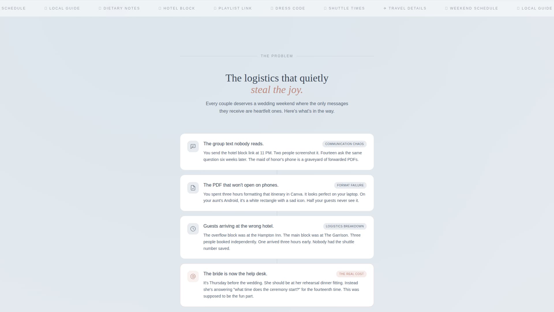
Problem Arc Card Stack
A single-column interstitial section directly below the header names the real chaos of pre-wedding guest communication. Each pain point, including unread group texts, unopened PDF attachments, and guests arriving at the wrong hotel, lives on its own icon-led card. The cards stack vertically, building tension before the solution grid takes over.
Modular Solution Feature Grid
Below the problem stack, modular cards bloom outward to showcase service features. Each card is a working visual preview rather than a description. Highlighted capabilities include drag-and-drop template blocks, RSVP-linked personalization, automated send scheduling, and multilingual toggles.
Pinned Freemium call to action
The primary call to action, "Build Your First Email Free," is pinned in the header navigation and repeated after the solution grid. It opens an inline signup form asking for only three fields: first name, partner's name, and wedding date. The form is designed to feel like the beginning of planning, not a bureaucratic hurdle.
Sample Email Secondary Path
A secondary conversion path below the fold offers visitors the option to receive a fully designed demo email in their own inbox. This doubles as social proof of the product's quality and as a soft email-capture mechanism.
Slate and Sky Design System
The entire template is built on a four-color system: deep editorial slate (#3B4856) for body text and card borders, soft cloud gray (#E8ECF0) for backgrounds, open-sky blue (#7AAFCF) for active tabs and selected states, and warm blush (#D4A59A) for buttons, hover states, and progress indicators.
Page sections overview
| Section | Purpose |
|---|---|
| Tab Switcher Header | Showcases three email templates inside a live inbox preview |
| Problem Arc Cards | Names guest-communication chaos with icon-led vertical cards |
| Solution Feature Grid | Presents service features as modular working preview cards |
| Primary call to action Block | Repeats the "Build Your First Email Free" signup prompt |
| Inline Signup Form | Captures first name, partner's name, and wedding date |
| Sample Email Path | Offers a demo email delivery as a secondary conversion route |
Design & branding system
The visual identity follows a Directory and Discovery theme that feels like a linen-stock invitation suite spread across a marble table on a clear morning. Every color and layout decision supports the sense of quiet ceremony before a big weekend begins.
- Slate (#3B4856) anchors all body text and card borders; cloud gray (#E8ECF0) washes every background surface
- Sky blue (#7AAFCF) marks active tabs and selected states; blush (#D4A59A) warms all buttons, hover states, and progress indicators
- The card-grid layout is modular and breathable, giving each content block its own visual space without crowding
Mobile & speed optimization
The modular card-grid structure is inherently well-suited to narrower screens. Cards that sit side by side on desktop reflow naturally into a single-column stack on smaller viewports, preserving the intended Problem to Solution scroll narrative.
- Vertical card stacking maintains the arc from pain points to feature solutions on all screen sizes
- The three-field inline signup form is compact enough to complete comfortably on a phone without excessive scrolling
- The inbox preview in the tab switcher is designed at pixel-perfect detail, keeping it legible at any viewport width
How this template helps you convert
The page is built around a show-don't-tell philosophy. By the time a visitor reaches the primary call to action, they have already interacted with working previews and recognized their own planning frustrations in the problem cards.
- The Feature Tab Switcher lets visitors interact with real email previews before reading a single claim, building trust through demonstration rather than description.
- The Problem Arc creates immediate emotional recognition, making the solution grid feel like a direct and personal answer rather than a generic product pitch.
- The three-field signup form and the secondary demo-email path offer two commitment levels, letting hesitant visitors choose the lower-stakes option and still enter the conversion funnel.
Other information about this template
This template sits at the intersection of the Technology category and the Wedding Email Templates subcategory. It is purpose-built for the wedding welcome email niche and reflects the specific communication needs of that audience.
- The template style is Card Grid (Modular), meaning individual content blocks can be rearranged or swapped to fit different service offerings or brand voices
- The creative direction follows a strict Problem to Solution Arc, a layout pattern proven to work well for Freemium and free-trial service pages
- The header concept is a Feature Tab Switcher, a component that replaces static hero images with interactive, content-rich previews
- The theme classification is Directory and Discovery, which influences the organized, scannable layout of the feature grid


Theme
Directory & Discovery
Creative direction
Problem→Solution Arc
Color system
Slate & Sky
Style
Card Grid (Modular)
Direction
Freemium/Trial
Page Sections
Feature Tab Switcher Header
Problem Arc Card Stack
Modular Solution Feature Grid
Pinned Freemium Call to Action
Sample Email Secondary Path
Slate and Sky Color System
Related questions
Who is this landing page template built for?
What makes the header different from a standard hero section?
Can I use this template if I am building a freemium or free-trial offer?
How does the inline signup form work?
What color system does this template use?