Minimalist Wedding Specialist Booking Website Template
Vow is a gallery and detail landing page for a minimalist wedding venue. Built around a Luxe Minimal visual identity, it uses a warm Parchment and Rust palette, a custom chapel illustration header, and a full-bleed gallery scroll to guide design-conscious couples toward booking. A fixed "Reserve Your Date" tab and a scarcity-driven form close the visit with quiet confidence.
by Rocket studio
Quick summary
Vow is a single-page wedding venue template designed for a converted stone chapel. It draws design-conscious couples in through a curated gallery scroll, then leads them to a booking form that reinforces exclusivity. The page feels edited down to its essentials: warm parchment tones, rust ink accents, and generous whitespace that lets every image breathe.
Who this template is for
This template is built for intimate venue owners and wedding professionals who value restraint over spectacle. It speaks directly to couples who treat their ceremony as a considered aesthetic act.
- Owners of boutique or converted wedding venues with strong visual identities
- Wedding planners presenting a single, curated space to a design-forward clientele
- Creatives and independent venue hosts who want a landing page that feels like editorial work
What problem this template solves
Most wedding venue pages try to say too much at once. They overwhelm visitors with carousels, package grids, and competing calls to action. Couples with refined taste leave before they feel anything.
- Generic venue templates look interchangeable and fail to communicate a specific atmosphere
- Busy layouts interrupt the emotional journey that leads a visitor to commit
- Booking prompts placed too early feel transactional rather than inviting
What you get with this template
This template delivers a complete gallery and detail landing page built around a single, clear booking goal. Every section is designed to deepen emotional engagement before asking for a date.
- A full-bleed gallery scroll that moves from wide architectural shots to intimate detail close-ups
- A fixed "Reserve Your Date" tab visible at the screen edge throughout the scroll
- A scarcity-reinforced booking form with a date-range calendar picker, a guest count field capped at 80, and one open personal prompt
Feature list
This template is built around a small number of carefully considered components. Each one earns its place.
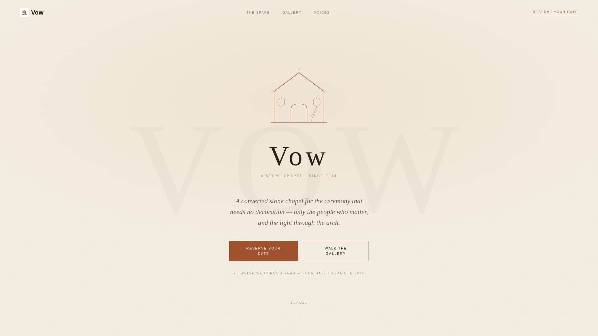
Custom Chapel Illustration Header
A single-weight line drawing of the chapel silhouette sits on a parchment ground. The illustration reduces the architecture to its purest geometry: one arched doorway, one peaked roofline, one sprig of dried eucalyptus. A hand-lettered logotype appears beneath it in charred timber, giving the header the quiet authority of a printed invitation.
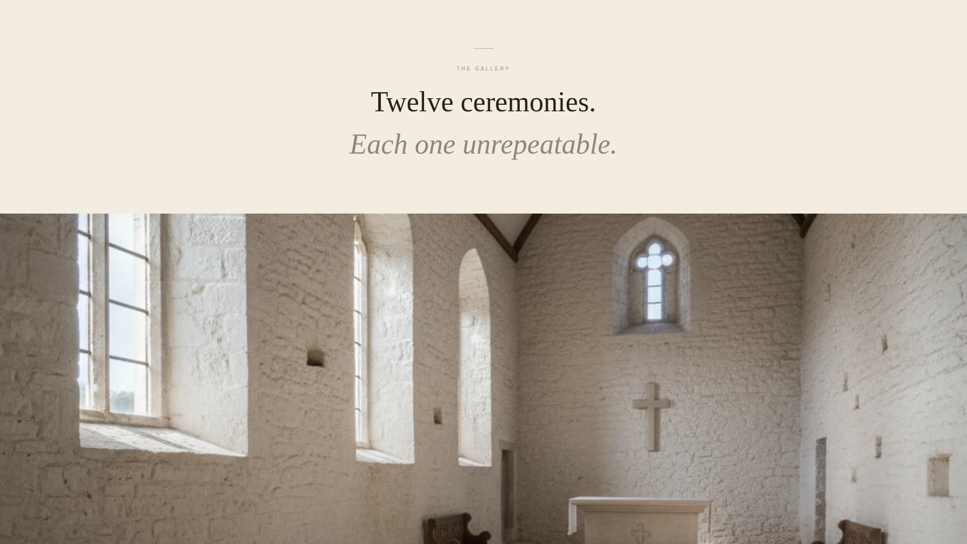
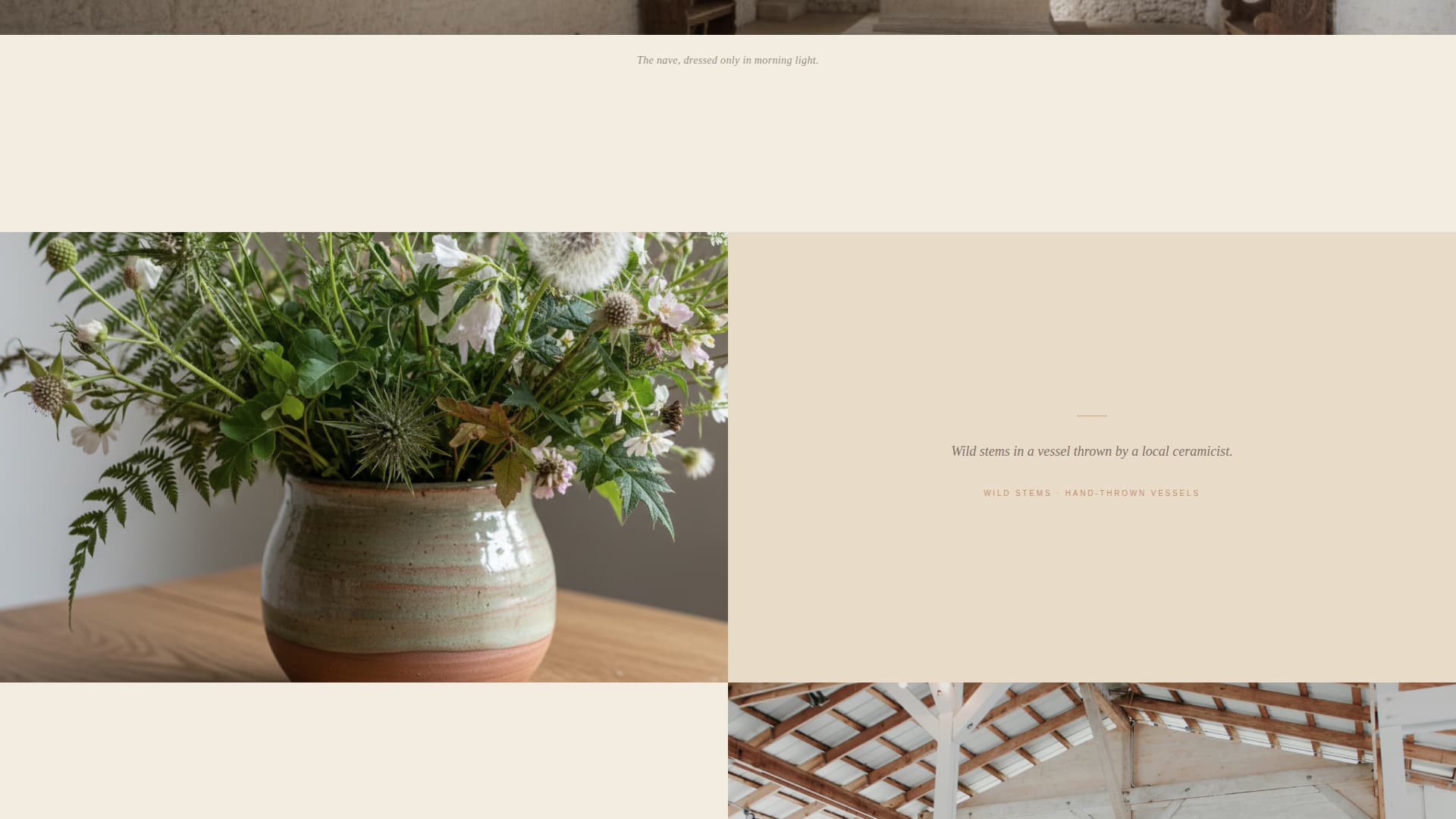
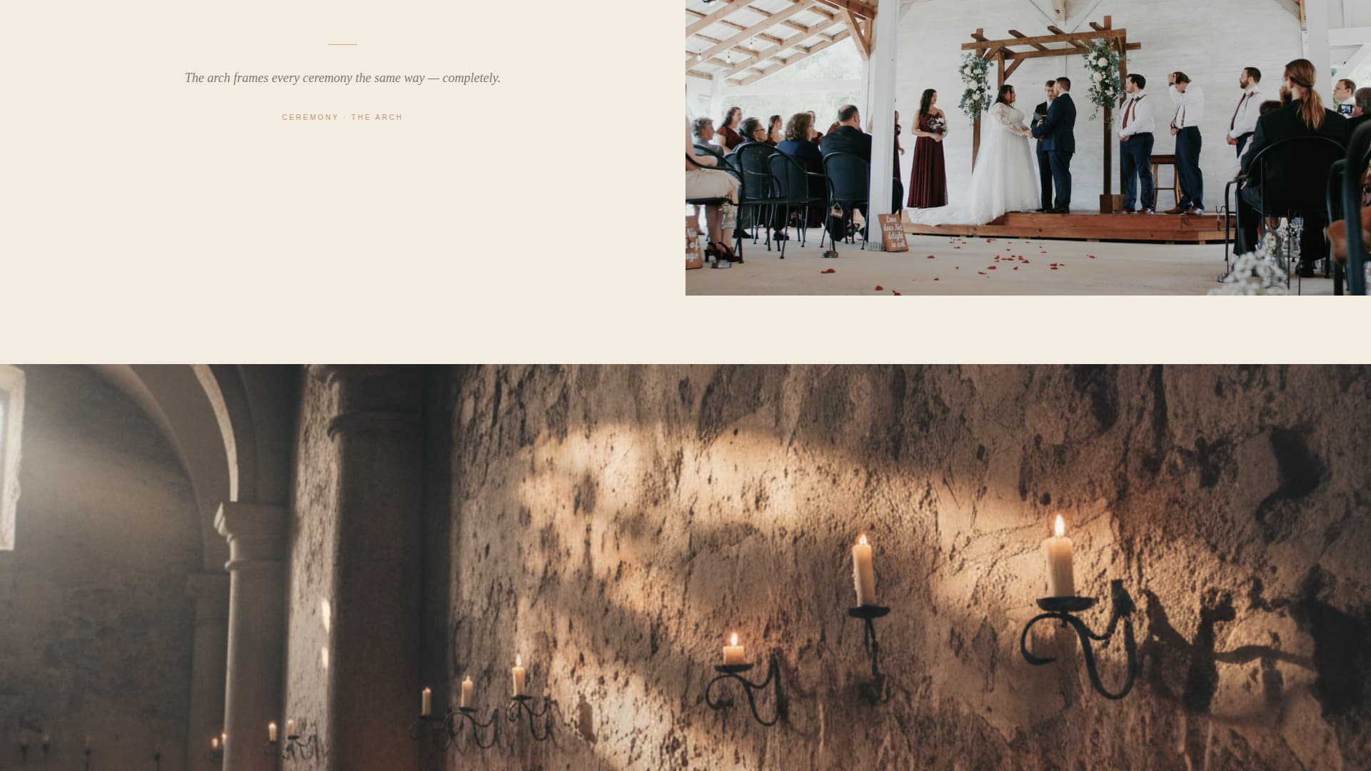
Gallery Walk Scroll Layout
The page is structured as a curated exhibition. Each section pairs one full-bleed photograph with a small serif caption. Generous vertical whitespace between images controls the pace, slowing the visitor down and drawing them progressively closer to the emotional heart of the space.
Fixed Booking Tab
A minimal "Reserve Your Date" tab is anchored to the screen edge for the full length of the scroll. It stays available without interrupting the gallery experience, so the visitor can act the moment they feel ready.
Scarcity-Driven Booking Form
The form appears at the gallery's emotional peak, after the most intimate image in the sequence. A quiet line above it reads "We host twelve weddings a year." The form asks for a preferred date range, a guest count, and a single open field inviting the couple to describe their day in a few words.
Secondary Tour Path
A "Tour the Chapel" link offers a secondary conversion route for visitors who are not yet ready to commit. It connects to a private walkthrough booking, keeping the relationship warm without pressure.
Section Pacing and Whitespace System
Vertical rhythm is a deliberate feature of this template. Generous spacing between sections forces a slower scroll, giving each image room to settle before the next one arrives. The pacing mirrors the restraint of the venue itself.
Page sections overview
| Section | Purpose |
|---|---|
| Illustration Header | Establishes venue identity with a custom line drawing and hand-lettered logotype |
| Fixed Booking Tab | Keeps the primary call to action accessible throughout the full scroll |
| Opening Architecture Shot | Introduces the venue with a wide full-bleed photograph and serif caption |
| Gallery Sequence | Escalates from architectural views to intimate ceremony detail close-ups |
| Booking Form | Converts emotional engagement into a date reservation with scarcity cue |
| Secondary Tour Link | Offers a lower-commitment path to a private chapel walkthrough booking |
Design & branding system
The visual identity is built on a Luxe Minimal theme. The palette borrows from natural, handmade materials: fired clay, aged linen, and cotton paper left in the sun.
- Warm parchment (#F3ECE0) covers the dominant background, dried terracotta rust (#A0522D) drives accent typography and hover states, charred timber (#2C2118) anchors body text and navigation, and kiln-fired cream (#E8DCC8) separates sections and card backgrounds
- Typography pairs a small serif for captions and form labels with the hand-lettered logotype treatment in the header, keeping the reading experience unhurried
- The custom illustration and hand-lettered type ensure the page feels authored rather than assembled
Mobile & speed optimization
The single-page layout is structured to translate cleanly to smaller screens. Full-bleed images and generous whitespace adapt naturally to portrait viewports without losing the gallery's pacing.
- The fixed booking tab is positioned to remain usable on mobile without covering key image content
- The booking form fields, including the date-range calendar picker and the guest count input, are designed for straightforward touch interaction
How this template helps you convert
The page is engineered around a single conversion goal: a date reservation. Every design and copy decision supports that outcome without forcing it.
- The gallery escalation builds emotional investment gradually, so by the time the booking form appears the visitor already feels connected to the space rather than pitched at
- The scarcity signal above the form ("We host twelve weddings a year") creates genuine urgency without resorting to countdown timers or aggressive prompts
- The secondary "Tour the Chapel" path captures visitors who need more before committing, turning a potential exit into a lower-stakes next step
Other information about this template
This template sits at the intersection of the minimalist wedding venue niche and editorial web design. It is a strong fit for venues where the atmosphere is the product.
- The template is categorized under Wedding and Events with a Minimalist Wedding subcategory focus
- The Gallery and Detail template style means the visual content does the primary selling work, supported by minimal copy
- The Booking and Scheduling landing page direction means every structural decision serves one outcome: a completed reservation form
- The Parchment and Rust color system and Gallery Walk creative direction work together to create a scroll experience closer to a printed lookbook than a typical venue website
- The guest count cap at 80 is built into the form as a design feature, reinforcing the venue's intimate positioning to prospective couples
Theme
Luxe Minimal
Creative direction
Gallery Walk
Color system
Parchment & Rust
Style
Gallery + Detail
Direction
Booking/Scheduling
Page Sections
Custom Chapel Illustration Header
Full-bleed Gallery Walk Scroll
Fixed Reserve Your Date Tab
Scarcity-driven Booking Form
Secondary Tour Booking Path
Related questions
Who is this template best suited for?
Can I update the gallery images with my own venue photography?
How does the booking form work?
Is this a multi-page template or a single landing page?
Can I adjust the scarcity message above the booking form?