Underwrite - Predictive Insurance Landing Page Template
Underwrite is a predictive insurance reserve forecasting landing page template built for AI-driven carriers and insurtechs. It features a Feature Tab Switcher header, anchor-nav hub and spoke layout, versus comparison tables, and a two-step lead capture form. The design uses a Tech Glass aesthetic in Electric Indigo to communicate precision, speed, and analytical depth.
by Rocket studio
Quick summary
Underwrite is a single-page template for an insurance AI forecasting platform. It guides actuarial directors, operations leaders, and CFOs from problem awareness to conversion using a hub and spoke anchor navigation, animated dashboard tabs, side-by-side comparison tables, and a two-step form that captures qualified leads before asking for a commitment.
Who this template is for
This template is built for teams selling predictive reserve and capacity intelligence to mid-market insurance carriers and insurtechs. It speaks directly to buyers who feel the pain of reserve shortfalls and slow forecasting cycles.
- Actuarial directors at property and casualty carriers who manage reserve models in spreadsheets
- Operations vice presidents at insurtechs whose forecasting hasn't kept pace with their growth
- Chief financial officers at managing general agents who have been surprised by surplus lines shortfalls
What problem this template solves
Reserve miscalculation costs the insurance industry an estimated $4.7 billion annually. Most forecasting tools either lag behind market signals or require manual interpretation. This template frames that gap clearly and positions the platform as the fix.
- Legacy actuarial tools and spreadsheets can't process policy data, claims history, and market signals together in real time
- Generic AI platforms lack the product line and regional specificity that carriers need for confident reserve decisions
- No existing page layout efficiently guides an actuarial buyer from skepticism to a demo request in one scroll
What you get with this template
You get a fully structured, conversion-focused landing page layout designed for an insurance AI inventory forecasting platform. Every section is purpose-built to move a technical, skeptical buyer toward action.
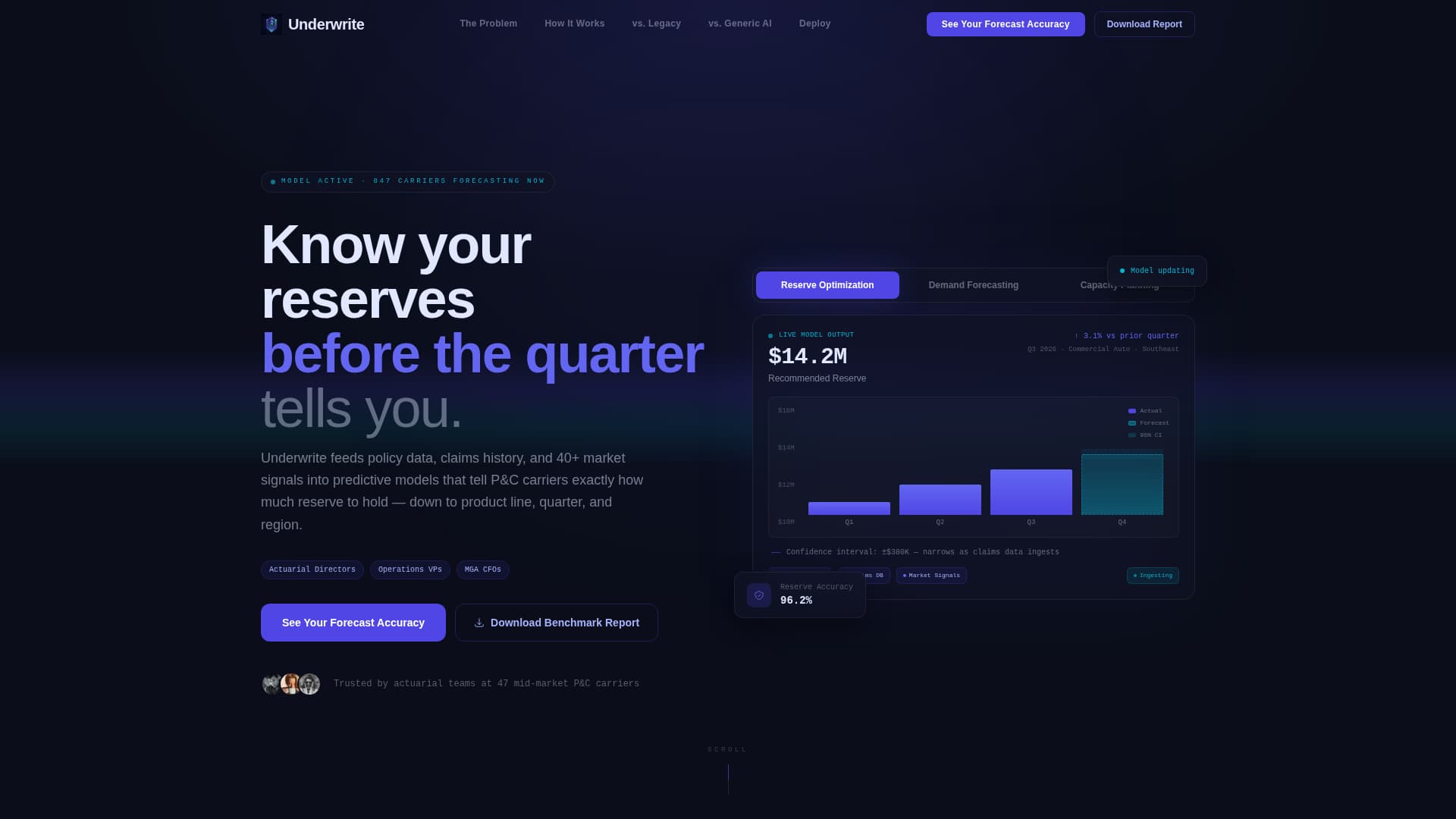
- A Feature Tab Switcher header with three glass-morphic dashboard views covering Reserve Optimization, Demand Forecasting, and Capacity Planning
- Five anchor-linked spoke sections that escalate urgency from industry problem to deployment timeline
- Two conversion paths: a primary two-step forecast accuracy form and a secondary benchmark report download
Feature list
This template ships with purpose-built components that reflect the complexity and credibility an insurance AI platform needs to earn.
Feature Tab Switcher Header
Three glass-morphic tabs float over a dark canvas. The active tab expands to show a simulated live dashboard with animated reserve curves, policy volume bars, and a narrowing confidence interval band. Specific numbers like "$14.2M recommended reserve, Q3 Commercial Auto, Southeast region" make the intelligence feel real, not mocked up.
Hub and Spoke Anchor Navigation
A persistent hub navigation bar links to five spoke sections: The Problem, How It Works, versus. Legacy Forecasting, versus. Generic AI, and Deploy. Each section is designed to answer one doubt and build momentum toward the next, structured like a staged launch sequence.
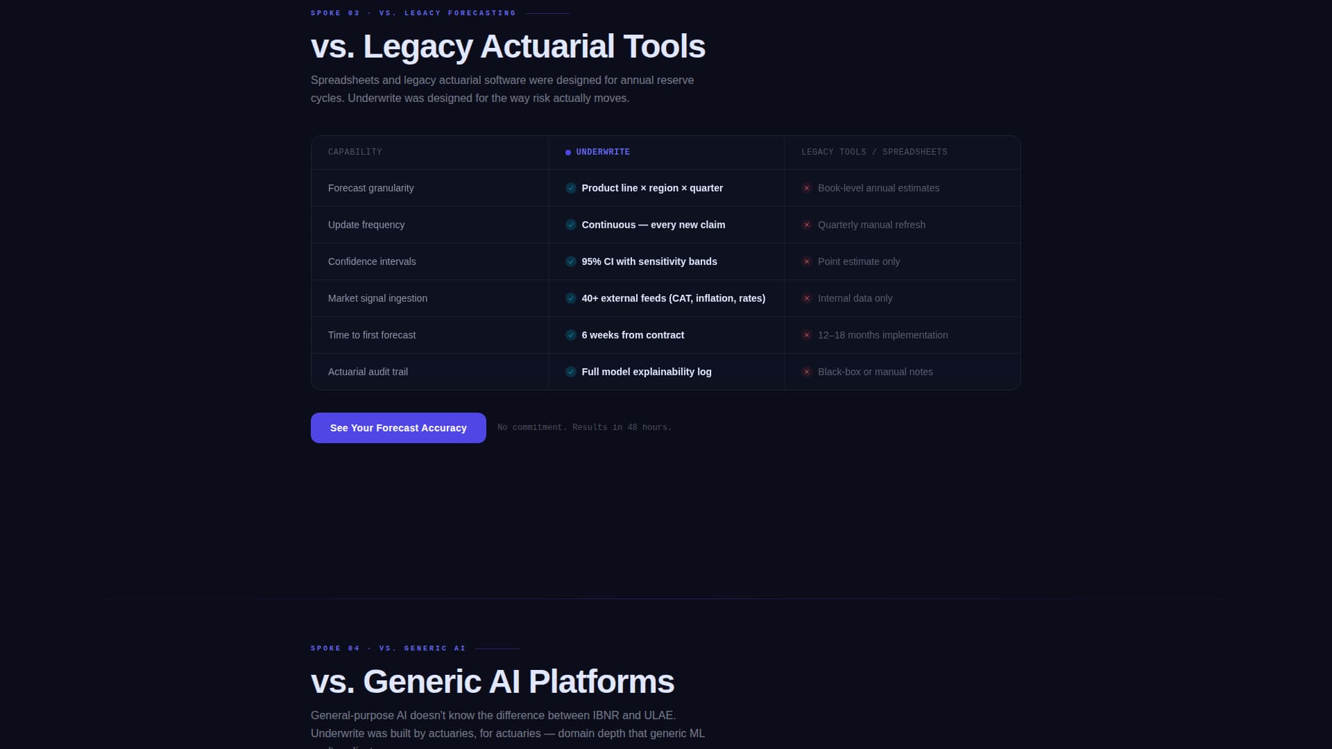
Side-by-Side Comparison Tables
Two dedicated versus sections use red and green cell highlighting to make the performance gap between legacy forecasting and AI-driven reserve modeling immediately visible. The contrast does the selling before the form ever appears.
Two-Step Lead Capture Form
The primary call to action opens a two-step form. Step one collects company size and current forecasting method via a dropdown. Step two collects name, email, and an optional upload field for a sample loss-ratio report. This staged approach reduces friction for high-intent buyers.
Secondary Benchmark Report Path
A "Download the Benchmark Report" conversion path captures leads who want industry comparison data before committing to a demo. It extends the reach of the page to earlier-stage buyers without diluting the primary conversion flow.
Deployment Timeline Spoke
The final spoke section visualizes a six-week path to live forecasts. It gives procurement-conscious buyers a concrete implementation expectation and reduces the perceived risk of switching from their current tools.
Page sections overview
| Section | Purpose |
|---|---|
| Feature Tab Switcher | Show reserve, demand, and capacity dashboards with animated data |
| Hub Nav Bar | Anchor links to all five spoke sections persistently |
| The Problem | Visualize the $4.7B annual industry cost of reserve miscalculation |
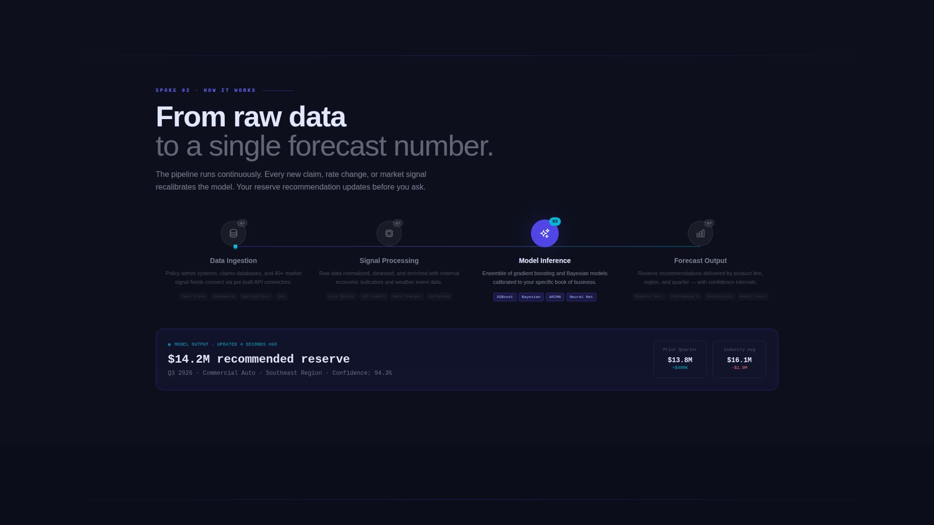
| How It Works | Animate the data pipeline from policy systems to a single forecast |
| versus. Legacy Forecasting | Compare AI reserve modeling against spreadsheet and legacy tools |
| versus. Generic AI | Compare platform specificity against general-purpose AI solutions |
| Deploy Timeline | Show a six-week path to live forecast delivery |
| Primary call to action Form | Capture qualified leads with a two-step forecast accuracy form |
| Benchmark Report call to action | Capture earlier-stage leads with a downloadable industry report |
Design & branding system
The Tech Glass visual identity uses an Electric Indigo color system that feels like staring into a server rack at 2 a.m. Every surface is intentional: dark, precise, and alive with data.
- Deep void black (#0B0E1A) sets the primary background, grounding the interface in technical authority
- Electric indigo (#4F46E5) radiates from interactive elements and data visualizations, signaling intelligence in motion
- Cool frost (#E0E7FF) carries body text and secondary surfaces for clean legibility against dark backgrounds
- Sharp cyan (#06B6D4) marks live-data accents and hover states, making interactive moments feel immediate and precise
Mobile & speed optimization
The template's layout and component choices keep the experience fast and readable across screen sizes. Glass-morphic effects and animated elements are scoped to perform without dragging load time.
- Anchor navigation collapses cleanly for smaller screens, keeping the hub and spoke flow intact on mobile
- Tab switcher transitions use smooth morph animations designed to stay fluid without causing layout shift
How this template helps you convert
The page is engineered around a Comparison and Versus conversion strategy. It earns the click by showing the evidence before asking for anything.
- The versus tables appear before any form, letting the performance gap between legacy forecasting and AI-driven reserve modeling do the convincing on its own terms.
- The two-step form reduces friction by separating company context from contact details, making each step feel low-commitment for a technical buyer.
- The secondary benchmark report download captures leads at an earlier decision stage, ensuring the page converts skeptical visitors who aren't ready to request a demo.
Other information about this template
This template is part of a broader library of AI and insurance technology page designs. It is well suited for teams building in the insurance AI forecasting space who need a page that communicates both analytical depth and practical deployment speed.
- The template style is Hub and Spoke with Anchor Navigation, making it straightforward to extend with additional spoke sections if your platform covers more use cases
- The Launch Energy creative direction is deliberately sequential, designed to mirror the decision logic of an actuarial or operations buyer evaluating a new forecasting platform
- The Electric Indigo color system and Tech Glass theme are fully adjustable to match your brand guidelines while preserving the high-contrast, data-forward visual identity

Theme
Tech Glass
Creative direction
Launch Energy
Color system
Electric Indigo
Style
Hub & Spoke (Anchor Nav)
Direction
Comparison/Versus
Page Sections
Feature Tab Switcher with Live Dashboard Simulation
Hub and Spoke Anchor Navigation
Side-by-side Comparison Tables
Two-step Lead Capture Form
Benchmark Report Secondary Conversion
Six-week Deployment Timeline Section
Related questions
Who is this landing page template designed for?
What conversion paths does this template include?
Can I customize the dashboard numbers and comparison table content?
How does the hub and spoke navigation work?
Does the template include the animated tab transitions?