Underwrite - Glassmorphic Insurance Landing Page Template
Underwrite is a glassmorphic insurance directory landing page built for urgent, high-intent visitors. A full-viewport coverage estimator captures user intent first, then smooth-scrolls into hub-and-spoke sections for Auto, Home, Life, Commercial, and Specialty insurance. Every spoke funnels visitors toward pre-filtered agent listings with zero sign-up friction.
by Rocket studio
Quick summary
Underwrite is a single-page insurance directory landing page that leads with an interactive coverage estimator. Frosted-glass panels float over a deep dark background, guiding panicked first-timers and seasoned business owners alike toward the right insurance agent in their area. The hub-and-spoke layout keeps navigation fast and the path to listings completely frictionless.
Who this template is for
This template is built for insurance directory operators, listing site founders, and lead-generation businesses that connect consumers with licensed agents or brokers. It suits teams who want a tool-first landing page rather than a generic hero image layout.
- Insurance directory and listing site owners who want to qualify visitor intent before showing results
- Independent brokers or agencies managing multiple verticals such as auto, home, life, and commercial coverage
- Startup founders building fintech-adjacent insurance marketplaces with a modern, app-like visual identity
What problem this template solves
Most insurance landing pages greet visitors with a stock photo and a vague "Get a Quote" button. That approach fails the person whose pipe just burst at midnight or whose new business just received a liability letter. Visitors arrive mid-stress and need immediate direction, not another generic form.
- Visitors leave before converting because the page never qualifies what they actually need
- Jargon-heavy layouts overwhelm first-time homebuyers and gig workers who are new to coverage decisions
- Generic hero sections waste the highest-intent moment a visitor will ever have on the page
What you get with this template
You get a fully structured, single-page hub-and-spoke landing page with a calculator-first header and five insurance vertical spokes. Every section is pre-built and visually cohesive inside the glassmorphic design system.
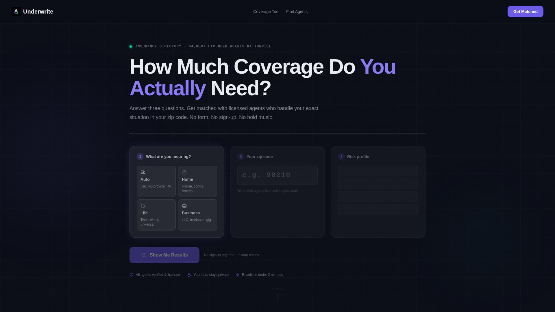
- A full-viewport interactive coverage estimator with three frosted-glass input cards covering coverage type, zip code, and a dynamic risk-profile question
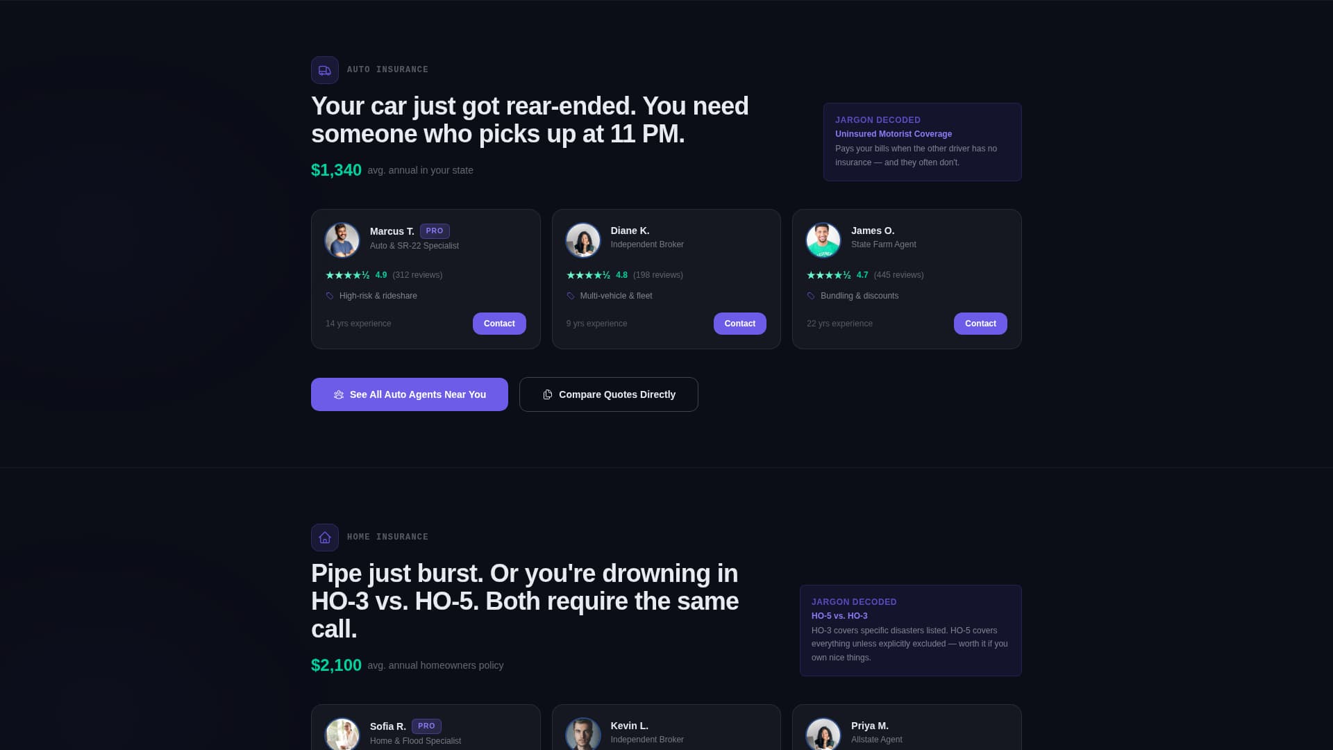
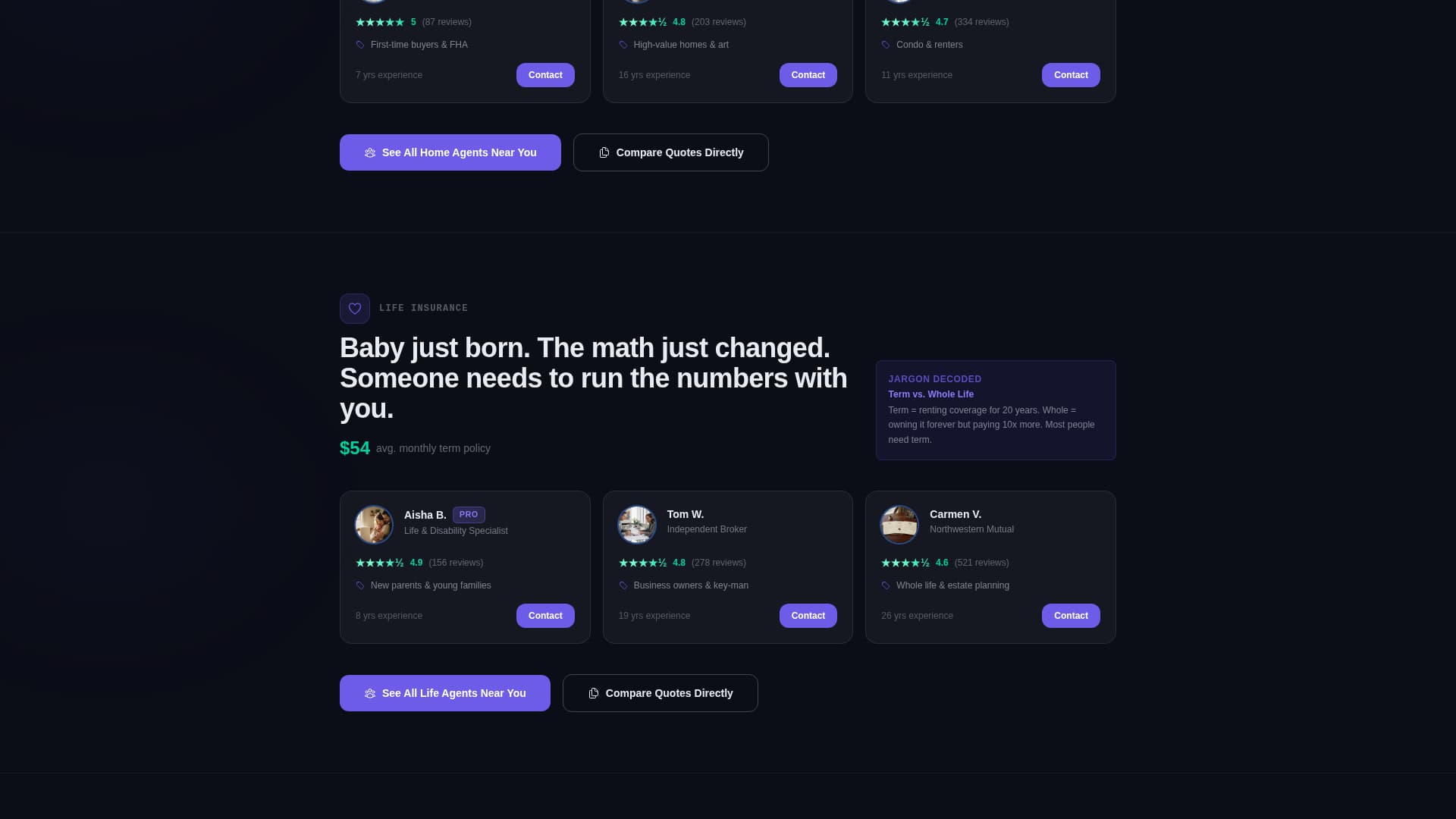
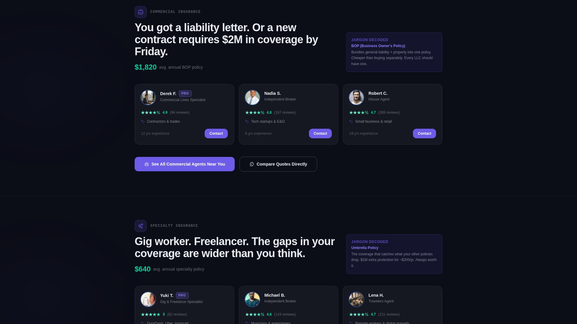
- Five anchored spoke sections, one each for Auto, Home, Life, Commercial, and Specialty insurance, each with frosted card clusters showing top-rated agents, average local premiums, and plain-language jargon explainers
- Two conversion paths per spoke: a primary iris-purple "See Agents Near You" button that passes calculator inputs to pre-filtered directory results, and a ghost-outline "Compare Quotes Directly" secondary call to action
Feature list
This template ships with purpose-built components designed specifically for an insurance directory and listing site. Each piece of the layout earns its place by moving a stressed visitor closer to the right agent.
Full-Viewport Coverage Estimator
The header is the tool. Three frosted-glass input cards ask what the visitor is insuring, their zip code, and a risk-profile question that changes based on the first selection. The cursor blinks in the first field on load and an iris-purple progress bar dares the visitor to start filling it in.
Hub-and-Spoke Anchor Navigation
A persistent top navigation appears the moment the visitor engages the estimator. Each nav item is an anchor link to one of the five insurance vertical spokes below. Iris purple pulses on hover states and active spoke links keep the visitor oriented as they scroll.
Frosted Card Clusters Per Vertical
Each spoke section holds a cluster of frosted-glass agent cards. Cards display agent ratings, average local premiums, and one-line jargon explainers that turn intimidating terms into plain language. Signal green appears on positive calculator outputs and confirmed rating states as a reward color.
Pre-Filtered Click-Through calls to action
Every spoke ends with a primary "See Agents Near You" button in electric iris. The button passes the user's coverage type, zip code, and risk profile directly to the directory results page, pre-filtered. No sign-up wall. No extra form. The estimator did the qualifying work upstream.
Scroll-Triggered Micro-Animations
Cards slide in from the edges as the visitor scrolls into each spoke. Numbers count up on entry and agent ratings shimmer with signal green on arrival. The motion reinforces the Startup Velocity energy of the design without overwhelming the content.
Secondary Quote Comparison Path
A ghost-outline "Compare Quotes Directly" button sits alongside the primary call to action in each spoke. It gives high-intent visitors a way to request multi-agent quotes without disrupting the primary click-through flow. Both paths co-exist without competing visually.
Page sections overview
| Section | Purpose |
|---|---|
| Coverage Estimator Header | Captures coverage type, zip code, and risk profile before any scroll |
| Personalized Results Banner | Shows estimated coverage range and matched agent count in the visitor's area |
| Auto Insurance Spoke | Surfaces top-rated auto agents, local premiums, and plain-language coverage explainers |
| Home Insurance Spoke | Addresses HO-3 versus. HO-5 confusion with decoded jargon and matched home agents |
| Life Insurance Spoke | Connects new parents and life-event visitors with local life insurance agents |
| Commercial Insurance Spoke | Serves small business owners facing liability concerns with matched commercial brokers |
| Specialty Insurance Spoke | Covers umbrella, gig-worker, and niche policies with explainer cards and agent listings |
| Persistent Anchor Nav | Keeps all five vertical spokes reachable from any scroll position |
Design & branding system
The visual identity runs on a glassmorphic color system built to feel like a fintech app at midnight. Every element floats above a deep void-black background, creating the sensation that panels hover a few millimetres above the screen.
- Core palette: deep void black (#0B0D17) as the canvas, electric iris (#6C5CE7) for primary actions and hover states, soft glass-fog white (#E8ECF1) at 40 percent opacity for card surfaces, and signal green (#00D2A0) reserved strictly for positive calculator outputs and confirmation states
- Frosted blur-backed containers hold all content sections, maintaining the glass-panel aesthetic across every spoke without breaking visual hierarchy
- Micro-interaction language: iris purple pulses on active navigation and hover states; signal green appears only when the tool delivers a result, making it a reward color earned by the visitor rather than decorative noise
Mobile & speed optimization
The glassmorphic layout is structured to translate cleanly across screen sizes. Frosted card clusters reflow into single-column stacks on smaller viewports, keeping the estimator inputs and spoke content readable without horizontal scrolling.
- The three estimator input cards are designed as stacking units, so the tool remains fully usable on a phone screen without pinching or zooming
- Scroll-triggered card animations are scoped to viewport entry, meaning they fire only when a section becomes visible rather than loading all at once on page entry
How this template helps you convert
The entire page is structured around removing friction between a stressed visitor and a matched agent. Conversion is built into the layout logic, not bolted on afterward.
- The estimator header captures intent, location, and risk context before the visitor sees a single agent listing, so every subsequent click-through arrives pre-qualified at the directory results page
- The hub-and-spoke anchor navigation eliminates dead ends by keeping all five insurance verticals reachable from any scroll depth, reducing the chance a visitor leaves to search elsewhere
- The primary call to action passes estimator inputs directly to pre-filtered results, so the visitor never restarts their search or hits a sign-up wall between the landing page and the listings
Other information about this template
This template is part of a broader set of calculator-first landing page designs built for high-intent, niche directory use cases. It suits operators who want a tool-driven entry point rather than a passive brochure layout.
- The template style is Hub and Spoke with Anchor Navigation, meaning the estimator acts as the central hub and each insurance vertical is a navigable spoke
- The creative direction is Calculator and Tool First, which means the header component is a functional input interface rather than a decorative hero image
- The theme is Startup Velocity paired with a glassmorphic color system, making it well suited for modern insurance marketplace brands that want a fintech-adjacent visual identity
Theme
Startup Velocity
Creative direction
Calculator/Tool First
Color system
Glassmorphic
Style
Hub & Spoke (Anchor Nav)
Direction
Click-Through
Page Sections
Full-viewport Coverage Estimator
Hub-and-spoke Anchor Navigation
Frosted Vertical Spoke Cards
Pre-filtered Click-through Ctas
Scroll-triggered Micro-animations
Secondary Quote Comparison Path
Related questions
Do I need a live backend to use the coverage estimator?
Can I add or remove insurance vertical spokes?
Does the call to action button actually pass estimator inputs to a results page?
Is this template suitable for a single-agent or single-broker site?