Underwrite - Compliant Insurance Landing Page Template
Underwrite is a landing page template built for an AI-powered insurance content writing tool. It showcases a compliance-first writing engine that ingests policy language, carrier guidelines, and state regulations to produce ready-to-publish insurance content. Designed for marketing directors, MGA teams, and agency owners, the template positions speed, accuracy, and compliance as its core proof points.
by Rocket studio
Quick summary
Underwrite is a single-page template for an AI writing engine built specifically for the insurance industry. It presents the tool's ability to generate compliant blog posts, email sequences, policy summaries, and claims explainers using a Data Command visual identity. The layout uses a modular card grid and a side-by-side comparison module to move enterprise buyers from skepticism to action.
Who this template is for
This template is built for insurance professionals who produce regulated content at scale. It speaks directly to buyers who need compliance confidence alongside publishing speed.
- Marketing directors at mid-size insurance carriers managing long compliance review cycles
- Content teams at managing general agents publishing across multiple state markets simultaneously
- Independent agency owners who need fresh, on-brand content without a dedicated writing staff
What problem this template solves
Producing insurance content is slow, fragmented, and legally risky. Most writing tools have no understanding of carrier guidelines, state department of insurance databases, or National Association of Insurance Commissioners standards. The result is content that stalls in review or gets rewritten from scratch.
- Teams lose weeks cycling content through legal and compliance reviewers before publication
- Generic AI writing tools produce copy that lacks insurance-specific terminology and regulatory accuracy
- Agencies publishing across multiple states must manually verify every piece against different regulatory requirements
What you get with this template
This template delivers a fully structured landing page designed to present an insurance AI content tool to enterprise buyers. Every section is purpose-built to reduce friction and build credibility fast.
- An animated code-snippet header that visually demonstrates the tool's input-to-output process in real time
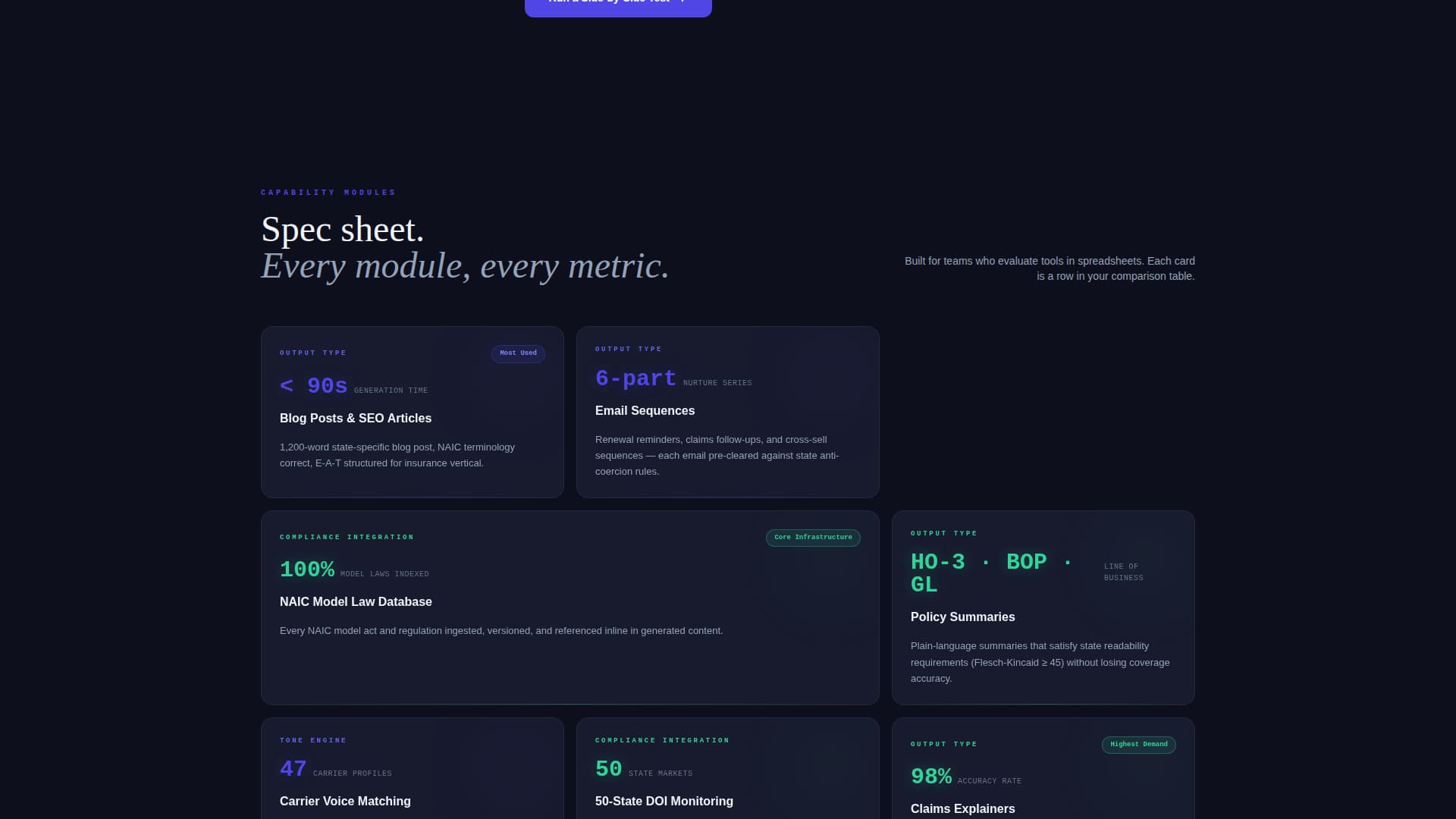
- A modular card grid presenting output types, compliance integrations, tone controls, and turnaround benchmarks as discrete capability modules
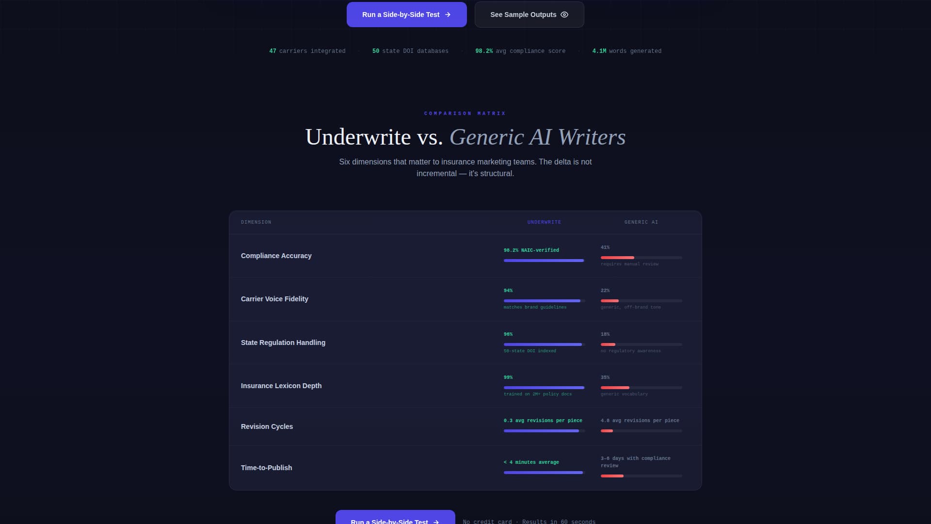
- A sticky comparison module letting visitors toggle Underwrite against generic AI writers across six measurable dimensions
- A progressive disclosure lead form that feels like configuring a tool rather than submitting a contact request
- A secondary conversion path gating sample outputs by line of business behind an email capture
Feature list
This template's layout and components work together to present a technically credible, conversion-focused product page. Each feature below maps directly to a prompt-specified element.
Animated Code-to-Copy Header
The header opens with a split-screen animation. The left side displays a raw API call with parameters including carrier name, target state, content type, and tone setting. The right side renders the finished insurance copy character by character in editorial type. A compliance score badge ticks up to 98% as the copy completes, making the entire value proposition visible in one frame.
Modular Capability Card Grid
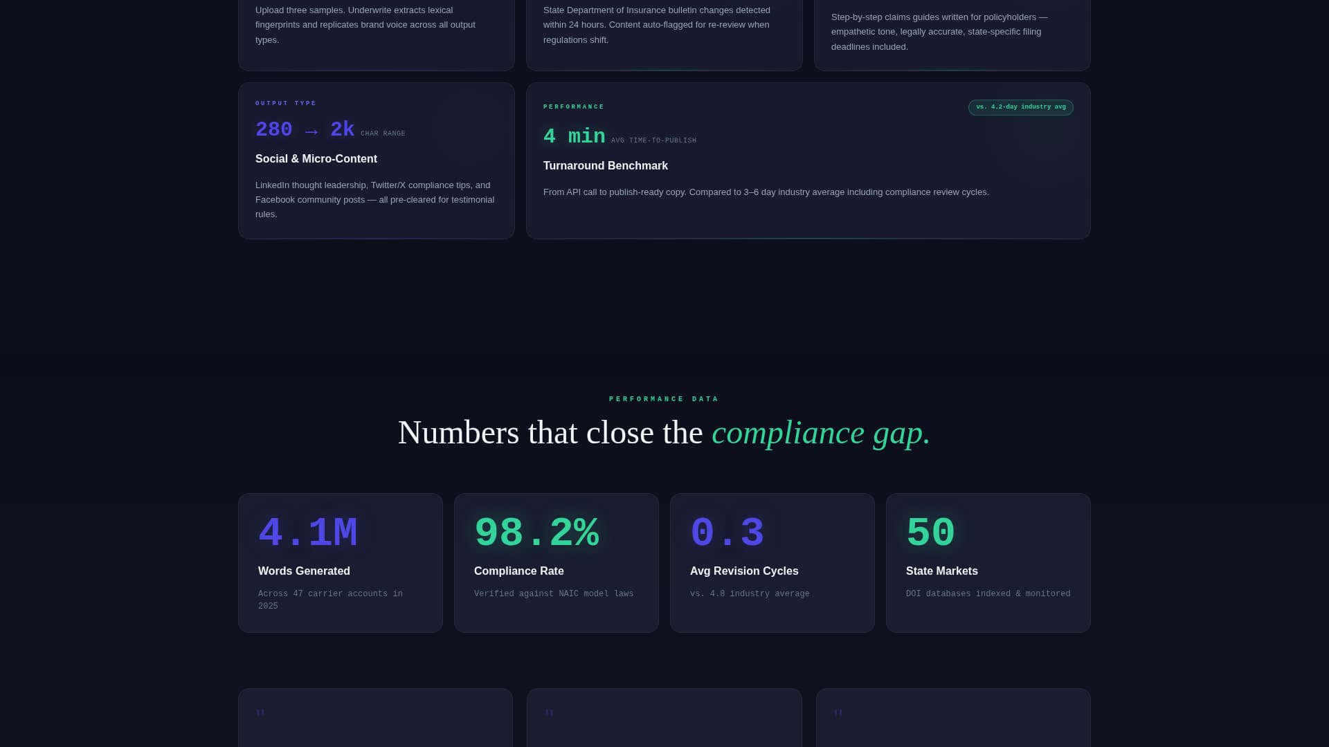
Each card in the grid is a self-contained capability module showing a metric, a feature name, and a single proof point. Cards cover output types such as blog posts, email sequences, social copy, and policy summaries, as well as compliance integrations, tone controls, carrier voice matching, and turnaround benchmarks. The layout is designed to read like a technical data sheet for enterprise buyers.
Persistent Comparison Toggle Module
A sticky module stays visible as the visitor scrolls and lets them compare the tool against generic AI writers across six dimensions: compliance accuracy, carrier voice fidelity, state regulation handling, insurance lexicon depth, revision cycles, and time-to-publish. This module is the page's primary differentiator section.
Progressive Disclosure Lead Form
The primary call-to-action form uses a three-step progressive disclosure structure. It asks for content type first via a dropdown, then target state, then a work email address. The sequence mimics tool configuration rather than a traditional sign-up flow, reducing perceived friction for enterprise buyers.
Floating and Inline call to action Placement
The primary call to action, "Run a Side-by-Side Test," appears both directly beneath the comparison module and as a floating button in the bottom-right corner. The floating version activates after the visitor reaches 40% scroll depth, keeping the conversion prompt contextually relevant without being intrusive.
Secondary Email-Gated Content Path
Visitors who are not ready to start a test can access sample outputs organized by line of business. This path is gated behind an email capture only, creating a lower-commitment entry point that qualifies browsers and feeds them into the same funnel.
Page sections overview
| Section | Purpose |
|---|---|
| Animated header block | Demonstrate input-to-output in real time |
| Capability card grid | Present discrete features as spec modules |
| Comparison toggle module | Contrast tool against generic AI writers |
| Primary call to action form | Capture leads via progressive disclosure |
| Floating call to action button | Maintain conversion access after scroll |
| Sample output gate | Convert browsers with low-commitment proof |
Design & branding system
The visual identity follows a Data Command theme. The palette is drawn from terminal and financial dashboard aesthetics, dense with information but never cluttered.
- Deep terminal black (#0D0F1C) forms the background, electric indigo (#4F46E5) covers all interactive surfaces and hover states, and cool slate (#94A3B8) handles body text and secondary labels
- Sharp mint (#34D399) appears exclusively as a success and output accent, used only when generated content is being displayed to reinforce the sense of live system output
- Typography splits between a monospaced font on the input side of the header and an editorial serif on the output side, making the contrast between raw data and finished copy a visual argument for the product
Mobile & speed optimization
The modular card grid and sticky comparison module are both structured for responsive layouts. The template is built to maintain clarity and hierarchy across screen sizes.
- The card grid reflows into single-column stacks on smaller screens without losing the spec-sheet readability of each module
- The floating call-to-action button and sticky comparison module are sized and positioned to remain usable on touch devices without obscuring content
How this template helps you convert
Every structural decision in this template is designed to move a skeptical enterprise buyer toward a test or a lead capture.
- The split-screen header delivers the product's core proof point before the visitor has scrolled a single pixel, establishing credibility through demonstration rather than description.
- The comparison toggle gives buyers a ready-made evaluation framework, reducing the effort required to build an internal case for the tool and accelerating the decision cycle.
- The dual conversion paths, one active and one passive, ensure that both decision-ready buyers and early-stage researchers leave the page as qualified contacts.
Other information about this template
This template is built specifically for the AI for insurance technology category and is suited to tools operating in the insurance AI content writer space. It is a strong fit for any product that needs to present compliance credentials alongside automation speed to a professional buyer audience.
- The template style is a card grid with modular sections, making it straightforward to add, remove, or reorder capability cards as a product's feature set evolves
- The Data Command theme and Electric Indigo color system are designed to signal technical authority to buyers accustomed to enterprise software interfaces
- The Spec Sheet creative direction and Comparison/Versus landing page direction work together to serve buyers who evaluate tools in detail before committing
- The Code Snippet header concept can be adapted to showcase different content types, carrier parameters, or compliance outputs depending on the product's core use case

Theme
Data Command
Creative direction
Spec Sheet
Color system
Electric Indigo
Style
Card Grid (Modular)
Direction
Comparison/Versus
Page Sections
Animated Code-to-copy Header
Modular Capability Card Grid
Persistent Comparison Toggle
Progressive Disclosure Lead Form
Dual Conversion Path Design
Floating Contextual Call to Action Button
Related questions
Who is this landing page template designed for?
Can I customize the card grid to match my product's specific features?
What does the comparison module show buyers?
How does the lead form work on this template?
Is there a way to convert visitors who are not ready to sign up?