Unbox - Immersive Packaging Landing Page Template
Unbox is a full-width immersive landing page template built for packaging design studios. It combines a scroll-jacked hero, cinematic gallery walk, and a waitlist intake form into one darkly opulent experience. The obsidian and gold visual system communicates luxury before a single word is read, helping agencies attract serious DTC and brand clients from the first scroll.
by Rocket studio
Quick summary
Unbox is a single-page, full-width immersive template designed for packaging design agencies. It leads with a cinematic scroll-jacked header, moves visitors through a gallery-style project showcase, and closes with a waitlist form that captures qualified leads. The dark obsidian and gold palette signals premium craft immediately, before any headline appears.
Who this template is for
This template is built for packaging design studios that want their site to feel as considered as the work they produce. It suits agencies positioning themselves at the premium or luxury end of the market and opening intake on a limited or seasonal basis.
- Packaging design agencies launching a new client intake cycle with limited spots
- Independent studios serving direct-to-consumer brands, beverage companies, cosmetics houses, or spirits labels
- Creative directors who want the portfolio experience to mirror the quality of physical packaging work
What problem this template solves
Most agency portfolio pages load a grid of thumbnails and ask visitors to do the interpretive work. For packaging design, that approach undersells the craft. Shelf presence, material choices, and tactile detail are lost on a flat image grid. Unbox solves this by slowing the visitor down and staging the work like an exhibition.
- Visitors arrive expecting another generic portfolio; instead they move through a controlled, gallery-paced experience that builds desire before any pitch is made
- Agencies struggle to communicate premium positioning through copy alone; the visual system and pacing do that work instead
- Limited intake periods create urgency, but only if the page earns trust first; the scroll-jacked hero proves craft before the waitlist form appears
What you get with this template
You get a complete, single-page layout structured around three core experiences: an immersive scroll-jacked hero, a full-viewport gallery walk, and a minimal waitlist capture section. Every layout decision supports the goal of communicating restraint, precision, and luxury.
- Scroll-jacked header section where a luxury package rotates slowly in a tight spotlight against pure black, with the headline appearing only after the full rotation completes
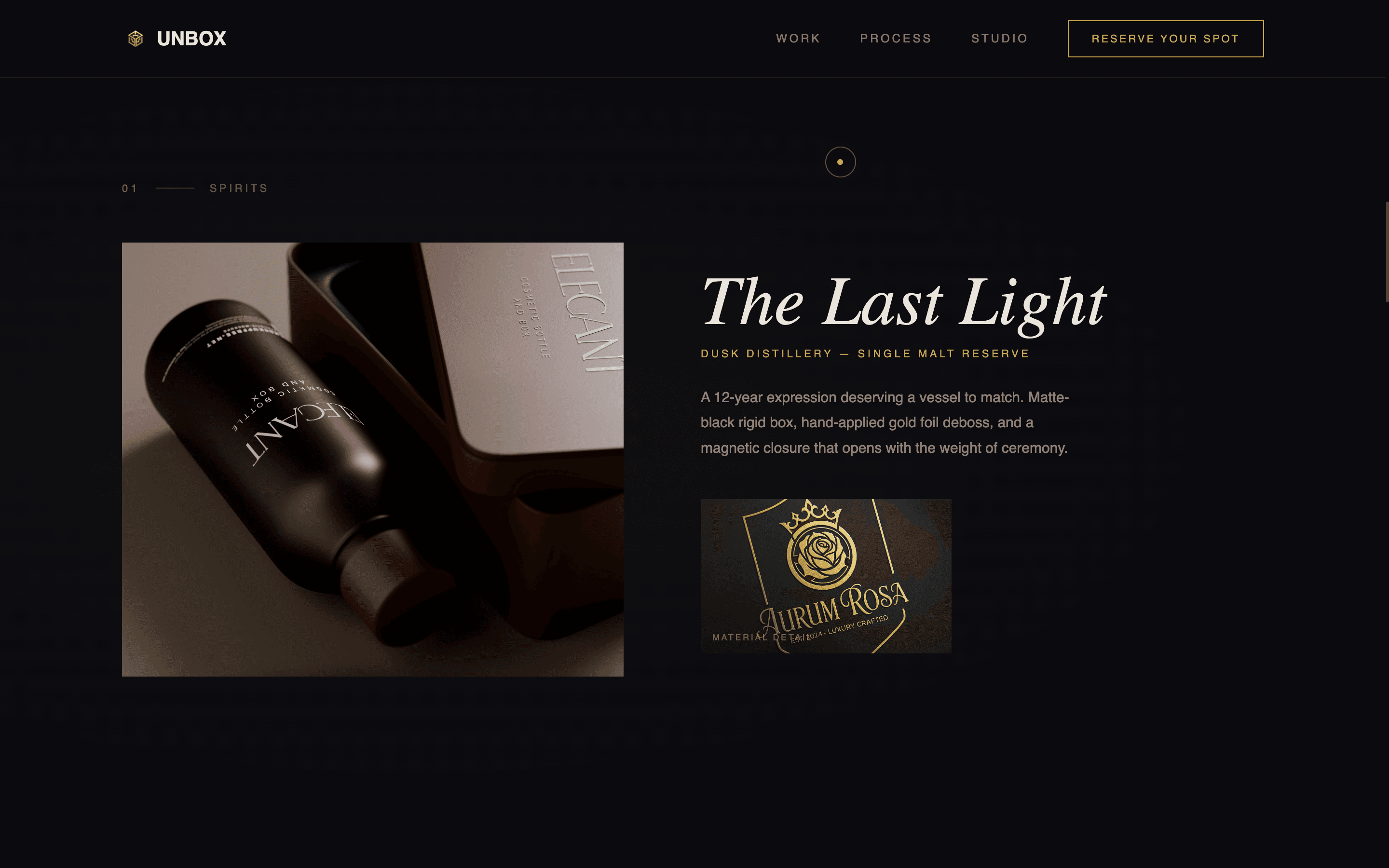
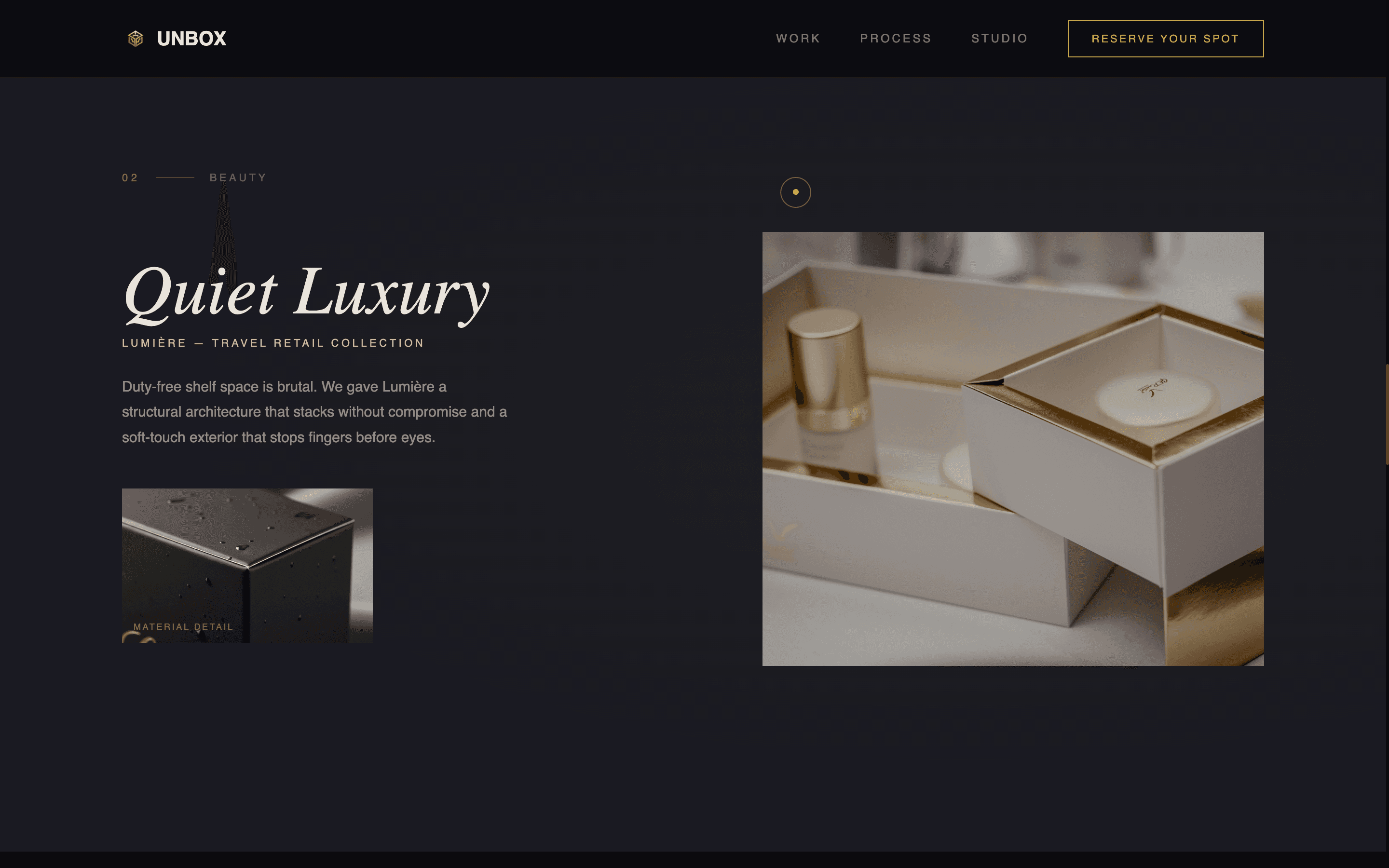
- Full-viewport gallery walk where each featured project occupies its own visual room, with packaging floats, shelf context, unboxing sequences, and macro material detail fading in at a deliberate pace
- Waitlist intake form with fields for name, brand name, product category dropdown, and launch timeline, plus a live counter showing remaining available spots
Feature list
This template ships with a focused set of layout and interaction features, each one serving the immersive positioning strategy described in the brief.
Scroll-Jacked Hero Rotation
The viewport locks on entry and presents a single luxury package rotating slowly in center frame. A tight spotlight casts a soft gold-edged shadow. The headline "We design what hands remember" fades in only after the full rotation completes, ensuring visitors experience the work before reading a word.
Gallery Walk Project Rooms
Each featured project fills the full viewport like a room in a gallery. Packaging floats against black, then context layers fade in: the shelf setting, the unboxing sequence, and material details at macro zoom. Negative space controls the pace and keeps attention focused on the object.
Interstitial Stat and Quote Cards
Between project rooms, a single full-bleed card appears in gold type on black. This gives the eye a deliberate rest and introduces a key statistic or client quote before the next project section opens.
Waitlist Intake Form with Spot Counter
The form section captures name, brand name, product category (beverage, beauty, food, spirits, other via dropdown), and launch timeline. A live counter below the form displays remaining spots, reinforcing scarcity and prompting timely action.
Gold-Accented Interactive Elements
The primary call-to-action button reads "Reserve Your Spot" in a gold-outlined style that fills solid gold on hover. Interactive edges and typographic accents throughout the page use molten gold, creating a consistent system of subtle, rewarding responses to user interaction.
Page sections overview
| Section | Purpose |
|---|---|
| Scroll-Jacked Hero | Locks viewport, rotates luxury package, reveals headline after full orbit |
| Gallery Project Room | Displays featured packaging work in full-viewport immersive frames |
| Interstitial Quote Card | Breaks between projects with a gold-on-black stat or client quote |
| Waitlist Intake Form | Captures lead details with dropdown category and launch timeline fields |
| Live Spot Counter | Shows remaining intake spots to reinforce limited availability |
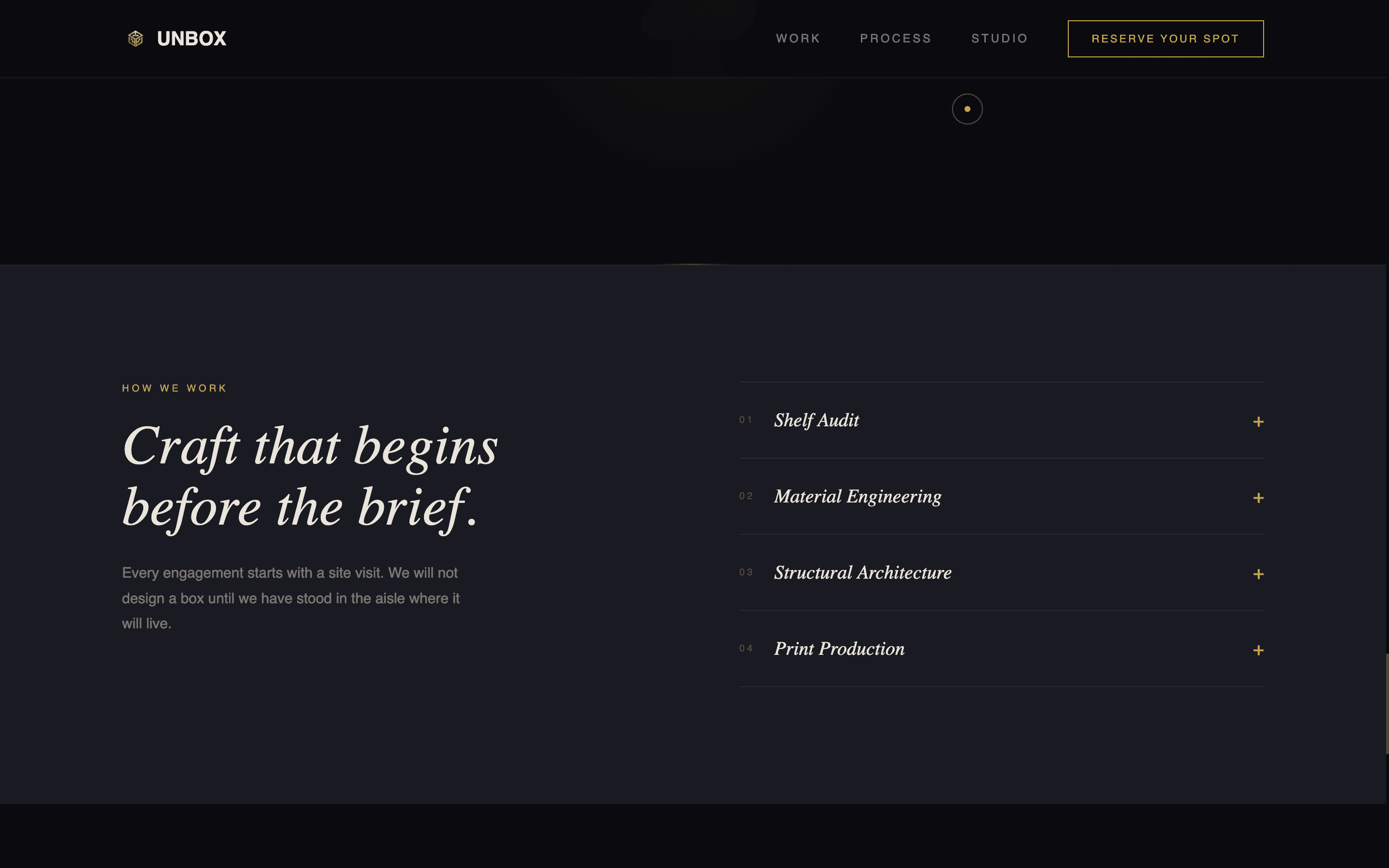
Design & branding system
The visual identity is built on an Obsidian and Gold color system that channels the feeling of opening a matte-black rigid box to find gold tissue paper inside. Every color and spacing decision communicates restrained opulence rather than loud luxury.
- Deep obsidian black (#0B0B0F) as the primary background, warm gallery charcoal (#1A1A22) for layered depth, molten gold (#C9A84C) reserved for hover states and typographic accents, and relief white (#E8E4DC) for body text that reads softly against dark surfaces
- Typography is whisper-weight on the hero, shifting to confident and legible in form and detail sections, maintaining the gallery atmosphere throughout
- Negative space is used intentionally and generously across all sections, letting packaging imagery breathe and reinforcing the sense that each piece of work is rare and considered
Mobile & speed optimization
The template is designed with a mobile-first layout structure so the immersive experience translates across screen sizes. Scroll-jacked behavior and gallery pacing are adapted for touch-based navigation without losing the cinematic quality.
- Full-viewport sections reflow cleanly on smaller screens, maintaining the single-object focus that defines the gallery walk experience
- The form section is kept minimal by design, with a clean field layout and dropdown that works intuitively on both desktop and mobile devices
How this template helps you convert
Every layout decision in Unbox is sequenced to build desire before asking for commitment. The page earns the signup by the time the visitor reaches the form.
- The scroll-jacked hero forces a slow, attentive first experience. Visitors hold the work in imagination before any headline or pitch appears, creating genuine emotional engagement rather than passive scanning.
- The gallery walk sustains that engagement across multiple projects, with interstitial quotes and stats providing credibility signals at natural pause points, so trust is built progressively rather than all at once.
- The waitlist form and live spot counter close the loop with clear scarcity. By the time a visitor reaches the form, they have experienced the craft, absorbed the social proof, and feel the limited availability as genuinely meaningful.
Other information about this template
This template is categorized under Portfolio and Agency, within the Branding and Design Agency subcategory, with a specific focus on the packaging design agency niche. It is built as a full-width immersive layout in the Dark Immersive theme, following the Gallery Walk creative direction and Scroll-Jacked Experience header concept. The page direction is Waitlist and Coming Soon, making it particularly well suited for studios opening a new quarterly intake cycle.
- The template style is Full-Width Immersive, meaning layout sections span the entire browser width with no constrained content columns interrupting the visual flow
- The obsidian and gold color system is implemented consistently across all interactive states, so brand identity stays coherent as users move through the page
- The product category dropdown includes five options out of the box: beverage, beauty, food, spirits, and other, covering the primary client verticals described in the brief

Theme
Dark Immersive
Creative direction
Gallery Walk
Color system
Obsidian & Gold
Style
Full-Width Immersive
Direction
Waitlist/Coming Soon
Page Sections
Scroll-jacked Hero with Headline Reveal
Full-viewport Gallery Walk
Interstitial Quote and Stat Cards
Waitlist Form with Category Dropdown
Live Spot Counter
Gold Interactive Accent System
Related questions
Who is this template designed for?
Can I adapt the gallery sections to show my own packaging projects?
What does the waitlist form collect?
Does this template work for a studio that is not yet accepting clients?
Can the scroll-jacked hero be adapted for different packaging visuals?