Track - Powerful Asset Tracking Landing Page Template
Track is a modular card grid landing page template built for asset tracking platforms. It features an interactive live-map header with animated asset dots, a staggered card layout showcasing key capabilities, and a click-through conversion flow. The dark Carbon Fiber visual system and cyan live-status accents give it the sharp, purposeful feel of a real operations dashboard.
by Rocket studio
Quick summary
Track is a single-page landing page template designed for asset tracking platforms. It opens with a fully animated dashboard preview, then walks visitors through asset categories, platform capabilities, and social proof, all in a modular card grid. The Carbon Fiber color system and high-voltage cyan accents make every active element feel live and precise.
Who this template is for
This template is built for teams selling or launching an asset tracking platform. It speaks directly to the people who feel the daily cost of not knowing where things are.
- Operations managers who currently track equipment across spreadsheets and want to show stakeholders a better way
- Fleet coordinators and field operations leads who need a page that communicates real-time location awareness instantly
- IT directors managing hardware registers across multiple sites or regions
What problem this template solves
Most asset tracking platforms have a convincing pitch but a forgettable landing page. Visitors read about features without ever feeling what the product does. Track solves that by letting visitors interact with the product before they click anything.
- Prospects arrive skeptical and leave without converting because static screenshots fail to demonstrate live tracking value
- Operations buyers need to see fleet scale, use-case breadth, and ease of use at a glance, not buried in a feature list
- The template removes friction by replacing a traditional form-gated demo with a click that routes to a guided demo environment
What you get with this template
Track delivers a complete, conversion-focused landing page structure with every major section pre-built and ready to customize. The layout is modular, so individual card rows can be reordered or swapped without rebuilding the full page.
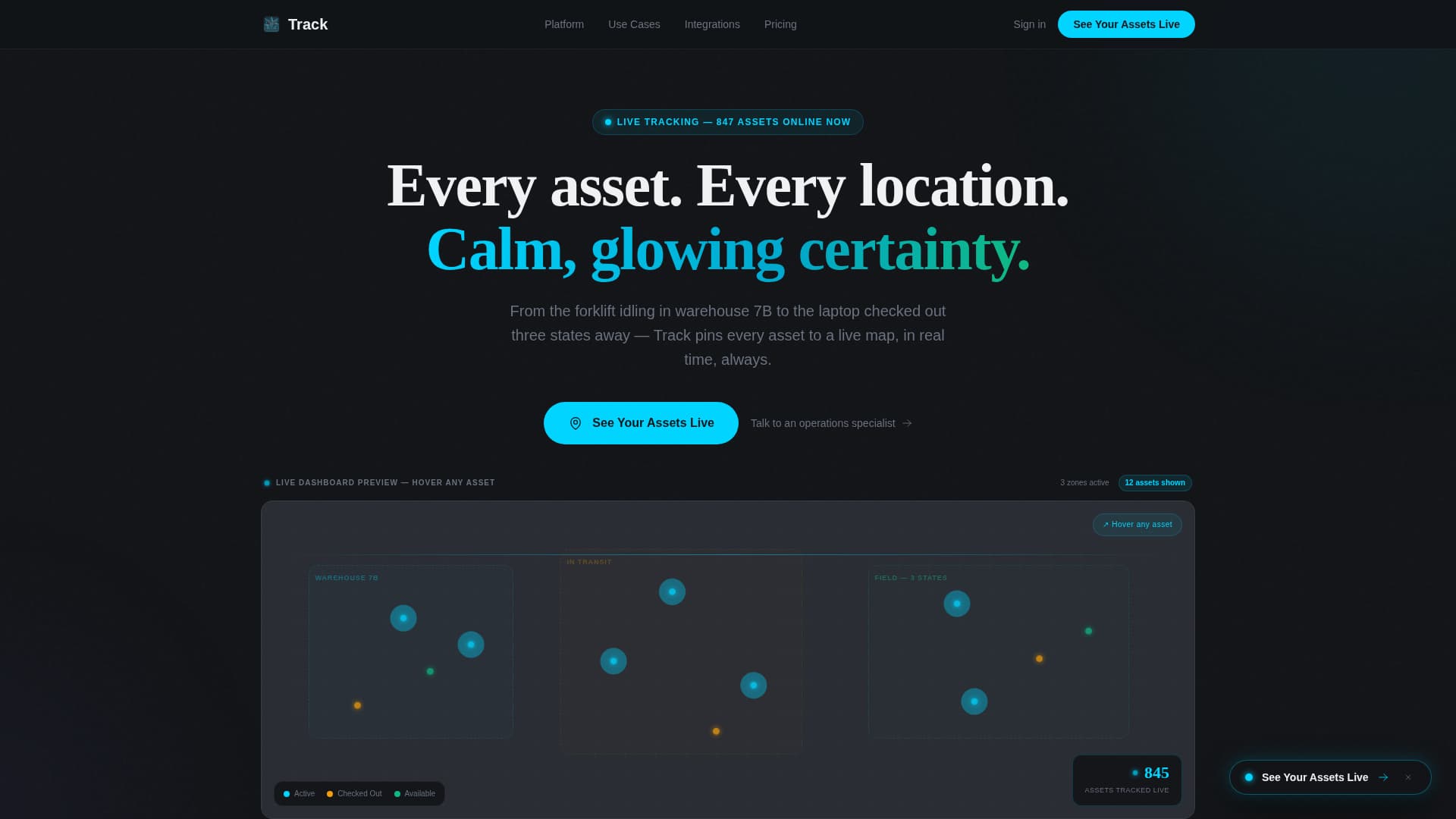
- An interactive header preview with twelve animated asset dots, live status badges, and a ticking asset counter
- Three staggered card rows covering asset categories, platform capabilities, and integration plus deployment proof
- A multi-placement call-to-action system with a floating button, anchored repeats, and a secondary specialist contact link
Feature list
This section details the core built-in components and interaction patterns included in the Track template.
Interactive Live-Map Header
The header renders a functioning miniature tracking dashboard directly in the viewport. Twelve animated asset dots move on looping paths across three zones: warehouse, in-transit, and field. Visitors can hover individual dots to reveal mock asset names, statuses, and last-pinged timestamps. A live counter in the corner tallies total assets tracked in real time.
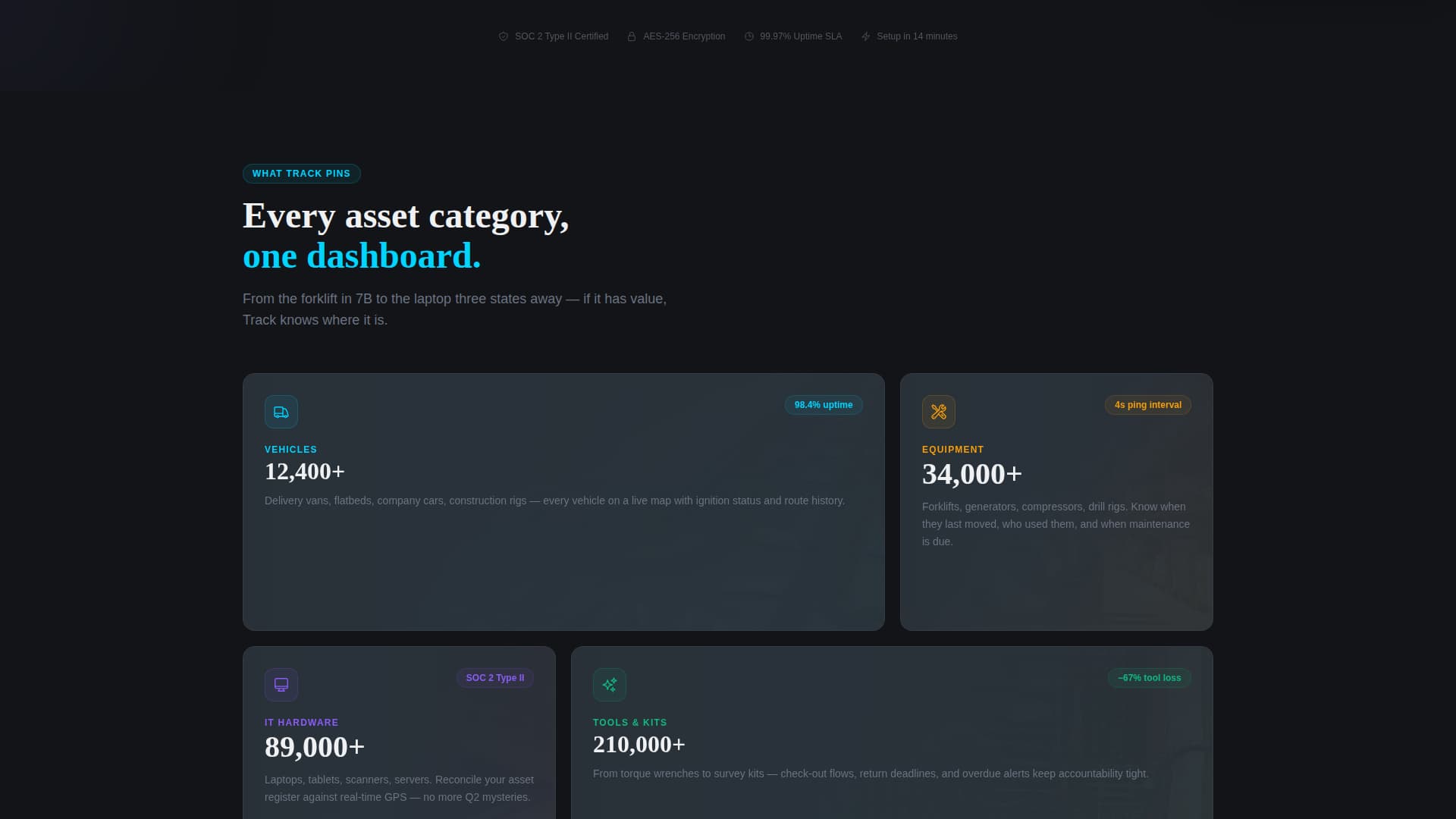
Staggered Card Grid Layout
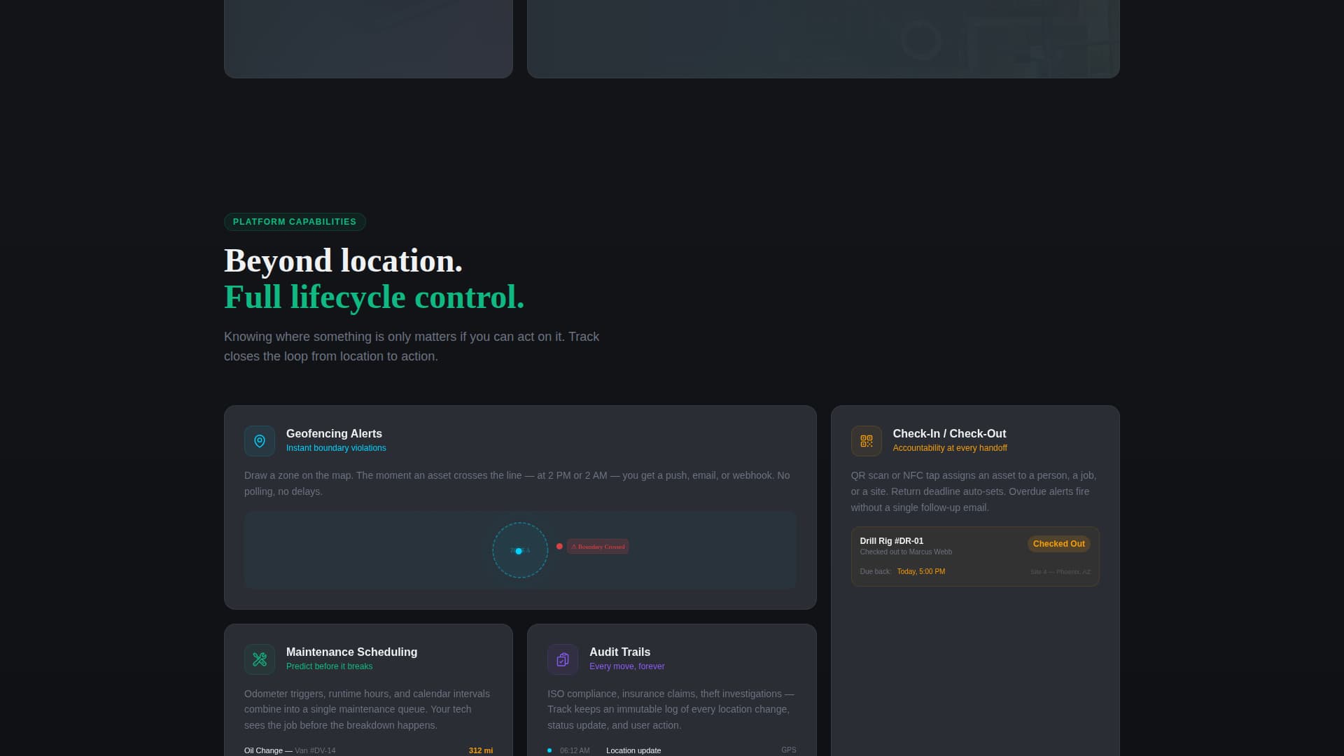
Below the header, card modules snap into view with staggered micro-animations as the visitor scrolls. The first row introduces asset categories such as vehicles, equipment, IT hardware, and tools. The second row reveals platform capabilities. The third row presents integration logos and deployment speed statistics. Each row builds momentum, with the cyan accent appearing more frequently as the page progresses.
Multi-Placement Call-to-Action System
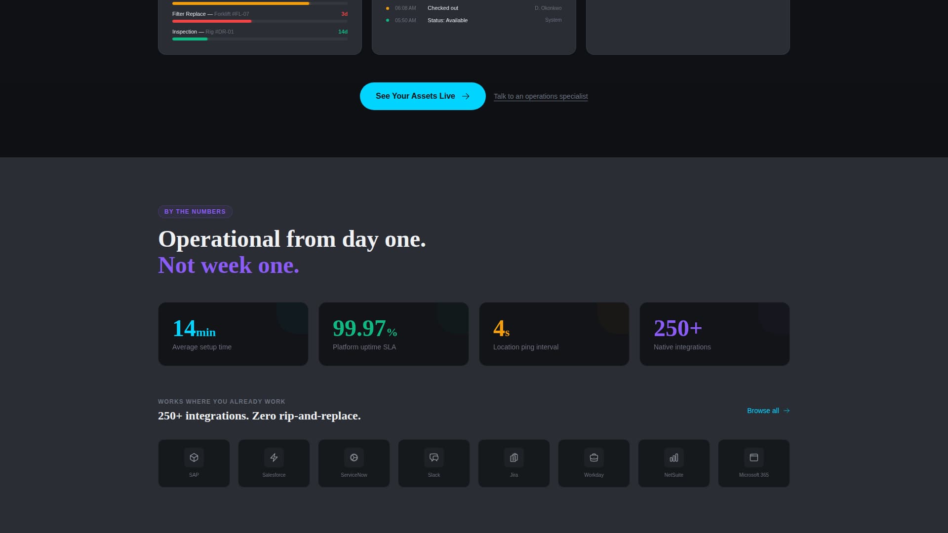
The primary call-to-action reads "See Your Assets Live" and appears in three deliberate positions. It first surfaces as a floating button after three seconds of header interaction. It then repeats anchored beneath the capability cards and once more inside a full-width closing band. A secondary text link, "Talk to an operations specialist," sits below each primary button for prospects already in a buying conversation.
Social Proof Fleet Bar
A full-width social proof bar anchors the lower section of the page. It displays fleet sizes managed by the platform, giving operations buyers an instant sense of scale and credibility. Numbers grow larger as the visitor nears this section, reinforcing the Launch Energy creative pacing.
Status Badge Animations
Asset status badges flip dynamically between "checked out" and "available" states throughout the header preview. The cyan accent color fires only on active states, hover pulses, and live-status indicators. This keeps the visual hierarchy clean while making real-time responsiveness feel tangible to every visitor.
Page sections overview
| Section | Purpose |
|---|---|
| Interactive Map Header | Demonstrate live asset tracking directly in the browser |
| Asset Category Cards | Introduce vehicles, equipment, IT hardware, and tools |
| Capability Feature Cards | Highlight geofencing, check-in/check-out, maintenance, audits |
| Integration & Speed Row | Show third-party logos and deployment speed proof points |
| Social Proof Bar | Display fleet sizes managed to establish platform scale |
| Primary call to action Band | Drive the final click to the guided demo environment |
Design & branding system
The Carbon Fiber color system gives Track a tactile, engineered darkness that feels built for serious operations environments. Every color decision serves a functional purpose: backgrounds recede, cards float, and the cyan accent fires only when something is actively alive.
- Core palette: deep carbon black (#121417) for backgrounds, woven graphite (#2A2D34) for card surfaces, titanium mid-tone (#6B7280) for borders and secondary text, signal white (#F0F1F3) for body copy, and high-voltage cyan (#00D4FF) for active states and live indicators
- Card elevation is achieved through subtle shadow layering against the graphite surface, keeping depth without heavy visual noise
- The Directory and Discovery theme organizes information in scannable grid blocks, so visitors can locate any capability at a glance
Mobile & speed optimization
Track is built with a modular card grid structure that adapts naturally to smaller viewports. The staggered animation system and interactive header are designed to remain legible and engaging on mobile screens without overwhelming the layout.
- Card rows reflow into single-column stacks on narrow screens, preserving the category-to-capability narrative order
- Animated asset dots and status badge flips are contained within the header viewport block, so they do not interfere with scroll performance on touch devices
- The floating call-to-action button appears after three seconds of interaction, keeping the conversion prompt visible without blocking content on smaller screens
How this template helps you convert
Track is designed around a single conversion insight: let the visitor use the product before asking them to click. Every structural decision on the page moves toward that moment.
- The interactive header preview gives visitors immediate, hands-on proof of the platform's live tracking capability, building trust before any copy is read
- The staggered card sequence paces the reveal of asset categories and capabilities like a system powering on, so engagement builds naturally toward the call-to-action rather than dropping off mid-scroll
- The no-form click flow routes visitors directly to a guided demo environment where they input their industry and fleet size, removing the commitment anxiety that a traditional lead form creates
Other information about this template
Track belongs to the IoT and Hardware subcategory within the broader Technology template category. It is purpose-built for the asset tracking niche and is well suited to platforms covering equipment tracking, vehicle fleet management, tool check-out systems, and IT hardware registers.
- The template style is Card Grid (Modular), making individual rows easy to reorder, replace, or expand as the platform's feature set grows
- The header concept is classified as an Interactive Preview, a pattern that replaces static hero screenshots with a live, in-browser demonstration
- The creative direction follows a Launch Energy pacing model, where visual intensity and cyan accent frequency increase as the visitor scrolls toward the conversion point
- The landing page direction is Click-Through, meaning there is no form on the page; the single conversion action is a click to the demo environment
Theme
Directory & Discovery
Creative direction
Launch Energy
Color system
Carbon Fiber
Style
Card Grid (Modular)
Direction
Click-Through
Page Sections
Interactive Live-map Header Preview
Staggered Card Grid with Micro-animations
Multi-placement Click-through Call to Action System
Live Status Badge Animations
Full-width Social Proof Fleet Bar
Carbon Fiber Visual Design System
Related questions
Does this template include a real working map or tracking system?
Can I change the asset categories shown in the card rows?
Is there a lead capture form included in this template?
Can the Carbon Fiber color system be swapped for a different brand palette?
Who handles the secondary specialist contact link?