Swipe - Dynamic Hospitality Landing Page Template
Swipe is a scroll-reveal landing page template built for hospitality point-of-sale software. It targets independent restaurant owners, boutique hotel managers, and multi-unit operators. Dark Glass Panel headers, a Feature Matrix scroll reveal, and a signal-green call-to-action work together to showcase a POS system's speed and clarity before a visitor ever fills out a form.
by Rocket studio
Quick summary
Swipe is a single-page, scroll-reveal template designed to market a hospitality point-of-sale system. It opens with three floating user interface panels showing live floor, ticket, and revenue data. Each downward scroll unlocks a new capability cluster, moving visitors from front-of-house to back-of-house to the owner's dashboard. The page drives clicks toward a free interactive demo, not a lead form.
Who this template is for
This template is built for teams selling or pitching hospitality software to venue operators who make fast, high-stakes decisions. It speaks the language of the floor, not the boardroom.
- Independent restaurant owners managing busy dining rooms and bar queues
- Boutique hotel general managers handling room charges and poolside tabs
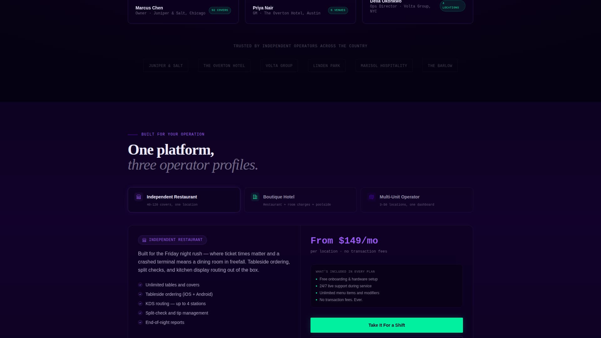
- Multi-unit operators who need live cover counts across several locations
What problem this template solves
Most software landing pages lead with a feature list and end with a form. Hospitality buyers do not have time for that. They need to see the tool working before they trust it.
- Generic SaaS pages fail to reflect the urgency of a live dinner service
- Feature lists buried in walls of text lose operators who think in covers and ticket times
- Form-gated demos create friction that kills confidence before a buyer even tries the product
What you get with this template
You get a complete, ready-to-customise scroll-reveal landing page that puts the product's own interface at the centre of every section. Nothing here is stock photography or abstract illustration.
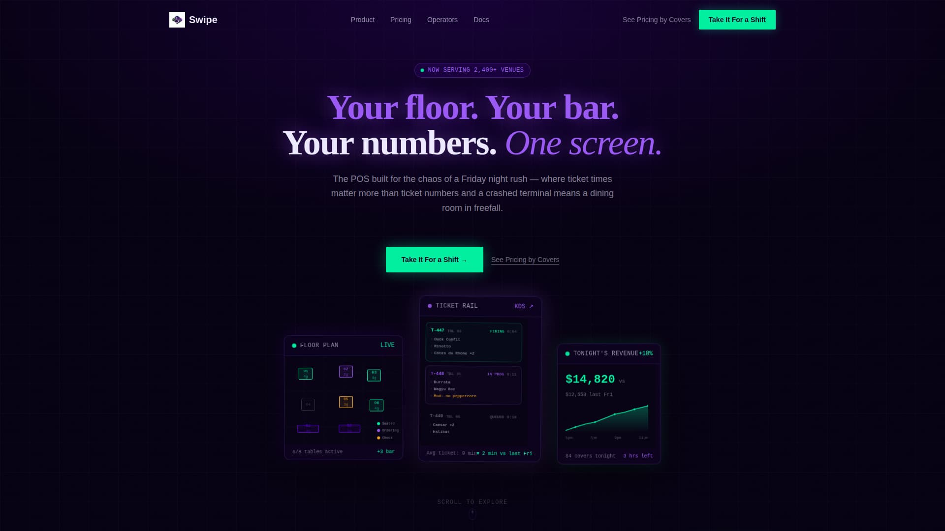
- A Dark Glass Panels header with three translucent user interface cards showing floor plan, ticket rail, and revenue graph
- Six capability cluster sections that expand on click to reveal the POS interface in context
- Two clear calls-to-action: a primary demo button and a secondary pricing link segmented by venue size
Feature list
This template ships with a focused set of design and layout capabilities derived directly from the brief.
Dark Glass Panels Header
Three frosted-glass user interface cards float against a pure black background. Each card shows a different live view: table statuses pulsing green and amber, a cascading ticket rail, and a climbing revenue graph during dinner service. Subtle parallax depth at slightly different z-indexes makes the panels feel three-dimensional without a single stock image.
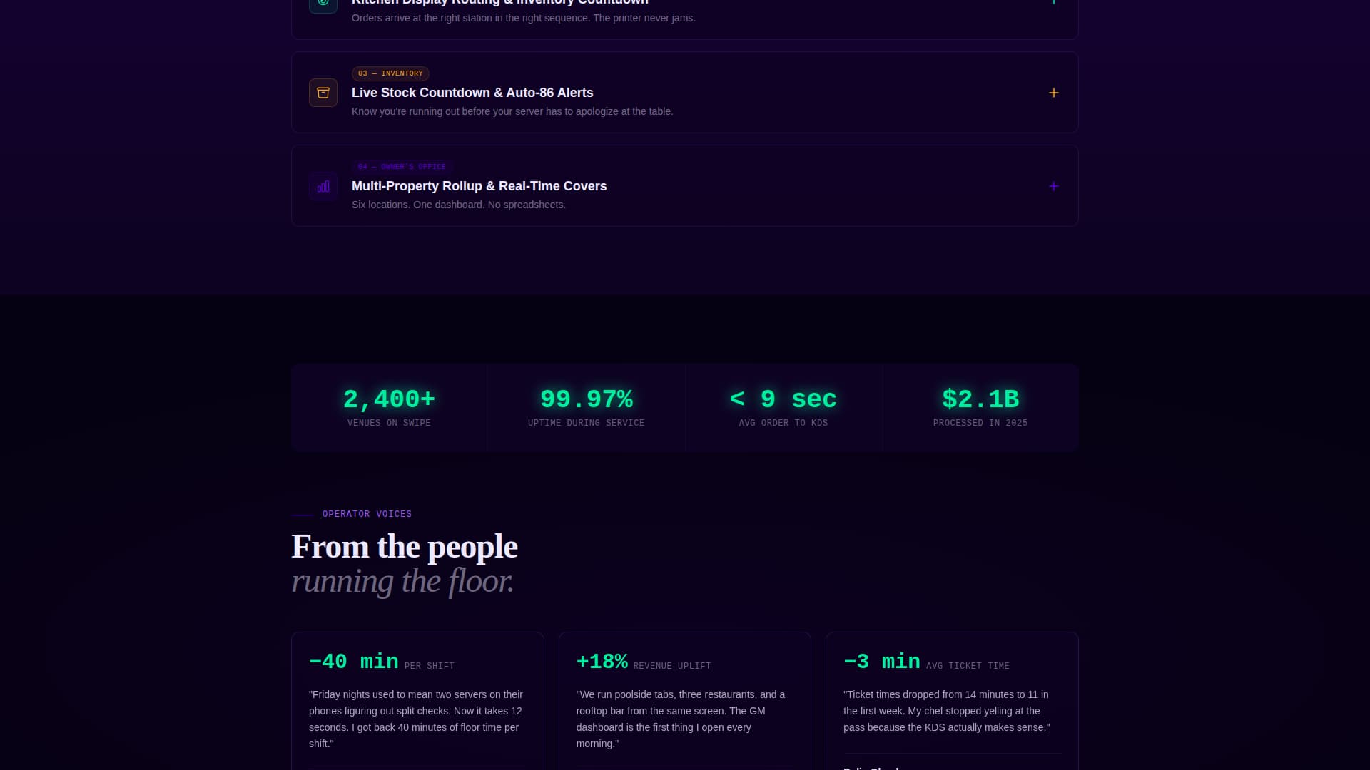
Scroll Reveal Capability Clusters
Every downward scroll unlocks a new section of the POS system. Clusters cover tableside ordering, split-check logic, kitchen display routing, inventory countdown, staff scheduling, and multi-property rollup. Each section loads with an upward wipe animation that reinforces the sense of orders arriving in sequence.
Expandable Interactive Panels
Each capability cluster is designed as an interactive panel. A visitor clicks to expand and sees the actual POS interface rendered in context, not a flat screenshot. This lets the product demonstrate itself before the visitor commits to a demo.
Fixed Viewport Call-to-Action
The primary call-to-action, labelled "Take It For a Shift," appears first beneath the header in signal green. After the second scroll reveal, it locks to the bottom of the viewport and stays visible throughout the rest of the page. A secondary text link routes to a pricing page segmented by venue size.
Operational Hierarchy Layout
The page is structured to mirror a real venue's chain of command. Sections move from front-of-house to back-of-house to the owner's office view, giving the scroll flow a narrative logic that hospitality operators will immediately recognise.
Electric Indigo Color System
Deep terminal black dominates the canvas. Charged indigo and phosphor violet layer behind sections as ambient washes. Signal green appears only on live-status indicators and confirmed success states, making every green element feel earned and meaningful.
Page sections overview
| Section | Purpose |
|---|---|
| Dark Glass Header | Introduce the product through three live user interface panels |
| Primary call to action Block | Drive visitors to the free interactive demo |
| Tableside Ordering Cluster | Reveal front-of-house ordering capability |
| Kitchen Display Cluster | Show back-of-house ticket routing in context |
| Inventory and Scheduling Cluster | Cover stock countdown and staff management |
| Multi-Property Dashboard | Present the owner-level rollup view |
| Fixed Bottom call to action | Keep the demo action visible at all times |
| Secondary Pricing Link | Route interested visitors to venue-sized pricing |
Design & branding system
The visual identity follows a Startup Velocity theme built on the Electric Indigo color system. Every design decision reinforces urgency, clarity, and operational precision.
- Core palette: deep terminal black (#0D0221), charged indigo (#5C00D2), phosphor violet (#9B59F5), interface white (#EDEAFF), and signal green (#00F0A0)
- Signal green is reserved strictly for live-status indicators and success states, so it never loses its meaning
- The overall aesthetic is described in the brief as a backlit cocktail bar at midnight: dark surfaces that make every glowing element feel intentional and alive
Mobile & speed optimization
The scroll-reveal structure and viewport-fixed call-to-action are designed to work across screen sizes. The template's layout logic keeps the most important action visible regardless of device.
- The fixed bottom call-to-action remains accessible on smaller screens so the demo path is never buried
- Section-by-section reveal prevents the page from overwhelming a visitor on a first load
- Dark-surface design naturally reduces visual noise on mobile displays, keeping focus on the user interface panels
How this template helps you convert
The page earns the click by showing the product working before it asks for anything. This approach removes the main barrier between a sceptical operator and a confident demo request.
- The three-panel header lets a visitor immediately see a floor plan, a live ticket rail, and a revenue graph, establishing product credibility in the first viewport
- The expandable capability clusters show the actual interface in context, so by the time the visitor reaches the fixed call-to-action they already understand the tool's value
Other information about this template
This template is part of the Swipe series and sits within the Technology category under the Hospitality Software and Software-as-a-Service subcategory. It was matched and built for the Hospitality POS System niche with an intersection match score of 13.
- The template style is Scroll Reveal (Progressive), meaning content is delivered in deliberate, sequenced stages rather than all at once
- The landing-page direction is Click-Through, prioritising demo engagement over lead-form capture
- The header concept, Dark Glass Panels, is a named design pattern within the Startup Velocity theme family
- The creative direction is Feature Matrix, which organises capabilities into expandable, contextual clusters rather than a flat feature list

Theme
Startup Velocity
Creative direction
Feature Matrix
Color system
Electric Indigo
Style
Scroll Reveal (Progressive)
Direction
Click-Through
Page Sections
Dark Glass Panels Header
Scroll Reveal Capability Clusters
Expandable Interactive Panels
Fixed Viewport Call-to-action
Operational Hierarchy Layout
Electric Indigo Color System
Related questions
Who is this landing page template designed for?
Does the template use stock photography or hero images?
What is the primary call-to-action on this page?
Can I customise the capability cluster sections?
Why does the page use a scroll-reveal structure instead of showing everything at once?