Stable - Thriving Equestrian Landing Page Template
Stable is a modular card-grid landing page built for racing stables that want to turn curious visitors into booked stable tour guests or syndicate briefing attendees. A twelve-tile photo mosaic header, flip-card horse roster, gold-highlighted results table, and an inline booking form work together inside a warm Botanical colour system that feels like a community, not a sales page.
by Rocket studio
Quick summary
Stable is a single-page, booking-focused landing page template designed for racing stables. It combines a staggered photo mosaic header, a modular flip-card horse roster, and a structured booking section to convert syndicate prospects, first-time share buyers, and breeders into confirmed visitors or Zoom briefing registrants. The tone is warm, earthy, and community-led throughout.
Who this template is for
This template is built for the people who run racing stables and need their online presence to feel as genuine as a conversation over the rail. It speaks to every corner of the stable community with confidence and warmth.
- Racing stable owners and trainers who want to attract syndicate investors and first-time horse share buyers
- Breeders looking to place yearlings with a credible, community-focused training operation
- Stable managers who need a professional booking page without a complex build
What problem this template solves
Most racing stable pages look like they were built in a hurry. They list horses, show a phone number, and ask nothing of the visitor. The result is a page that earns no trust and books no visits. This template solves that directly.
- It replaces a flat, static page with a layered, story-driven experience that rewards visitors who take their time
- It removes the friction between interest and action by pairing a sticky booking bar with a clear, minimal booking form
- It gives breeders and syndicate prospects the credibility signals they need before they commit to a visit or a share
What you get with this template
You get a fully structured, single-page layout with every section already mapped and designed. There is no guesswork about what to build or in what order. Each component is built for a racing stable audience specifically.
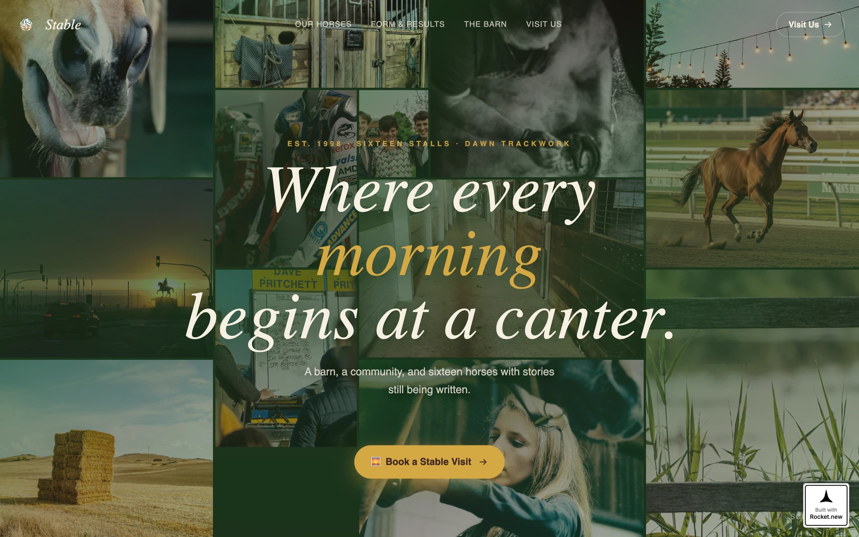
- A twelve-tile photo mosaic header with a floating "Book a Stable Visit" call-to-action pill and a staggered fade assembly animation
- A flip-card stable roster where each horse card flips to reveal a hand-written style trainer's note on the reverse
- A booking section with an inline calendar, group size selector, a free-text field, and a secondary path to a Zoom syndicate briefing
Feature list
This template is built around purposeful interactions. Every feature below comes directly from the design brief and serves a real visitor need.
Twelve-Tile Photo Mosaic Header
Twelve irregularly sized image tiles fill the viewport on load. Each tile arrives with a staggered fade animation, assembling the scene like a memory surfacing. The layout shows many stories at once: horses in motion, stable hands at work, syndicate members together in the mounting yard.
Flip-Card Horse Roster
Each horse in the stable roster sits on a modular card. Hovering flips the card with a three-dimensional turn to reveal a hand-written trainer's note on the reverse. The interaction rewards curiosity and builds personality around every horse in the string.
Gold-Highlighted Results Table
The race results table quietly marks personal bests in sun-dried hay gold without a label or explanation. Returning visitors notice it over time. New visitors discover it as they explore. The effect makes the page feel like it has depth beyond the first scroll.
Animated Facilities Section
The facilities are presented in an asymmetric bento grid layout. A small animated horse gallops across the gutter between cards as visitors scroll past the section. The detail is understated and adds life without interrupting the reading flow.
Inline Booking Form with Sticky Bar
The primary "Book a Stable Visit" call-to-action appears first as a floating pill inside the header mosaic, then locks into a sticky bar after the second scroll fold. The booking form includes an inline calendar for preferred visit date, a group size selector covering single, couple, and syndicate options, and a single open-text field for the visitor to describe what they are looking for.
Zoom Syndicate Briefing Path
Visitors who are not ready to drive out to the stable can register for a scheduled Zoom evening briefing instead. This secondary conversion path lowers the commitment barrier and keeps warm prospects engaged without losing them entirely.
Page sections overview
| Section | Purpose |
|---|---|
| Photo Mosaic Header | Introduces the stable through twelve image tiles and surfaces the primary booking call-to-action |
| Stable Roster Grid | Shows each horse with a flip interaction that reveals the trainer's personal note |
| Results and Form | Displays race results with quietly gold-highlighted personal bests for discovery |
| Facilities Bento Grid | Presents stable facilities in an asymmetric layout with an animated galloping horse detail |
| Booking Section | Hosts the inline calendar, group size selector, free-text field, and Zoom briefing link |
| Page Footer | Splits logo and tagline on the left with navigation links and social icons on the right |
Design & branding system
The visual identity follows a Community Hearth theme using a Botanical colour system. The palette draws from the natural world of a training track at first light, earthy and unhurried, with every colour doing a specific job.
- Deep paddock green (#2D5F2B) anchors headers and card borders; sun-dried hay (#D4A843) warms call-to-action buttons and hover states; rich loam brown (#3E2723) grounds body typography; hedgerow cream (#F5F0E1) sits as the dominant background so horse photography can breathe
- Typography pairs Fraunces, a warm serif used for display headings, with DM Sans for clean, readable body copy
- The overall feeling is warm amber tack-room light: lived-in, trustworthy, and belonging to a community rather than a brand
Mobile & speed optimization
The template is designed desktop-first to match the older, desktop-heavy audience of syndicate investors and stable visit bookers. Mobile layouts are included and structured for solid performance across devices.
- Images are lazy-loaded across all sections, including the twelve-tile mosaic header, to keep initial load times manageable
- Animations use GPU-accelerated CSS transforms only, keeping scroll reveals and card flips smooth without taxing lower-powered devices
- The sticky booking bar adapts to smaller screens so the primary call-to-action remains reachable at every scroll depth on both desktop and mobile
How this template helps you convert
Every design and layout decision in this template points toward a single outcome: getting the right visitor to book a visit or register for a briefing. The approach is community-first, pressure-free, and deliberate.
- The page shows real community signals first, faces in the mosaic, trainer notes on every horse card, and a results table with quiet gold highlights, so visitors feel they are joining a table rather than entering a sales funnel before they ever see the booking form.
- The dual conversion path removes a common drop-off point. Visitors ready to commit book a stable visit directly. Visitors who need more time register for the Zoom syndicate briefing instead. Both paths are present throughout the scroll without competing.
Other information about this template
This template is a strong fit for boutique racing operations that rely on personal relationships and word-of-mouth referrals. It is built to serve that relationship-led culture digitally.
- The localization setup in the brief specifies Australian English, AUD currency formatting, and DD/MM/YYYY date display, making it immediately suitable for Australian racing stables without additional adjustments
- The footer follows a split layout with the stable logo and tagline on the left and navigation links with social icons on the right, giving the page a clean, professional close
- The Surprise and Delight creative direction means the page rewards multiple visits: the gold highlights in the results table and the trainer notes on the flip cards are details that deepen familiarity over time


Theme
Community Hearth
Creative direction
Surprise & Delight
Color system
Botanical
Style
Card Grid (Modular)
Direction
Booking/Scheduling
Page Sections
Twelve-tile Photo Mosaic Header
Flip-card Horse Roster
Gold-highlighted Results Table
Inline Booking Form
Zoom Syndicate Briefing Path
Animated Facilities Bento Grid
Related questions
Who is this landing page template designed for?
Can I change the horse cards and trainer notes to match my own stable?
What does the booking section actually include?
Does this template work for breeders as well as syndicate buyers?
Is the animated galloping horse a video or a CSS animation?