No-Code Enterprise Software Pricing Website Template
Quoteflow is a no-code configure, price, quote (CPQ) landing page template built for revenue teams ready to ditch spreadsheet chaos. It combines a dashboard-style data grid layout with animated counters, a live interactive demo panel, and a progressive lead-capture form, all wrapped in a bold dark-neon visual system designed to move RevOps buyers from skeptical to signed up.
by Rocket studio
Quick summary
Quoteflow is a single-page, dashboard-style landing page template for no-code CPQ platforms. It leads with a high-fidelity product screenshot, punches with animated impact stats, and builds trust through a rhythmic stat-proof-interaction flow. The design is built to convert RevOps directors, sales leaders, and CFOs who need to see the product work before they commit.
Who this template is for
This template is built for revenue technology companies, no-code platform founders, and go-to-market teams selling complex quoting or pricing automation software. If your buyers live in spreadsheets and approval backlogs, this page speaks their language.
- Revenue Operations (RevOps) directors managing spreadsheet-based pricing models
- Sales leaders whose deals stall waiting for multi-step quote approvals
- CFOs evaluating CPQ tools and trying to avoid six-figure consulting engagements
What problem this template solves
Most CPQ software landing pages hide the product behind generic headlines and vague benefit copy. Buyers arrive unsure whether the tool can actually handle their pricing complexity. This template solves that trust gap by leading with dense, real user interface detail and undeniable performance numbers before a single word of marketing copy appears.
- Deals stall when buyers cannot visualize how pricing rules and approvals connect
- Visitors leave before converting when a page relies on copy alone and buries the product
- Long-form consulting-style CPQ implementations drain confidence in any new tool
What you get with this template
You get a complete, ready-to-customize landing page that puts your product's power on display from the first scroll. Every section is structured to build evidence progressively so each new visitor section feels earned.
- A header featuring an angled product screenshot inside browser chrome with a headline in oversized monospace type
- A horizontal stats data grid with animated scroll-triggered counters showing deal velocity, quote speed, and implementation cost
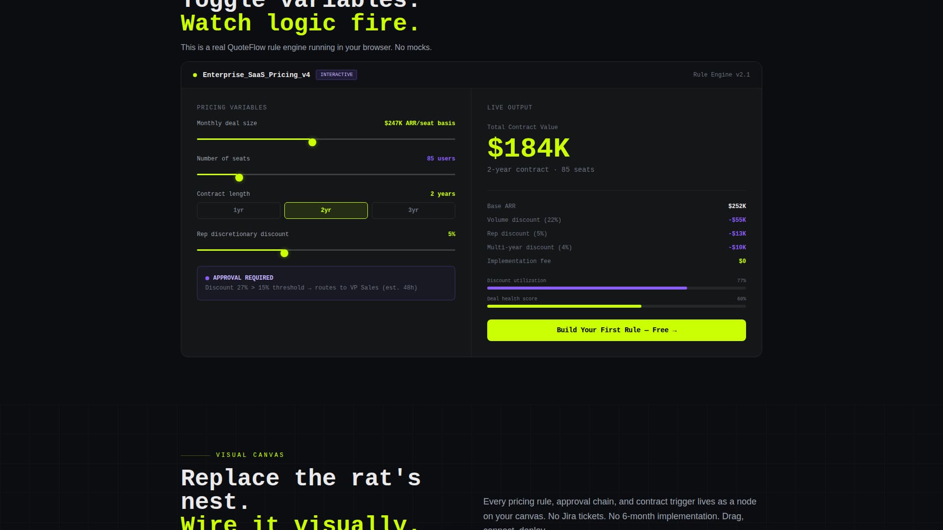
- A mid-page interactive demo panel where visitors can toggle pricing variables and watch output recalculate live
- A progressive lead-generation form collecting work email, company size, and current pricing tool in three focused steps
- A secondary email-gated video walkthrough path for visitors who want proof before committing
Feature list
This section covers the core template components delivered in the Quoteflow layout.
Animated Stats Data Grid
A horizontal grid directly below the hero displays three outsized metrics with scroll-triggered animated counters. Numbers tick up on viewport entry. Context labels appear after each counter so the impact lands before the explanation.
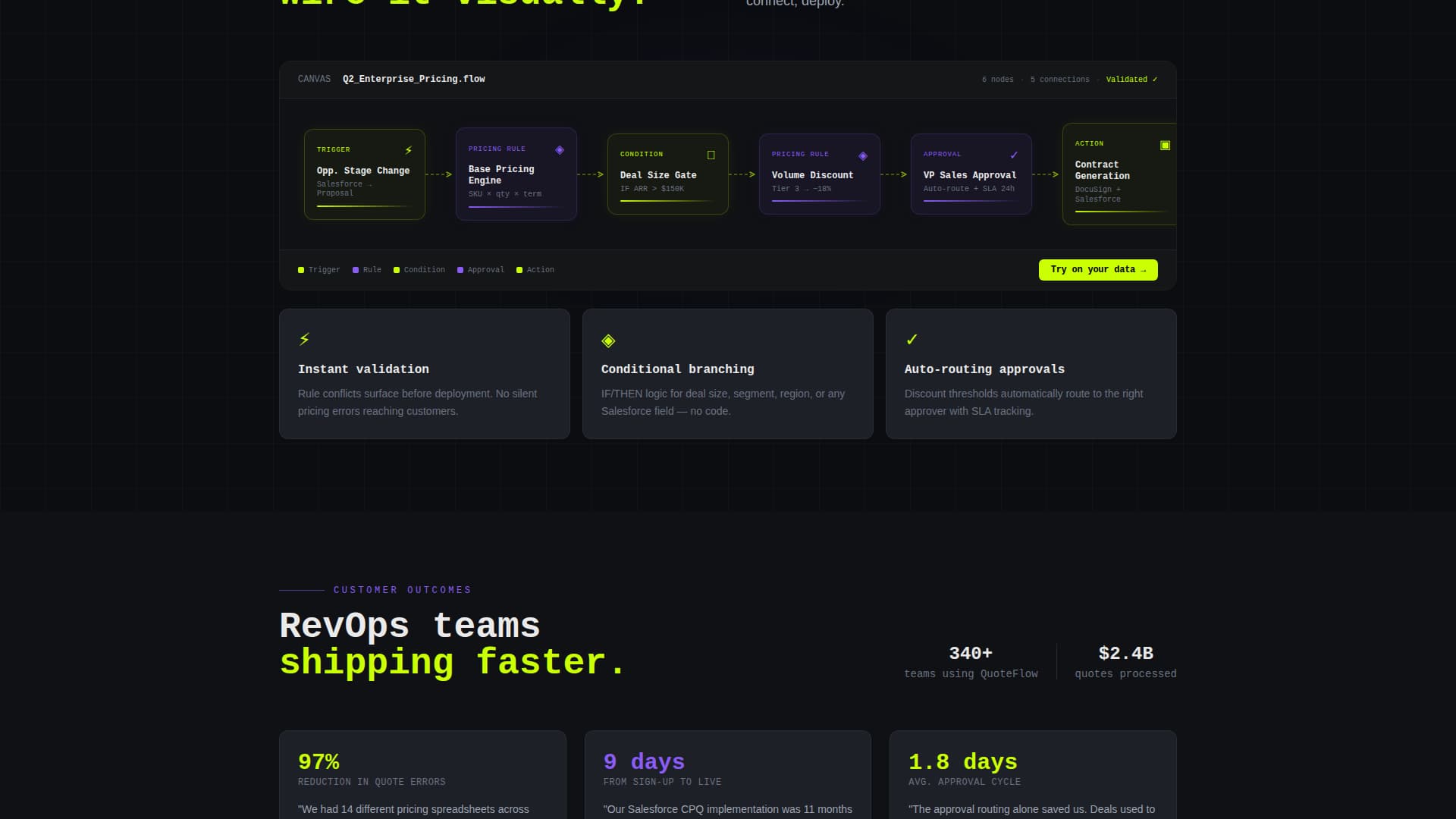
High-Fidelity Product Screenshot Header
The hero section features a detailed workflow builder screenshot inside a subtle browser chrome frame, tilted two degrees with a soft chartreuse glow behind it. The image shows a multi-step pricing rule with conditional branches, an approval node, and a live output panel, giving technical buyers instant recognition.
Live Interactive Demo Panel
A mid-page panel lets visitors toggle pricing variables directly on the page and watch a quoted output recalculate in real time. This turns passive reading into active product discovery without requiring a separate demo environment.
Progressive Lead Capture Form
The primary conversion form collects intent in three lightweight steps: work email, company size range, and current pricing tool. This reduces form friction while surfacing lead qualification signals for the sales team.
Gated Video Walkthrough Path
A secondary conversion option offers a two-minute embedded video walkthrough locked behind a single email field. It serves visitors who are not ready for the full form but want a concrete product preview first.
Rhythmic Section Architecture
Every major section follows a stat-proof-interaction pattern. Each block opens with one outsized metric, followed by a feature explanation, then an interactive or visual proof element. This structure builds an evidence wall that raises conversion intent as the visitor scrolls deeper.
Page sections overview
| Section | Purpose |
|---|---|
| Hero header | Display product screenshot with headline and primary call to action |
| Stats data grid | Hit visitors with animated impact metrics immediately below fold |
| Pricing rule feature | Explain visual workflow builder with animated node diagram |
| Interactive demo panel | Let visitors manipulate pricing variables and see live output |
| Approval chain feature | Show how approval flows connect without engineering work |
| Secondary video call to action | Offer gated two-minute walkthrough for mid-funnel visitors |
| Discount guardrails feature | Demonstrate how discount rules are set visually |
| Contract generation feature | Cover the quote-to-cash output step with supporting stat |
| Primary lead form | Capture work email, company size, and current pricing tool |
| Footer | Close with repeated call to action and supporting trust elements |
Design & branding system
The visual identity follows a Dynamic Motion theme with an Acid Digital color system. Void black and interface gray form the background layer, keeping everything dark and recessed. Chartreuse and UV purple fire across that darkness like signals on a circuit board, directing attention to every interactive and data element.
- Core palette: void black (#0B0D11) and interface gray (#1E2028) for backgrounds, electric chartreuse (#CAFF04) for all interactive elements including buttons, hover states, counters, and progress bars
- UV purple (#8B5CF6) applied to secondary actions, graph fills, and status badges; off-white (#EAEAEA) used for all body and heading text
- Typography uses oversized monospace type for the hero headline; motion is constant but disciplined with scroll-triggered counters, node-by-node workflow animations, and live recalculation effects
Mobile & speed optimization
The dashboard-style layout is structured to render clearly on smaller screens without losing the data-dense feel that makes the design persuasive on desktop. Interactive elements adapt to touch input, and the progressive form reduces tap friction on mobile.
- Animated counters and the interactive demo panel are built to respond on scroll trigger across device sizes
- The three-step progressive form is compact enough to complete comfortably on a mobile screen without excessive scrolling
How this template helps you convert
The page is engineered as an evidence wall. Every scroll step gives the visitor one more reason to trust the product before the form ever appears. By the time the primary call to action is reached, the visitor has already seen the interface working.
- Animated stats hit immediately after the hero, establishing credibility with specific numbers before any feature copy appears.
- The live demo panel lets visitors interact with the product concept mid-page, turning passive intent into active engagement that dramatically shortens the mental gap between visiting and signing up.
- The two-path conversion structure captures both high-intent visitors through the full form and lower-intent visitors through the email-gated video, so fewer qualified visitors leave empty-handed.
Other information about this template
This template is categorized under Technology, specifically No-Code Enterprise Software, with a niche focus on no-code CPQ tooling. It is designed to support a quote-to-cash positioning narrative and pairs well with platforms whose buyers are evaluating whether to replace tools like Salesforce CPQ, homegrown pricing tools, or manual spreadsheet processes. The template style is Dashboard and Data Grid, and the creative direction is Stats-First Impact. The header concept is a Product Screenshot, and the landing page direction is Lead Generation. The Dynamic Motion theme and Acid Digital color system together produce a terminal-screen aesthetic that feels native to technical and revenue operations audiences.
- Template style: Dashboard and Data Grid with a Dynamic Motion animation theme
- Color system: Acid Digital using void black, electric chartreuse, UV purple, interface gray, and off-white
- Suitable for platforms positioning against tools like Salesforce CPQ, spreadsheet-based pricing, or homegrown quoting systems


Theme
Dynamic Motion
Creative direction
Stats-First Impact
Color system
Acid Digital
Style
Dashboard/Data Grid
Direction
Lead Generation
Page Sections
Animated Stats Data Grid
High-fidelity Product Screenshot Hero
Live Interactive Demo Panel
Progressive Lead Capture Form
Gated Video Walkthrough Path
Stat-proof-interaction Section Rhythm
Related questions
Who is the target audience for this landing page template?
Can I customize the stats shown in the animated data grid?
Does the interactive demo panel require coding to connect to real data?
How does the two-path conversion flow work?
Is this template suited for a free-trial or demo-request campaign?