Healthcare Software & SaaS Professional Website Template
Portal is a healthcare customer portal landing page template built for app download conversion. It uses a cinematic Tech Glass visual style, a Problem-to-Solution scroll arc, and a simulated patient week data grid to show exactly what the app does before asking for the download. Dual call-to-action buttons, a sticky download bar, and a three-field SMS quick-start form reduce friction for every type of user.
by Rocket studio
Quick summary
Portal is a single-page app download landing page template for a healthcare customer portal product. It opens with a floating phone mockup on a deep charcoal background, walks visitors through a Problem-to-Solution card arc, and closes with a low-friction SMS form. The design uses frosted glass panels, luminous teal accents, and a clean data grid to make the app feel real before anyone taps download.
Who this template is for
This template is built for healthcare software teams and patient engagement product managers who need to convert real patients into app users. It works especially well when the target audience spans multiple life stages and comfort levels with technology.
- Chronically busy parents managing pediatric appointment schedules and prescription refills
- Post-surgical patients tracking recovery milestones and recent lab results from home
- Elderly members and their adult children handling refill reminders and co-pay payments
What problem this template solves
Patients often deal with fragmented care experiences: multiple portals for different providers, long hold times for simple questions, and paper billing that arrives weeks after the fact. A landing page that simply lists features rarely earns a download from someone who is already frustrated. This template fixes that by making the app's value visible through the scroll itself.
- Long average hold times replaced by visible instant-chat solution cards on scroll
- Three separate provider portals replaced by one unified dashboard shown in the data grid
- Paper billing delays replaced by a real-time billing solution card revealed mid-scroll
What you get with this template
You get a fully structured, single-page layout designed around one goal: the app download. Every section is a live preview of what the app already does, so the call to action feels like unlocking something the visitor just watched work.
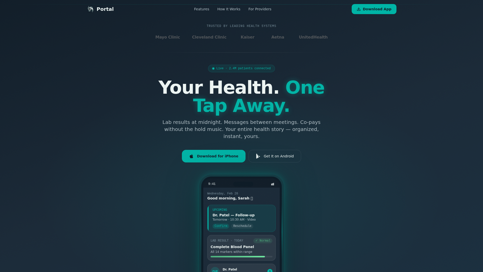
- A cinematic hero with a floating phone mockup showing a live-feeling dashboard, appointment card, lab result, and unread message badge
- A Problem-to-Solution card arc with scroll-triggered flips from gray pain cards to glowing teal solution cards
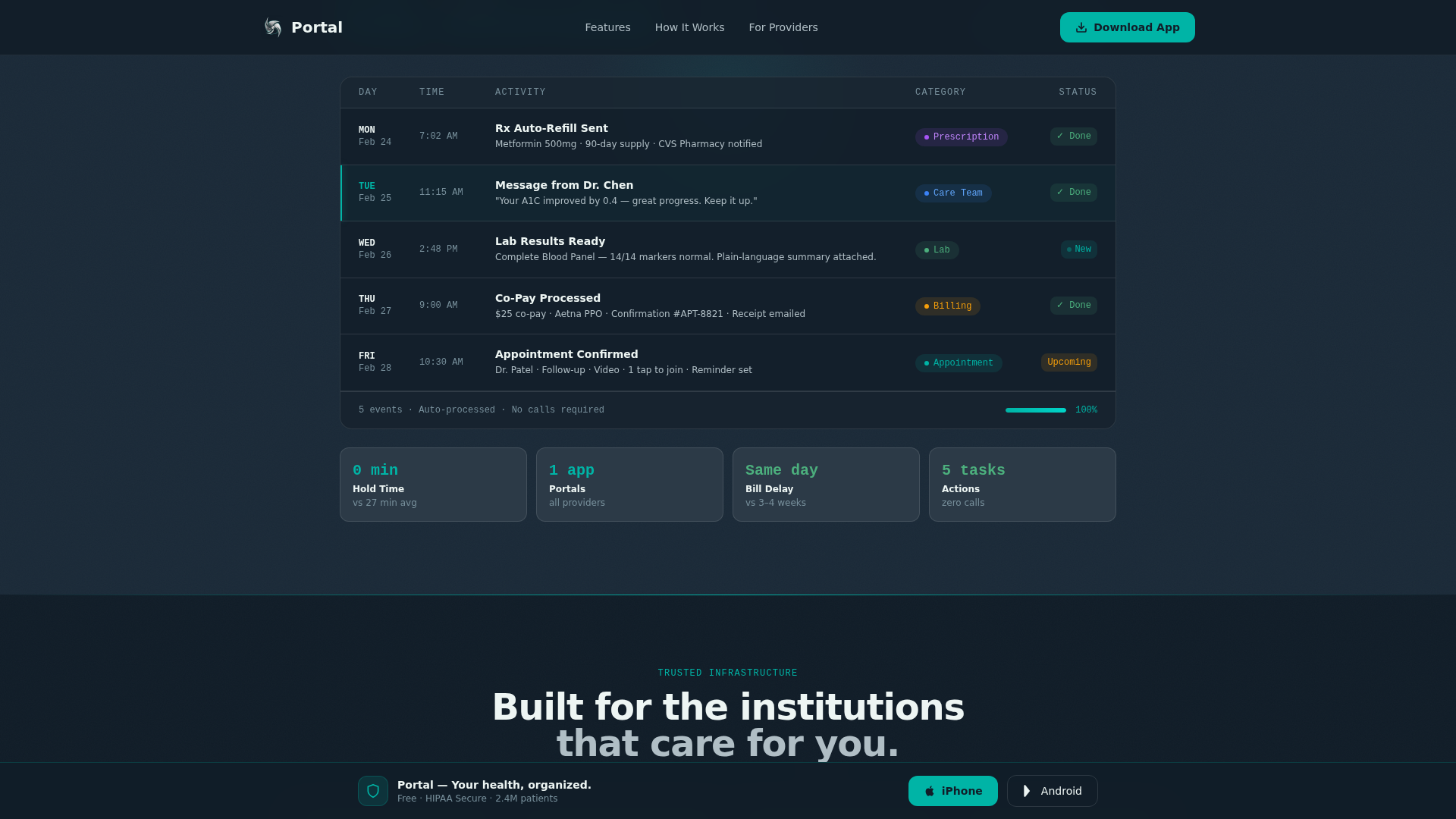
- An interactive patient week data grid, a three-field SMS quick-start form, a sticky download bar, and a trust logo bar
Feature list
This template is built around six purposeful components that work together to move a hesitant visitor toward a confident download.
Floating Phone Hero Mockup
The hero section displays a phone mockup with a live-feeling dashboard. It shows an upcoming appointment card, a recent lab result with a green normal-range indicator, and an unread message badge from a care team member. The screen glows faintly teal at the edges, making the device feel active rather than decorative.
Problem-to-Solution Card Arc
Three pain-point cards open in gray and static, each naming a real friction point such as a 27-minute average hold time or paper statements arriving weeks late. As the visitor scrolls, each card flips or dissolves into a glowing teal solution card. The transition makes the app feel inevitable rather than optional.
Interactive Patient Week Data Grid
A full-width data grid simulates a real patient week, from a Monday prescription refill auto-sent to a Wednesday lab result pushed with a plain-language explanation to a Friday appointment confirmed with one tap. It is the most persuasive section on the page because it shows the app in operation.
Dual Download Call-to-Action Buttons
Two prominent download buttons appear immediately beneath the hero mockup: one for iPhone and one for Android. They repeat as a sticky bottom bar that appears after the visitor has scrolled past the halfway point, keeping the conversion path always within reach.
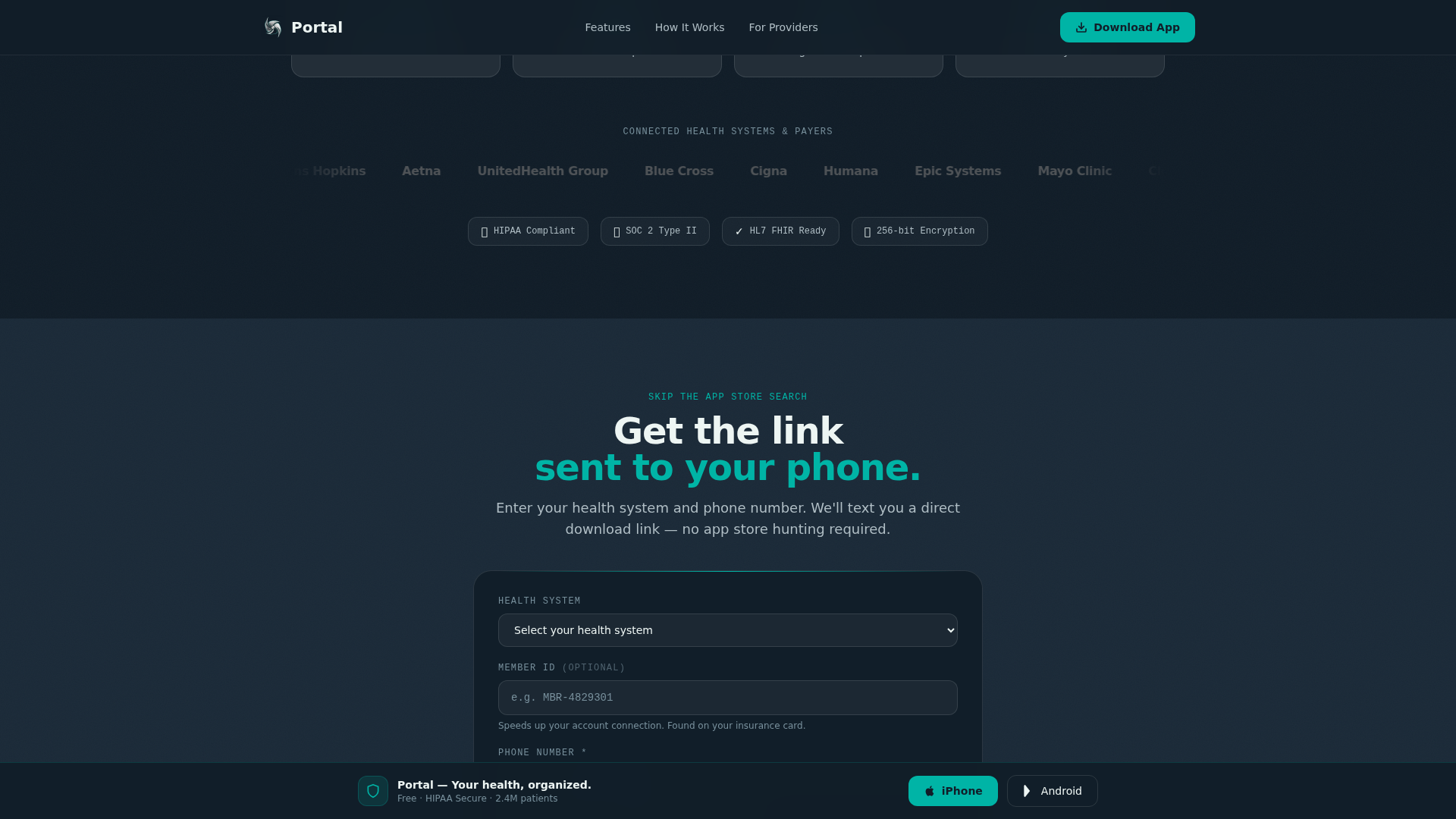
Three-Field SMS Quick-Start Form
Before the final call-to-action cluster, a short form collects health system name via dropdown, an optional member ID, and a phone number. The form sends a direct download link via SMS, reducing friction for older users who find app store navigation uncomfortable.
Institutional Trust Logo Bar
A minimal horizontal strip renders recognizable health system and insurance partner logos in monochrome silver on charcoal. It appears before any copy so that institutional trust is established the moment the page loads.
Page sections overview
| Section | Purpose |
|---|---|
| Logo Trust Bar | Establish institutional credibility immediately |
| Cinematic Hero | Introduce app with floating phone mockup |
| Problem Card Grid | Surface three recognizable patient pain points |
| Solution Card Flip | Reveal teal-lit answers to each pain card |
| Patient Week Grid | Show a simulated active patient timeline |
| Trust Metrics Bar | Reinforce value with key performance stats |
| Quick-Start Form | Capture phone number and send SMS download link |
| Final call to action Cluster | Drive app download with dual platform buttons |
Design & branding system
The visual language follows a Tech Glass theme built on the Teal Catalyst color system. Every design choice reinforces the feeling of a next-generation clinic interface: sterile enough to trust, warm enough to exhale in.
- Deep clinical charcoal (#1B2A38) for primary backgrounds, luminous teal (#00B4A6) for all interactive elements and data highlights, frosted white (#EDF5F3) for card surfaces, and quiet silver (#B0BEC5) for secondary text and dividers
- Cards float on frosted panels with subtle backdrop blur, reinforcing the glass motif throughout the scroll
- DM Sans handles headings and body copy for clean readability; JetBrains Mono renders data labels and metrics for a precise, clinical feel
Mobile & speed optimization
This template is built mobile-first because the product it promotes is a mobile app. The layout, touch targets, and sticky elements are all sized and positioned for a thumb-first experience, with equal care given to desktop presentation.
- GPU-accelerated transforms power all card flip animations, shimmer sweeps, scan lines, and count-up effects without layout thrashing
- IntersectionObserver drives scroll-triggered interactions so animations fire only when elements enter the viewport, keeping the page responsive at every scroll depth
- The sticky download bar and dual call-to-action buttons remain accessible at all screen sizes without obscuring content
How this template helps you convert
Every scroll section in this template is a live preview of the app in action. Visitors are not asked to imagine the product; they watch it work before they ever see a download button repeated.
- The Problem-to-Solution arc builds emotional momentum by naming real frustrations and dissolving them into teal solution cards, so the visitor arrives at the data grid already leaning forward.
- The patient week data grid shows specific, believable app actions across a real Monday-to-Friday timeline, making the download feel like the natural next step rather than a leap of faith.
- The three-field SMS form reduces the final friction point by delivering the download link directly to the visitor's phone, bypassing app store navigation entirely for users who need that path.
Other information about this template
This template is part of a broader set of healthcare software and patient portal landing page designs. It is particularly well suited for teams building consumer-facing health technology products in the United States market.
- The template uses English copy, USD billing references, and US date formatting throughout
- Animation intensity is set to high by default, including card flips, shimmer sweeps, scan lines, and count-up number reveals
- The footer follows a linear single-row pattern, keeping the page's visual weight at the top and middle where conversion decisions happen
- This template can support localization adjustments to language and date format if your patient base requires it

Theme
Tech Glass
Creative direction
Problem→Solution Arc
Color system
Teal Catalyst
Style
Dashboard/Data Grid
Direction
App Download
Page Sections
Floating Phone Hero with Live Dashboard
Scroll-triggered Problem-to-solution Card Flip
Interactive Patient Week Data Grid
Dual Platform Download Buttons and Sticky Bar
Three-field SMS Quick-start Form
Institutional Logo Trust Bar
Related questions
Who is this template designed for?
Can I edit the pain-point and solution card copy?
Does the phone mockup in the hero require a real app screenshot?
How does the SMS quick-start form work in this template?
Is this template suitable for promoting both iOS and Android apps?