Portugal Travel Specialist Professional Website Template
Passeio is a single-column Portugal travel guide landing page built around curiosity and atmosphere. It uses a curated collection layout, a portrait-style hero, and a Northern Lights color palette to guide visitors from inspiration to action. The page ends with a live virtual workshop registration and a weekly dispatch sign-up, turning casual browsers into committed travelers.
by Rocket studio
Quick summary
Passeio is a Portugal travel guide landing page designed for bloggers, creators, and travel educators. It flows as a single column of thematic collections, from coastal food to fado houses to Atlantic edges. A portrait-style hero pulls visitors in immediately. The page closes with event registration for a live planning workshop, earning the ask through atmospheric storytelling first.
Who this template is for
This template is built for travel content creators and educators who know Portugal personally and want to share that knowledge with real depth. It suits anyone turning a travel blog into a structured offer or community touchpoint.
- Portugal travel bloggers ready to monetize their audience through live events or a weekly email dispatch
- Travel educators and workshop hosts who want a visually rich landing page that earns registration before asking for it
- Expat writers and niche guide creators serving repeat visitors, first-timers, and experience-led travelers
What problem this template solves
Most travel landing pages look like brochures: uniform grids, generic calls to action, and zero personality. They fail to hold attention long enough to build trust. Passeio solves this by letting the experience speak before the ask arrives.
- Visitors arrive curious but uncommitted; the curated collection structure keeps them scrolling by mood rather than obligation
- A blunt registration form too early drives people away; here, the call to action appears only after three thematic collections have already done the convincing
- Generic layouts lose the texture of a specific destination; this template is built exclusively around Portugal's coastal, cultural, and emotional identity
What you get with this template
You get a fully structured single-column landing page with a clear visual hierarchy and a deliberate content rhythm. Every section serves a purpose, from first impression to final sign-up.
- A tall portrait hero section, three themed curated collection blocks, a sticky registration bar, a full-width event registration section with a short form, and a newsletter subscribe section
- A four-color Northern Lights palette pre-assigned to navigation, interactive elements, hover states, and background breathing room
- An Organic Flow theme with handwritten-style headline treatment, atmospheric photography placeholders, and a layout built to feel like a journal rather than a checklist
Feature list
This template is built around six distinct functional and visual capabilities drawn directly from the design brief.
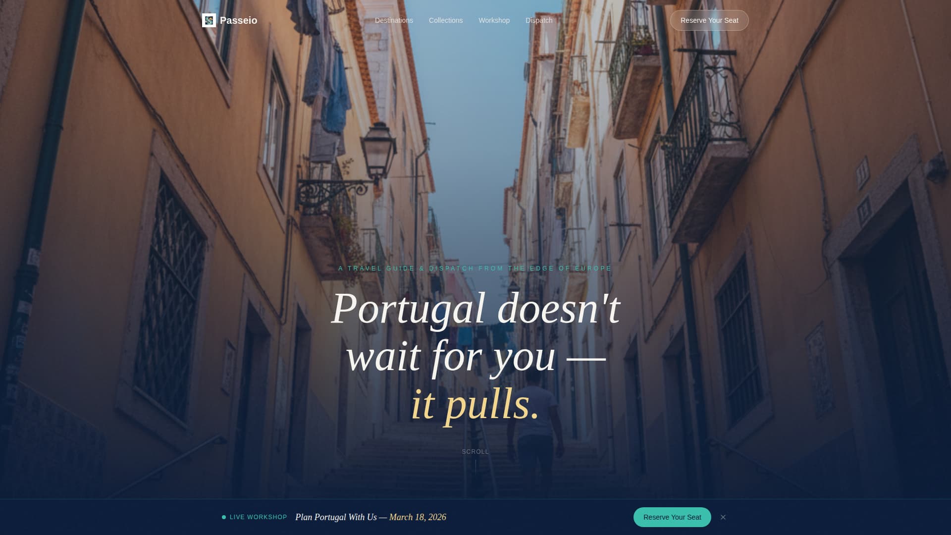
Portrait-Native Hero Section
The header fills the full viewport as a tall vertical portrait composition. A handwritten-style headline fades in over the image without a button, inviting scroll rather than clicking. The framing forces the eye upward, mirroring the physical experience of climbing a narrow Lisbon staircase.
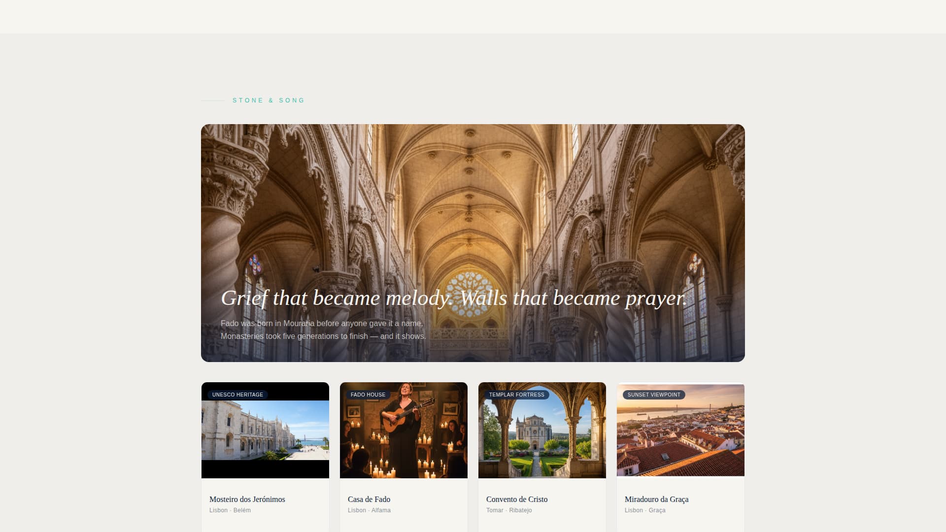
Curated Collection Layout
Three themed content groupings replace a traditional itinerary structure. Each collection opens with a single atmospheric photograph and a two-line poetic caption. Three to five clickable destination cards sit beneath, organized by mood: coastal food, fado and monasteries, and Atlantic-edge adventures.
Sticky Event Registration Bar
After the second collection block scrolls past, a subtle sticky bar appears at the top of the viewport. It carries the primary call to action, "Reserve Your Seat," without interrupting the reading experience. It stays visible as visitors continue exploring the rest of the page.
Full-Width Workshop Registration Form
Near the page's end, a dedicated full-width section presents the live virtual workshop sign-up. The short form asks for a first name, an email address, and a single dropdown asking when the visitor plans to travel. Response options range from "Within 3 months" to "Just dreaming."
Weekly Dispatch Subscribe Section
A secondary conversion path sits alongside the registration section. It uses a single email field and a caption that reads "Not ready to plan? We'll send the good stuff." This path lowers the commitment barrier and keeps undecided visitors connected.
Northern Lights Color System
The four-color palette is pre-assigned by function. Deep Atlantic midnight anchors body text and navigation. Aurora teal marks interactive elements and destination links. Soft lantern glow warms hover states and highlighted dates. Chalk-white plaster fills background space between sections.
Page sections overview
| Section | Purpose |
|---|---|
| Portrait Hero | Sets emotional tone and pulls visitors into the scroll |
| Salt and Smoke | Groups coastal food and fishing-village experiences |
| Stone and Song | Clusters fado houses and monastery visits |
| Edge of the World | Collects Alentejo and Azores adventure content |
| Sticky Workshop Bar | Keeps the event registration call to action visible after scroll |
| Workshop Registration | Captures first name, email, and travel timeline |
| Newsletter Subscribe | Offers a low-commitment email sign-up path |
Design & branding system
The Organic Flow theme gives the page its unhurried, journal-like rhythm. Every design decision reinforces the feeling of discovery rather than sales pressure. Color, typography, and layout work together to feel personal and place-specific.
- The four-color Northern Lights palette uses deep Atlantic midnight (#0B1D3A), aurora teal (#3ABFAD), soft lantern glow (#F4D78E), and chalk-white plaster (#F7F5F0) in clearly assigned functional roles
- A handwritten-style headline treatment on the hero section creates warmth and individuality, separating the page from generic travel templates
- Generous whitespace between sections mirrors the visual breathing room of whitewashed walls between tiled doorways in Portuguese architecture
Mobile & speed optimization
The single-column flow means this layout is structurally mobile-friendly from the ground up. No complex grid rearrangements are needed as screen size narrows. The portrait hero is phone-shaped by design, so it reads naturally on the device most travel browsing happens on.
- The portrait-native hero composition was explicitly designed to look intentional on mobile screens, not merely adapted from a desktop layout
- Single-column stacking means each collection block, card group, and form section presents cleanly on small screens without losing hierarchy
- Lightweight section structure avoids unnecessary layout complexity, keeping the page easy to load and navigate on mobile connections
How this template helps you convert
The page is structured so that trust is built before any registration ask appears. Visitors invest emotionally in the content before they encounter a form, which makes the eventual call to action feel like a natural next step rather than an interruption.
- Three curated collection blocks build genuine desire for the destination before any call to action appears, so visitors arrive at the registration section already engaged
- The sticky bar introduces the workshop call to action gently after the second collection, creating awareness without forcing a decision before the visitor is ready
- Two conversion paths at the close of the page, event registration and newsletter sign-up, match visitors at different readiness levels, keeping no one without a next step
Other information about this template
Passeio is a strong fit for travel creators who are building an audience around Portugal specifically and want a landing page that reflects the depth of their knowledge. It works as a standalone promotional page for a workshop, a seasonal campaign hub, or a featured post gateway.
- The template name "Passeio" means a stroll or a leisurely walk in Portuguese, which matches the unhurried pace of the layout and the associative, non-linear content structure
- The three collection themes, Salt and Smoke, Stone and Song, and Edge of the World, are pre-named in the template and can be replaced to match your own editorial categories
- The travel timing dropdown in the registration form, ranging from "Within 3 months" to "Just dreaming," allows hosts to segment their workshop audience without adding form complexity


Theme
Organic Flow
Creative direction
Curated Collection
Color system
Northern Lights
Style
Single Column Flow
Direction
Event Registration
Page Sections
Portrait-native Hero Section
Curated Thematic Collections
Sticky Workshop Registration Bar
Full-width Event Registration Form
Secondary Newsletter Subscribe Path
Northern Lights Color System
Related questions
What type of page is this template?
What does the workshop registration form collect?
Can I replace the three collection themes with my own categories?
Who is this landing page template designed for?
Does the page offer more than one way for visitors to sign up?