SpaceTech Startup Specialist Directory Website Template
Orbit is a split-screen landing page template built for curated spacetech seed-stage startup directories. It pairs a scrolling logo bar with a live-filter card grid, giving investors and founders an immediate sense of ecosystem density. Two parallel conversion tracks handle deal flow requests and venture submissions, all wrapped in a mission-control dark visual identity.
by Rocket studio
Quick summary
Orbit is a single-page directory template designed for the spacetech seed-stage startup ecosystem. It opens with a constellation of startup logos, filters ventures by subsector, and converts two distinct audiences at once, investors seeking deal flow and founders seeking visibility. The layout, color system, and motion language all borrow from ground station interfaces.
Who this template is for
This template is built for operators running curated startup directories in deep-tech or frontier sectors. It suits teams who need to attract both sides of a marketplace at the same time.
- Venture scouts and corporate investment arms searching for early-stage spacetech deal flow
- Angel syndicates and program managers who need ventures filtered by Technology Readiness Level (TRL) and funding status
- Directory operators and community builders who want a credible, high-signal first impression for seed-stage founders
What problem this template solves
Most generic directory pages feel like unfiltered spreadsheets. They fail to communicate ecosystem depth, and they give investors no fast way to sort signal from noise. Founders, meanwhile, have no obvious path to submit their venture.
- Investors arrive with no context and leave before they engage with the actual listings
- Founders have nowhere obvious to submit their company or see where they fit in the broader landscape
- Directory operators struggle to make a single page feel authoritative enough to justify an email address
What you get with this template
You get a fully structured, single-page directory landing page with every section pre-built and ready to populate. The layout handles two conversion goals without competing for attention.
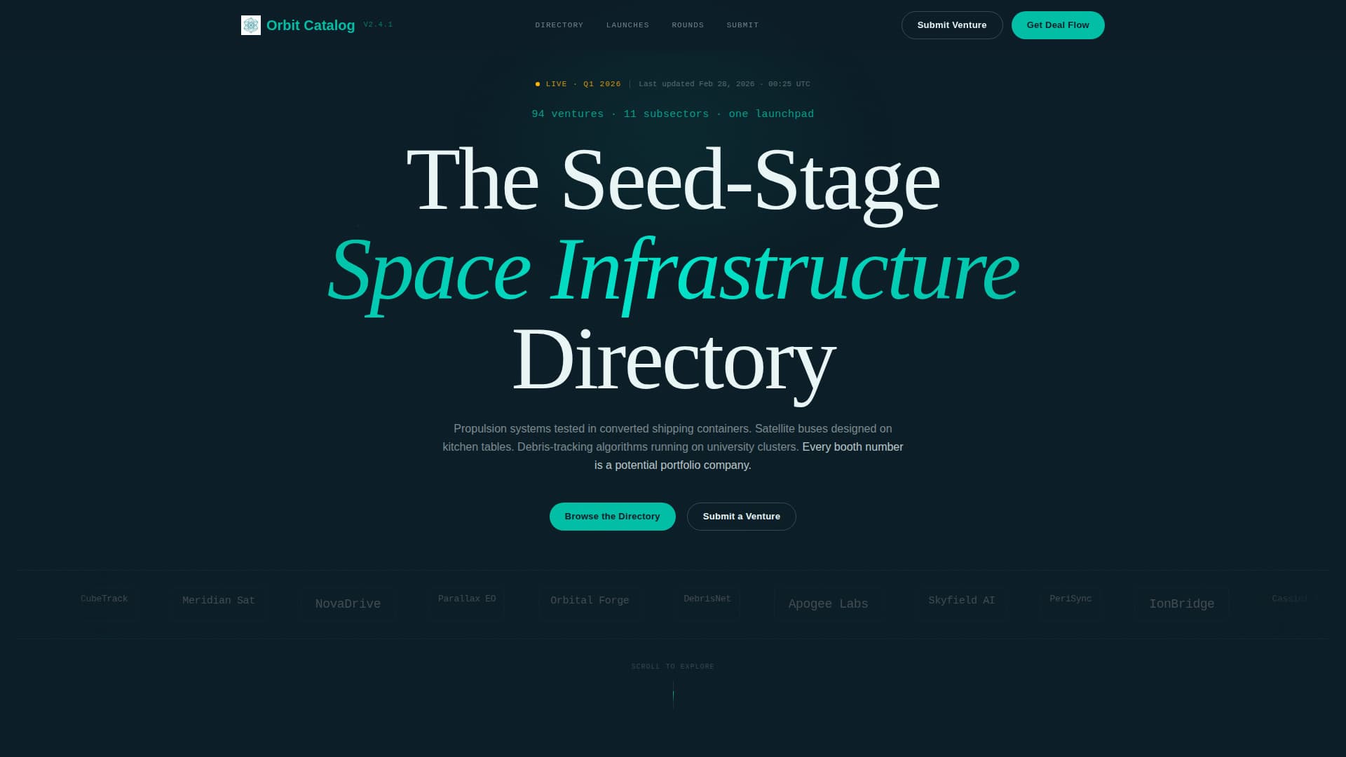
- A scrolling logo bar header featuring forty-plus startup logos in a slow orbital drift, monochrome at rest and full-color on hover with a teal glow border
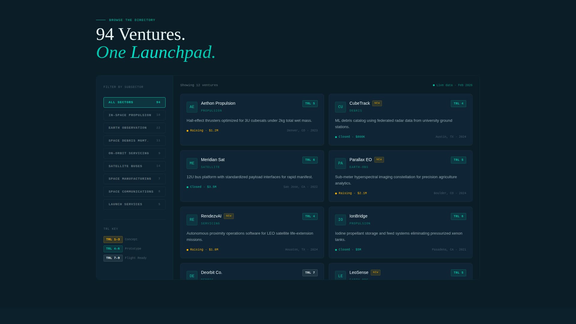
- A split-screen (50/50) browse section with a locked left-panel subsector filter and a right-panel startup card grid, each card showing logo, one-line mission, TRL badge, and funding status
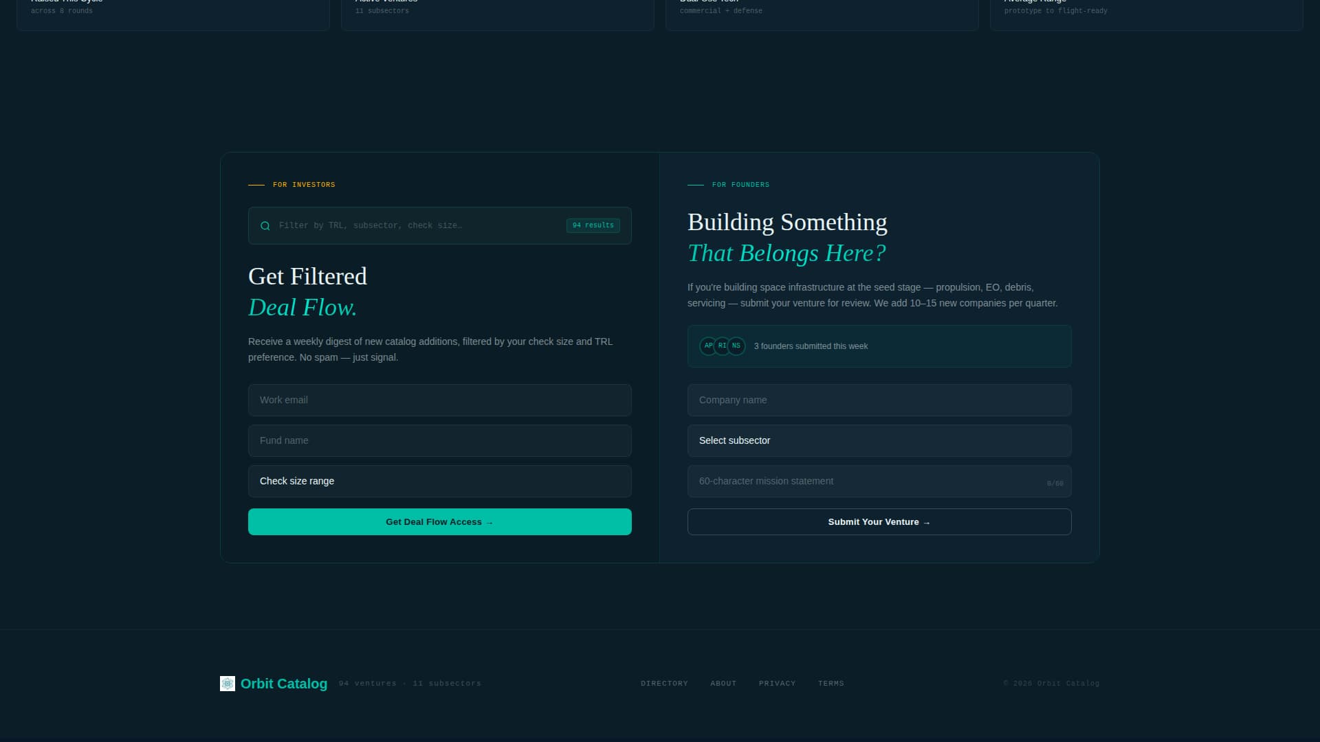
- Two persistent call-to-action (call to action) tracks: "Get Deal Flow Access" for investors and "Submit Your Venture" for founders, both living in teal pill buttons in the navigation bar and repeating at the terminal section
Feature list
This template packs a focused set of purpose-built components that serve a directory use case without unnecessary complexity.
Orbital Logo Bar Header
A horizontal scroll of forty-plus startup logos moves in a slow right-to-left orbital drift on a dark field. Each logo is monochrome at rest and snaps into full color with a catalyst-teal glow border on mouseover. Logo sizes vary to suggest different subsectors across the ecosystem.
Subsector Filter Panel
The left panel of the split-screen browse section locks a vertical subsector filter covering categories such as In-Space Propulsion, Earth Observation, Space Debris, and On-Orbit Servicing. Visitors can narrow the card grid without leaving the page, keeping momentum high.
Startup Card Grid with TRL Badges
Each startup card in the right panel reveals a logo, a one-line mission statement, a TRL badge indicating development stage, and current funding status. Cards snap into view with a payload-deployment animation that reinforces the launch energy of the page.
Dual-Track Conversion Forms
Investors fill a three-field progressive form: email address, fund name, and check-size range. Founders fill a parallel form: company name, subsector dropdown, and a 60-character mission statement. Both forms are accessible from the persistent navigation bar and from the terminal section.
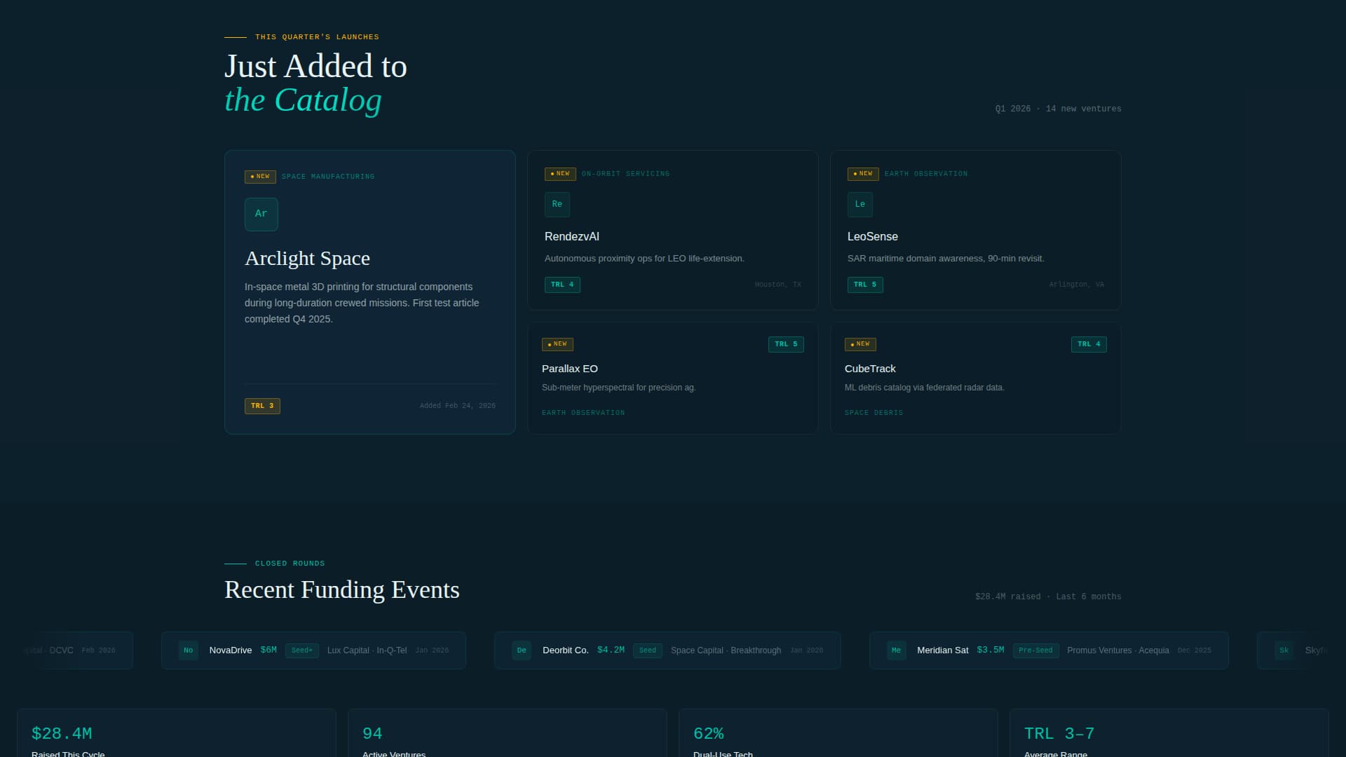
Signal Amber Live Badges
Signal amber is reserved exclusively for "New" tags on recently added startups and for notification pips on live funding events. This controlled use of accent color trains visitors to pay attention whenever amber appears, creating a real-time data feel without visual clutter.
Escalating Scroll Sequence
The page builds momentum through a countdown-style narrative arc. Sections progress from "Browse the Directory" to "This Quarter's Launches" (newly added startups) to "Closed Rounds" (recent funding proof tickers), culminating in a terminal split-screen call to action that closes the loop for both audience tracks.
Page sections overview
| Section | Purpose |
|---|---|
| Logo Bar Header | Establishes ecosystem density with forty-plus scrolling startup logos |
| Telemetry Tag Line | Anchors context with a single stat line above the logo scroll |
| Subsector Filter Panel | Lets visitors narrow the directory by technology category |
| Startup Card Grid | Displays ventures with mission, TRL badge, and funding status |
| This Quarter's Launches | Highlights newly added startups with signal amber "New" pips |
| Closed Rounds Ticker | Shows recent funding events as social proof scroll |
| Dual call to action Terminal | Closes the page with parallel investor and founder conversion forms |
Design & branding system
The visual identity follows a Directory and Discovery theme built on the Teal Catalyst color system. Every color choice has a specific functional role, so the interface feels like a working ground station rather than a decorative website.
- Mission-control dark (#0B1D26) for all backgrounds, catalyst teal (#00BFA6) for section dividers, hover states, and button fills, and telemetry white (#EAF6F6) for body text and card surfaces
- Signal amber (#FFB400) used exclusively for "New" tags, notification pips, and call to action pulse states to draw the eye only when something genuinely demands attention
- Split-screen (50/50) layout keeps filters and content in a consistent spatial relationship, preventing cognitive load as visitors scroll through dense directory content
Mobile & speed optimization
The split-screen layout is designed to reflow cleanly across screen sizes. The filter panel and card grid stack vertically on smaller viewports, preserving the browse experience without requiring a separate mobile layout.
- Persistent teal pill navigation buttons remain accessible at all scroll depths on both desktop and mobile viewports
- Startup cards use snap-in animations sized to feel fluid on touch screens without overwhelming devices with heavy motion sequences
- Logo bar scroll speed and hover states are designed to work on both pointer and touch input, so the orbital drift remains legible across interaction modes
How this template helps you convert
The page is structured to trigger engagement before it ever asks for a form fill. Density of logos and funding proof create a sense of FOMO (fear of missing out) that makes both investor and founder calls to action feel like access rather than obligation.
- The logo bar and stat tag line ("94 ventures. 11 subsectors. One launchpad.") establish credibility in the first three seconds, giving investors and founders a reason to scroll before they are asked for anything.
- The escalating scroll sequence builds commitment gradually, moving visitors from passive browsing through social proof before landing them at the dual call to action terminal with enough context to convert confidently.
Other information about this template
Orbit is part of the Startup and Launch category on the template marketplace, sitting within the SpaceTech Startup subcategory and the SpaceTech Seed Stage Startup niche. It carries an intersection match score of 13, reflecting a tight alignment between the template design system and the target audience's expectations.
- The template style is Split Screen (50/50), the theme is Directory and Discovery, the header concept is Logo Bar, the creative direction is Launch Energy, and the conversion approach is Lead Generation
- The Teal Catalyst color system is purpose-built for this niche and is not a generic dark-mode palette; every color assignment has a documented functional role in the directory experience
- The 60-character mission statement constraint on the founder submission form is an intentional design choice that keeps card content scannable and consistent across the directory
Theme
Directory & Discovery
Creative direction
Launch Energy
Color system
Teal Catalyst
Style
Split Screen (50/50)
Direction
Lead Generation
Page Sections
Orbital Scrolling Logo Bar
Split-screen Browse Layout
Trl-badged Startup Cards
Dual Parallel Conversion Forms
Escalating Section Narrative
Signal Amber Live Badges
Related questions
Who are the two audiences this landing page is built to convert?
Can I update the subsector filter categories to match my directory?
What does the TRL badge on each startup card indicate?
How does the signal amber color function in the visual system?
Where do the investor and founder calls to action appear on the page?