Mobilize - Purposeful Volunteer Landing Page Template
Mobilize is a volunteer matching landing page template built for community-focused platforms that connect individuals with nonprofits. It uses a story-driven, card grid layout with a full-screen video hero, illustrated infographic cards, flippable testimony cards, and dual registration modals to turn curious visitors into committed volunteers or team organizers.
by Rocket studio
Quick summary
Mobilize is a single-page template designed for volunteer matching platforms. It guides visitors from problem awareness through a founder origin story, into a clear matching process, and finally to a live event registration. The earthy Forest Trust color system and documentary-style video hero make the page feel grounded, warm, and human from the first scroll.
Who this template is for
This template is built for social impact platforms that need to turn passive interest into active participation. It speaks equally well to individual volunteers and organizational buyers, making it versatile across multiple audience types.
- Nonprofit volunteer coordinators who need a reliable way to recruit skilled, committed volunteers for specific roles
- College students and purpose-driven individuals looking for meaningful service opportunities that match their schedules and interests
- Corporate social responsibility managers who need to place teams of employees into community projects quickly and efficiently
What problem this template solves
Volunteer platforms often struggle to communicate why their matching process is better than a simple sign-up sheet. Visitors arrive skeptical, browse without committing, and leave before registering. This template solves that trust gap by building the case before asking for anything.
- High volunteer dropout and no-show rates are visualized early using illustrated infographic cards, so visitors understand the problem the platform exists to fix
- The mismatch between volunteer skills and available roles is addressed directly through a guidebook-style explanation of how the matching process works
- Corporate visitors who need to organize group participation have their own clear registration path, so they never feel like an afterthought
What you get with this template
You get a fully structured, single-page layout that walks every visitor type through a deliberate narrative arc. The design is ready to customize with your own footage, statistics, and stories.
- A full-screen video hero section with a documentary grain overlay, a fade-in headline, and two distinct calls to action
- A modular card grid built from illustrated infographic cards, flippable testimony cards, and persona-specific asymmetric cards
- Two registration modals: one lightweight individual flow and one group registration path with a headcount field for corporate visitors
Feature list
This template packages several purpose-built components into one cohesive, scroll-driven experience.
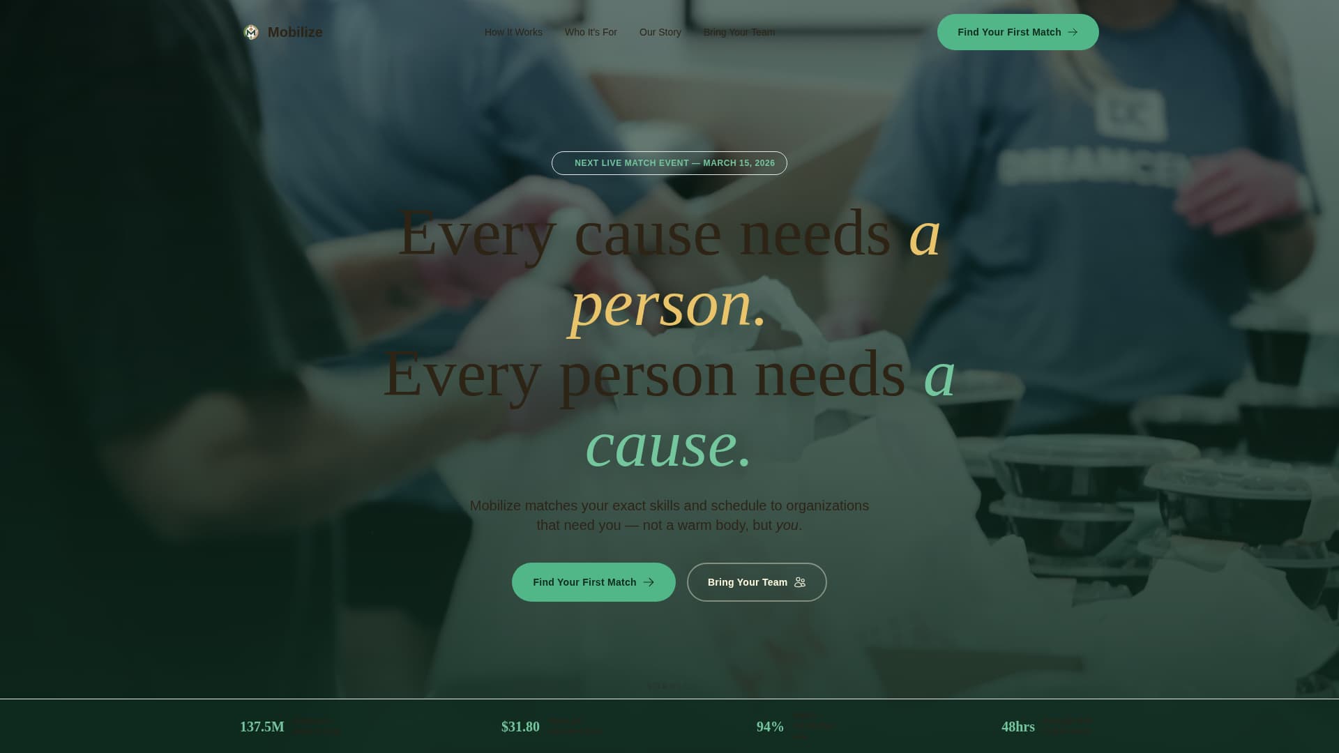
Full-Screen Video Hero with Dual Call to Action
The hero section fills the entire viewport with documentary-style video footage. A single headline fades in over the footage. Two calls to action sit side by side: one for individual visitors and one for corporate teams, so no visitor lands without a clear next step.
Illustrated Infographic Card Grid
The first card row below the hero presents volunteer dropout statistics and the nonprofit mismatch gap as illustrated infographic cards with hand-drawn icons. These cards make abstract data visual and emotionally resonant without relying on dense text blocks.
Flippable Testimony Cards
Each guidebook chapter card in the matching-process section can be flipped to reveal a real volunteer's testimony on the back. This interaction rewards curiosity and delivers social proof at exactly the right moment in the narrative.
Sticky Header with Primary Call to Action
A sticky header keeps the primary "Find Your First Match" call to action visible throughout the entire scroll. Visitors never have to scroll back up to take action once they are ready to register.
Dual Registration Modals
Clicking "Find Your First Match" opens a lightweight modal collecting name, email, zip code, a three-checkbox interest selector, and a preferred day dropdown. The "Bring Your Team" path opens a separate group form with a headcount field, serving corporate visitors without interrupting the individual flow.
Persona-Specific Asymmetric Cards
A dedicated card row presents three distinct audience personas: the nonprofit coordinator, the college student, and the corporate social responsibility manager. Asymmetric card sizing gives each persona room to breathe and helps every visitor type recognize themselves in the page.
Page sections overview
| Section | Purpose |
|---|---|
| Video Hero | Full-screen documentary footage with fade-in headline and dual call to action |
| Crisis Infographic Cards | Illustrated stats on volunteer dropout rates and nonprofit staffing gaps |
| Origin Story Block | Founder narrative revealing the platform's founding moment and mission |
| How Matching Works | Flippable guidebook chapter cards covering skills, availability, geography, and passion |
| Three Personas Row | Asymmetric cards for coordinator, student, and corporate social responsibility manager audiences |
| Final Call to Action Row | "Find Your First Match" and "Bring Your Team" registration cards side by side |
| Footer | Arc Browser Split layout with logo, tagline, and navigation links |
Design & branding system
The visual identity follows an Educational Guide theme, using the Forest Trust color system to create a palette that feels like a well-worn field guide. Every color has a structural role, and nothing competes for attention.
- Deep canopy green (#1B4332) anchors the header, footer, and primary text; sun-dappled moss (#52B788) activates buttons and progress indicators; warm birch bark (#D4A373) warms each card surface; and soft trail dust (#FEFAE0) serves as the page background, giving every module room to breathe
- Typography pairs Fraunces serif headings for a field guide editorial feel with DM Sans body text for clean, readable body copy across all screen sizes
- GSAP scroll reveals, staggered bento card entrances, and card flip interactions bring the layout to life without overwhelming the earthy, documentary tone
Mobile & speed optimization
The template is built mobile-first, which reflects how most individual volunteers discover and engage with platforms: on their phones, often on the go.
- The card grid layout reflows naturally at smaller screen sizes, keeping the bento entrance animations and card flip interactions intact on mobile viewports
- Native CSS scroll behavior and lazy-loaded images keep the page responsive without relying on heavy third-party scroll libraries for static sections
- Server Components handle static content sections, reducing the interactive payload so the registration modals and video hero remain snappy even on slower connections
How this template helps you convert
The page is designed so visitors feel invested in the platform's story before they ever see a registration form. By the time a call to action appears, the visitor already sees themselves in the narrative.
- The origin story scroll structure builds emotional buy-in section by section, moving from the problem to the solution to a personal invitation, so the registration modal feels like a natural next step rather than an interruption
- The sticky header call to action and the repeated "Find Your First Match" card at the end of every row give visitors multiple low-friction moments to convert without forcing the ask too early
- The "Bring Your Team" secondary path ensures corporate visitors are never pushed toward an individual form, reducing drop-off from the audience segment most likely to register large groups at once
Other information about this template
This template is built specifically for the volunteer matching platform niche within the broader community and nonprofit category. It is a strong fit for organizations running live matching events, seasonal volunteer drives, or corporate social responsibility programs.
- The template sits within the Volunteer and Community Group subcategory and is optimized for event registration as its primary conversion goal
- The card grid layout is modular, meaning individual card rows can be reordered or removed to fit platforms with fewer audience segments or a shorter origin story
- The footer uses the Arc Browser Split pattern with the logo and tagline on the left and navigation links on the right, providing a clean, structured close to the page


Theme
Educational Guide
Creative direction
Origin Story
Color system
Forest Trust
Style
Card Grid (Modular)
Direction
Event Registration
Page Sections
Full-screen Video Hero
Illustrated Infographic Card Grid
Flippable Testimony Cards
Sticky Header with Persistent Call to Action
Dual Registration Modals
Persona-specific Asymmetric Cards
Related questions
Can I use this template without video footage?
Is this template suitable for a nonprofit that does not run matching events?
How does the group registration path work for corporate teams?
How many audience personas does the template include?
What design system does this template use?