Mise — Immersive Fine Dining Landing Page Template
Mise is a cinematic restaurant how-to blog landing page built for culinary industry content creators. It uses a horizontal scroll layout, collage-style hero, and five editorial chapter panels to guide visitors from discovery to email signup. The design runs on a Luxe Minimal dark palette with saffron-gold accents, thin serif headlines, and a fixed lead-gen rail throughout.
by Rocket studio
Quick summary
Mise is a single-page horizontal scroll landing page designed for a restaurant operations blog. It pairs a Cinematic Dark visual identity with a chapter-driven editorial layout. Five swipeable content panels move visitors from kitchen basics to burnout essays. A persistent bottom rail collects email signups throughout the experience.
Who this template is for
This template is built for culinary content creators who have real, earned knowledge to share. It suits operators who want a beautiful digital home for practical restaurant writing.
- First-time restaurant owners who need a credible place to share what they are learning
- Seasoned general managers or culinary grads turning operational expertise into a content platform
- Food industry writers and educators building an email-first audience around restaurant how-to content
What problem this template solves
Most blog templates feel generic. They do not carry the weight of a subject as specific and high-stakes as running a restaurant. Mise solves that mismatch.
- Visitor trust erodes when the design does not match the depth of the content
- Standard templates bury the call to action and lose potential subscribers mid-scroll
- Generic layouts fail to signal expertise before the visitor reads a single line
What you get with this template
You get a fully structured, single-page horizontal scroll landing page with a defined visual system and interactive components ready to be populated with your content.
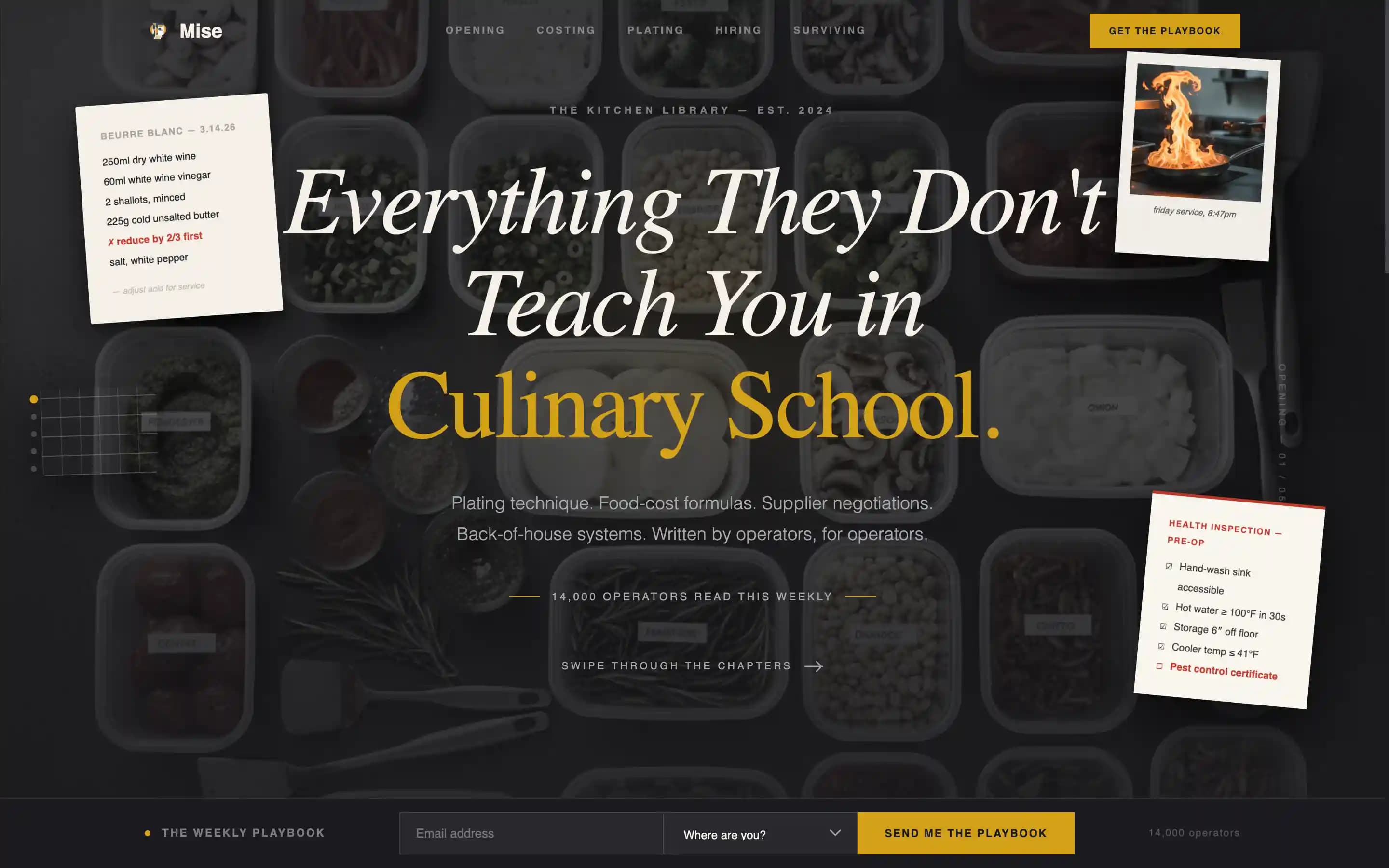
- A collage-style hero section with a thin serif headline and layered, rotated fragment elements on a charcoal background
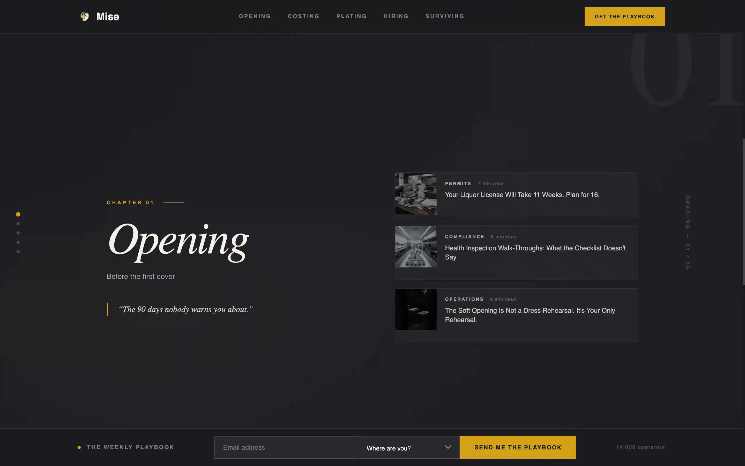
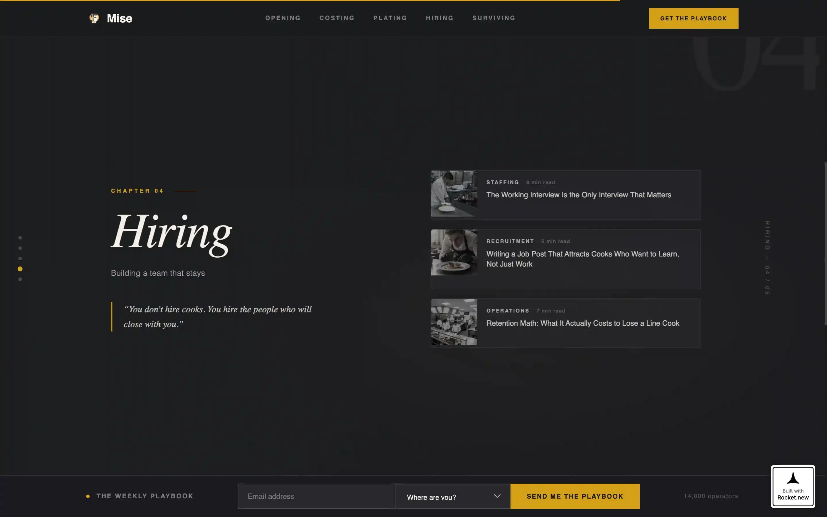
- Five full-viewport horizontal scroll panels organized as editorial chapters, each holding three article thumbnail cards
- A fixed bottom rail with an email capture field and a journey-stage dropdown, visible throughout the entire scroll
Feature list
This template ships with a focused set of high-impact components designed for editorial lead generation in the restaurant industry.
Collage Scrapbook Hero
The hero uses overlapping, slightly rotated fragments layered over a deep charcoal background. Elements include a torn recipe card, an overhead mise en place shot, a crumpled linen napkin, a health-inspection checklist, and a Polaroid of a sauté pan. Drop shadows give depth, and a thin Fraunces serif headline anchors the composition.
Five-Panel Horizontal Scroll
Five full-viewport cards serve as editorial chapters: Opening, Costing, Plating, Hiring, and Surviving. Visitors swipe through them in order, with each panel containing three vertically stacked article thumbnail cards. The progression moves from operational basics toward more intimate mental-health and burnout writing, rewarding visitors who continue scrolling.
Fixed Lead Generation Rail
A persistent bottom rail stays visible across every panel. It holds the primary call-to-action button, a single email field, and a dropdown asking visitors where they are in their journey. Dropdown options include stages such as "Still dreaming," "Signing a lease," and "Already open." The rail never disappears, so the signup opportunity is never missed.
Article Preview Modal
Visitors can tap any article thumbnail to open a 200-word preview of the full guide. The preview ends with a soft email gate: visitors enter their address to unlock the complete article. This secondary conversion path gives undecided visitors a low-friction reason to subscribe.
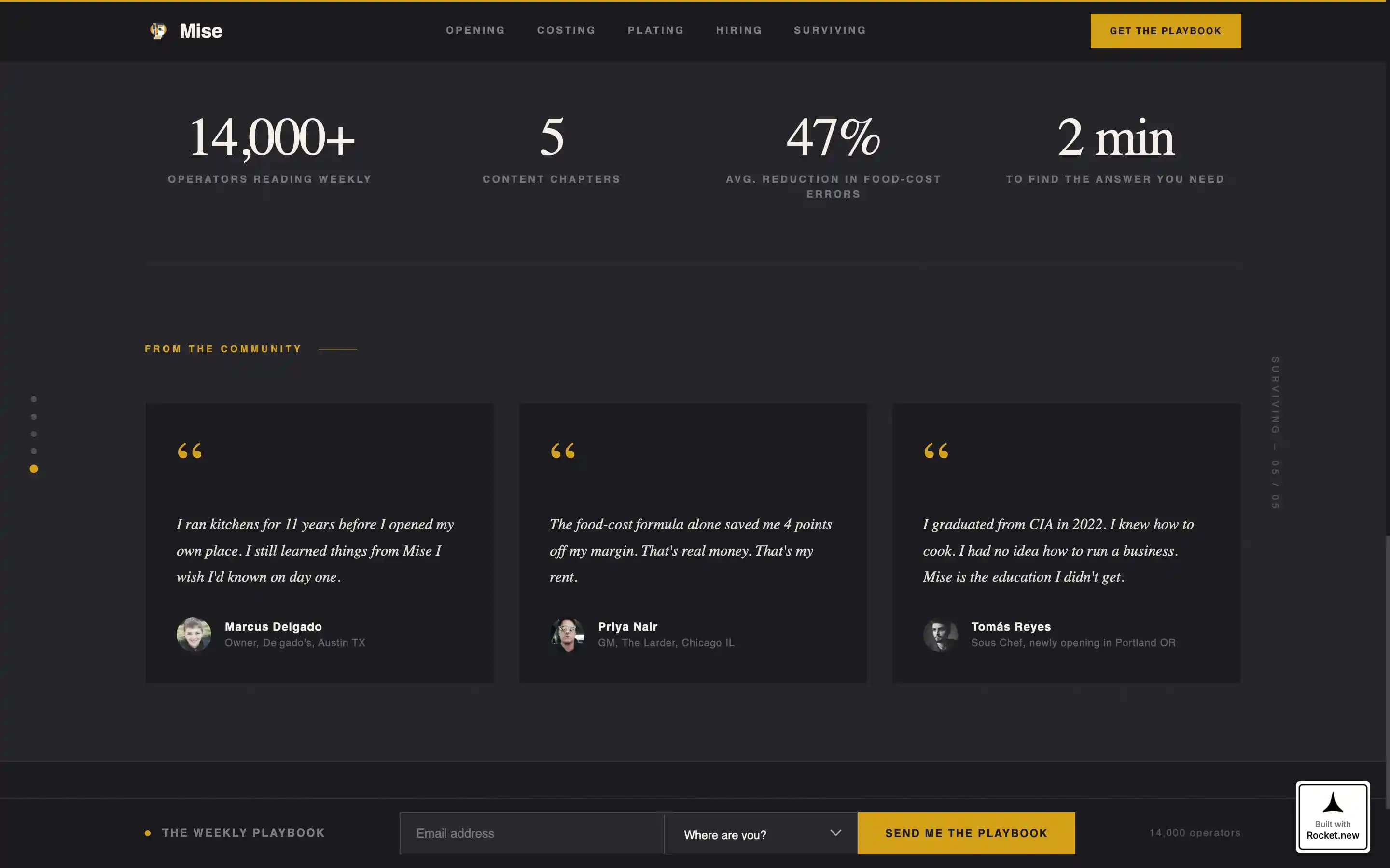
Social Proof Strip
A dedicated strip displays the subscriber count of 14,000 operators alongside pull quotes from real practitioners. Specificity in visible headlines across panels reinforces that the content is written by someone with genuine kitchen experience.
Scroll-Linked Chapter Progress
A scroll-linked progress indicator lets visitors track which chapter panel they are on. Staggered reveals and cursor-reactive depth on fragment elements add editorial momentum without overwhelming the reading experience.
Page sections overview
| Section | Purpose |
|---|---|
| Hero Collage | Opens with layered fragments and a single bold editorial headline |
| Horizontal Scroll Panels | Five swipeable chapter cards, each with three article thumbnails |
| Social Proof Strip | Displays subscriber count and practitioner pull quotes |
| Article Preview Modal | Soft-gate 200-word preview that converts curious visitors into subscribers |
| Fixed Bottom Rail | Persistent email capture with journey-stage dropdown across all panels |
| Footer | Minimal horizontal flow layout closing the page cleanly |
Design & branding system
The visual identity is Luxe Minimal with a Cinematic Dark color system. Every surface is matte and deliberate, built to feel like a Michelin-starred dining room before service begins.
- Color palette: charcoal black (#1A1A1E) as the primary background, brushed stainless (#A8A9AD) for secondary text, parchment ticket white (#F5F0E8) for foreground body text, and saffron gold (#D4A017) reserved strictly for hover states, active links, and pull-quote marks
- Typography: Fraunces thin serif for all headlines and display text, DM Sans for body copy and user interface elements
- Motion and interactivity: high-intensity horizontal scroll momentum, floating fragment animations in the hero, staggered card reveals on panel entry, and cursor-reactive depth on layered elements
Mobile & speed optimization
The template is built desktop-first, with the horizontal scroll experience designed for larger screens. A mobile vertical fallback is included for smaller devices.
- Desktop layout prioritizes the horizontal swipe experience with momentum-driven scroll behavior
- Mobile fallback converts the five chapter panels into a vertical stack so content remains accessible on all screen sizes
- Static content areas use server components to keep the page responsive, while the scroll engine and modal run as client components
How this template helps you convert
Every design and layout decision in Mise is built to move a visitor toward leaving their email address.
- The fixed bottom rail keeps the primary call to action visible at every point in the scroll, so no panel is a dead end for lead capture
- Article thumbnail previews deliver real, specific value before asking for anything, which builds the trust needed for a visitor to subscribe
- The journey-stage dropdown in the email form personalizes the signup experience, making the ask feel relevant rather than generic
Other information about this template
Mise is part of a Blog and Editorial template category designed for content-led businesses in the restaurant and culinary industry. It sits at the intersection of editorial craft and operational utility.
- Template style: Horizontal Scroll with a Curated Collection creative direction
- Header concept: Collage and Scrapbook composition on a Cinematic Dark background
- Landing page direction: Lead Generation with email list growth as the primary conversion goal
- The subscriber framing of 14,000 operators is built into the social proof strip as a trust signal
- The template is suited for USA-centric restaurant industry content written in English
Theme
Luxe Minimal
Creative direction
Curated Collection
Color system
Cinematic Dark
Style
Horizontal Scroll
Direction
Lead Generation
Page Sections
Collage Scrapbook Hero Section
Five-panel Horizontal Scroll
Fixed Lead Generation Rail
Soft-gate Article Preview Modal
Social Proof Strip
Scroll-linked Progress and Animation
Related questions
What kind of content fits this template?
Can I change the chapter panel labels?
How does the email signup work?
Is this template suitable for a new blog with no audience yet?
What typography does this template use?