Lookup - Powerful Telecommunications Landing Page Template
Lookup is a telecommunications directory landing page built around a live comparison table and a zip-code search bar. It lets visitors find carriers, plans, coverage maps, and pricing in one place. The dark Dashboard Pro design and terminal-style header make the tool feel immediate and credible, turning a frustrating research task into a fast, honest answer.
by Rocket studio
Quick summary
Lookup is a single-page telecommunications directory template designed around one idea: give the visitor a real answer before they lose patience. A terminal-style header and a zip-code search bar open the experience. A live comparison table fills the next section. Methodology copy earns trust on the scroll down. Every part of the page serves the data, not the decoration.
Who this template is for
This template is built for anyone who runs or builds a telecom directory, listing site, or plan comparison tool. It suits operators who want to deliver honest, useful data without friction.
- Small business owners comparing Session Initiation Protocol trunk pricing and internet service options
- Information technology managers building vendor shortlists for formal request-for-proposal processes
- Rural households and families who need reliable, unfiltered signal and coverage data by address
What problem this template solves
Finding the right telecom provider is harder than it should be. Coverage maps exaggerate, carrier websites bury pricing, and comparison tools hide behind sign-up walls. Lookup solves all three problems at once.
- Visitors get a direct zip-code search with no form gate and no account required before seeing results
- The comparison table surfaces carrier rows with speed tiers, contract terms, monthly cost, and reliability scores side by side
- Methodology sections explain how listings are verified and what "coverage" actually means versus what carriers advertise
What you get with this template
The template delivers a complete, ready-to-customize landing page focused entirely on telecom plan discovery. Every section flows from the search bar downward, building trust as the visitor scrolls.
- A terminal-style code snippet header with a styled API-style query and streaming result lines
- A functional zip-code search bar that mirrors the header command in a standard graphical interface
- A live comparison table with expandable rows, a sticky call-to-action bar, and a secondary email-capture path
Feature list
This section describes the core built-in components and design features included in the Lookup template.
Terminal Code Snippet Header
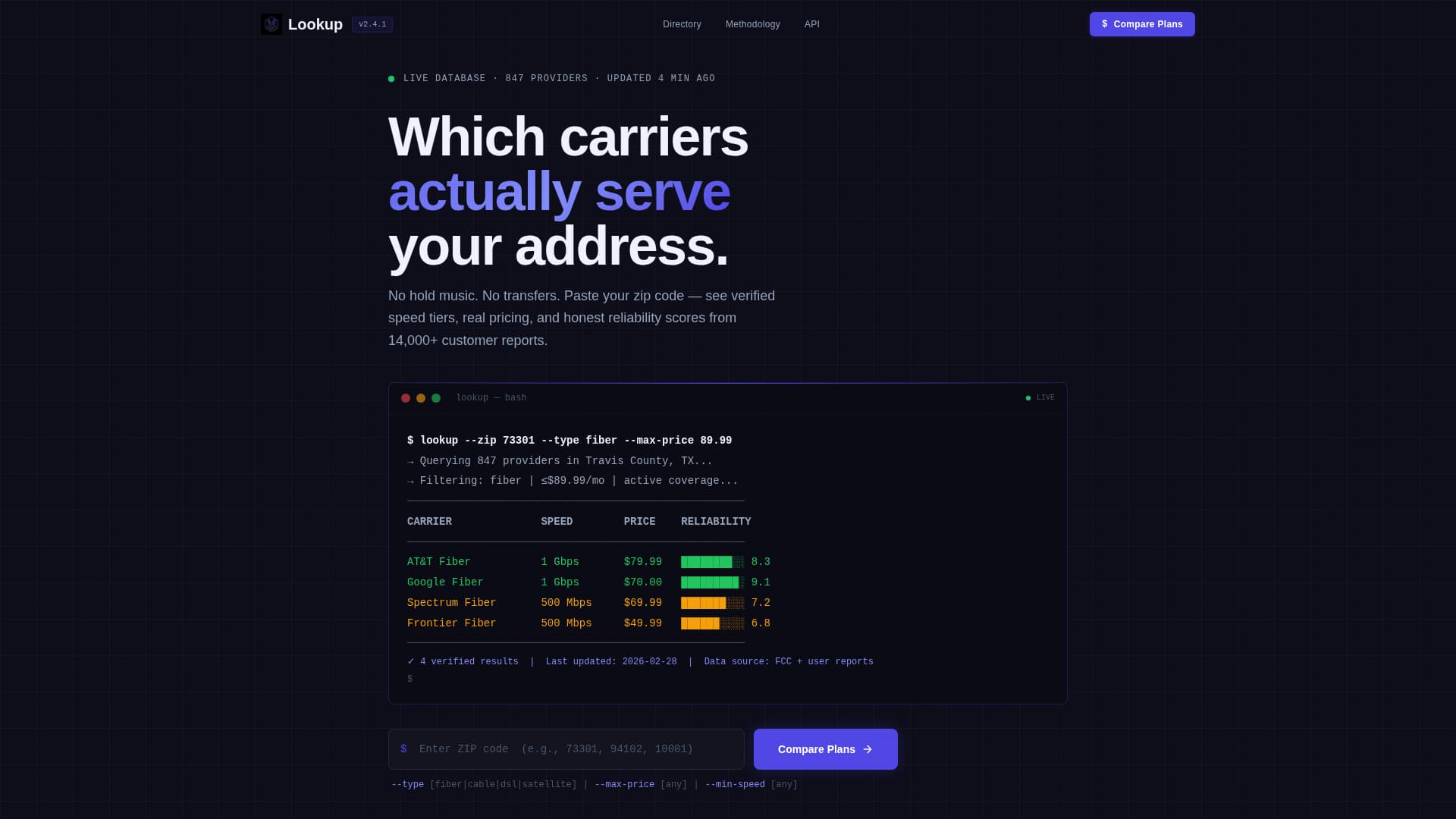
The header opens with a styled terminal block displaying a real API-style query such as lookup --zip 73301 --type fiber --max-price 89.99. Results appear line by line, each carrier name, speed tier, and monthly cost streaming in as if a live database is responding. No stock photography, no lifestyle imagery, just the tool, already working.
Zip Code Search Bar
Directly below the terminal header sits a graphical search bar that mirrors the command-line query. Visitors type their zip code and the interaction carries the same intent as the terminal above it. The bar acts as the page's primary entry point and the clearest call to action before the table loads.
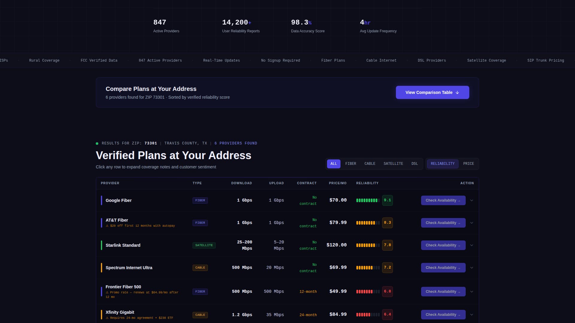
Live Carrier Comparison Table
The comparison table is the core of the page. Carriers occupy rows. Columns cover download speed, upload speed, contract length, monthly cost, and a user-rated reliability score. Each row expands on click to show coverage notes and customer sentiment from the directory. The layout makes side-by-side evaluation fast and honest.
Click-Through Carrier Buttons
Every carrier row ends with a "Check Availability" button. The button passes the visitor's previously entered zip code directly to the provider's sign-up page, removing friction from the handoff. No extra form, no detour, the click feels like a natural next step.
Sticky Primary Call-to-Action Bar
A "Compare Plans at Your Address" call-to-action is anchored above the comparison table and repeats as a sticky bar while the visitor scrolls. This keeps the primary conversion path visible at every point on the page without interrupting the data experience.
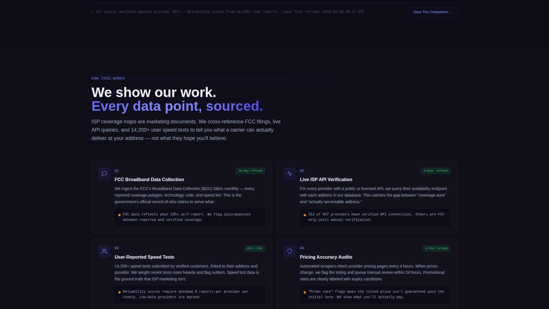
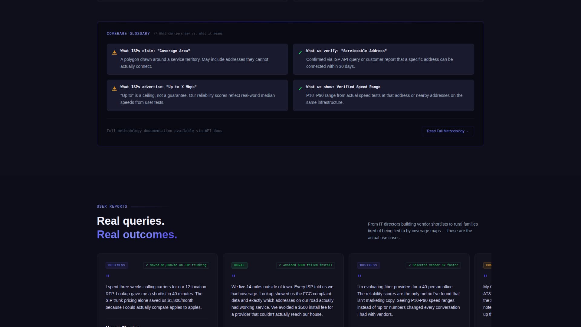
Methodology Trust Section
Scrolling past the table reveals a section explaining how listings are verified, how often data refreshes, and what "coverage" genuinely means compared to carrier claims. Each paragraph adds a layer of transparency, so by the time a visitor reaches the bottom they trust the data enough to click through.
Page sections overview
| Section | Purpose |
|---|---|
| Terminal header block | Sets tool-first tone with styled API-style query |
| Zip code search | Primary entry point for address-based lookup |
| Carrier comparison table | Side-by-side plan data with expandable rows |
| Sticky call to action bar | Keeps primary action visible during scroll |
| Methodology disclosure | Builds trust by explaining data sourcing and verification |
| Email capture module | Secondary path for visitors not yet ready to click through |
Design & branding system
The visual identity uses the Dashboard Pro theme with an Electric Indigo color system. The palette reads like a network operations center at 2 AM, purposeful, technical, and zero-clutter.
- Deep terminal black (#0D0D1A) forms the base background, holding every element in place like a rack-mounted chassis
- Electric indigo (#4F46E5) activates on interactive elements, data highlights, hover states, and live-data indicators to direct attention without noise
- Cool slate (#94A3B8) draws table grid lines and secondary text, while phosphor white (#F0F0FF) keeps primary text and table cell backgrounds crisp and readable
Mobile & speed optimization
The template is structured to stay functional and scannable on smaller screens. The comparison table and search bar are the most data-dense parts of the layout, so they are built to reflow cleanly on mobile viewports.
- The comparison table adapts to narrower screens so carrier rows remain readable without horizontal scrolling becoming a barrier
- The sticky call-to-action bar is designed to remain accessible at the bottom of mobile viewports throughout the scroll experience
How this template helps you convert
The page is optimized for click-through conversion. Every design and layout decision reduces friction between the visitor's question and their next action.
- The zip-code search bar captures intent immediately and feeds it forward to the comparison table, so the visitor stays in a single, uninterrupted research flow
- Per-row "Check Availability" buttons carry the visitor's zip code directly to a provider sign-up page, making the handoff feel earned rather than pushed
- The secondary email-capture module for "Save This Comparison" catches undecided visitors without blocking the primary click-through path
Other information about this template
The Lookup template is categorized under Technology and the Telecommunications Digital Presence subcategory. It is designed specifically for the telecommunications directory and listing site niche.
- The template style is a Comparison Table layout built on the Dashboard Pro theme
- The creative direction is Calculator or Tool First, meaning the search interaction drives the entire page experience
- The header concept is a Code Snippet, giving the page an immediate terminal aesthetic without requiring any custom development work
- The landing page direction is Click-Through, prioritizing zero-friction handoffs to provider sign-up pages over form-heavy lead capture
Theme
Dashboard Pro
Creative direction
Calculator/Tool First
Color system
Electric Indigo
Style
Comparison Table
Direction
Click-Through
Page Sections
Terminal Code Snippet Header
Zip Code Search Bar
Live Carrier Comparison Table
Per-row Click-through Buttons
Sticky Primary Call to Action Bar
Methodology Trust Section
Related questions
Does this template require a sign-up wall before visitors see results?
Can I customize the carrier rows and plan data in the comparison table?
What does the 'Check Availability' button do?
Is this template suitable for a rural coverage directory?
Can the sticky call-to-action bar be turned off or repositioned?