Launch — Innovative Next.js Framework Landing Page Template
Ship is a split-screen Next.js video tutorial landing page template built for developer education brands. It pairs a live-feeling course dashboard on the left with bold headline copy and a pulsing call-to-action on the right. The Acid Digital color system and Launch Energy layout rhythm make it ideal for promoting fast-paced, production-focused coding courses.
by Rocket studio
Quick summary
Ship is a single-page landing page template designed for Next.js video tutorial series. It uses a 50/50 split-screen layout, an Acid Digital color system, and a Launch Energy content rhythm. Every section pairs a code snippet or terminal output with a video lesson preview, building trust through real implementation detail before asking for an email.
Who this template is for
This template is built for developers and educators who sell or promote coding courses. It works best when the product is a technical video series that targets working developers.
- Developers launching a paid or free Next.js course who need a conversion-ready page fast
- Freelancers or agencies building tutorial landing pages for technical education clients
- Startup teams promoting internal or public onboarding programs built around video lessons
What problem this template solves
Most course landing pages feel like generic marketing sites. They use stock photography, vague bullet points, and calls to action that appear before any real value is shown. Technical developers are skeptical by default. They want proof before they click anything.
- Developers scroll past pages that show no real code, so trust is never established
- Course creators lose sign-ups because their page does not match the quality of their teaching
- Generic templates do not reflect the speed and precision that a production-focused developer course demands
What you get with this template
You get a fully structured landing page layout built around a split-screen format. Every section is purpose-built to escalate trust and drive email sign-ups without friction.
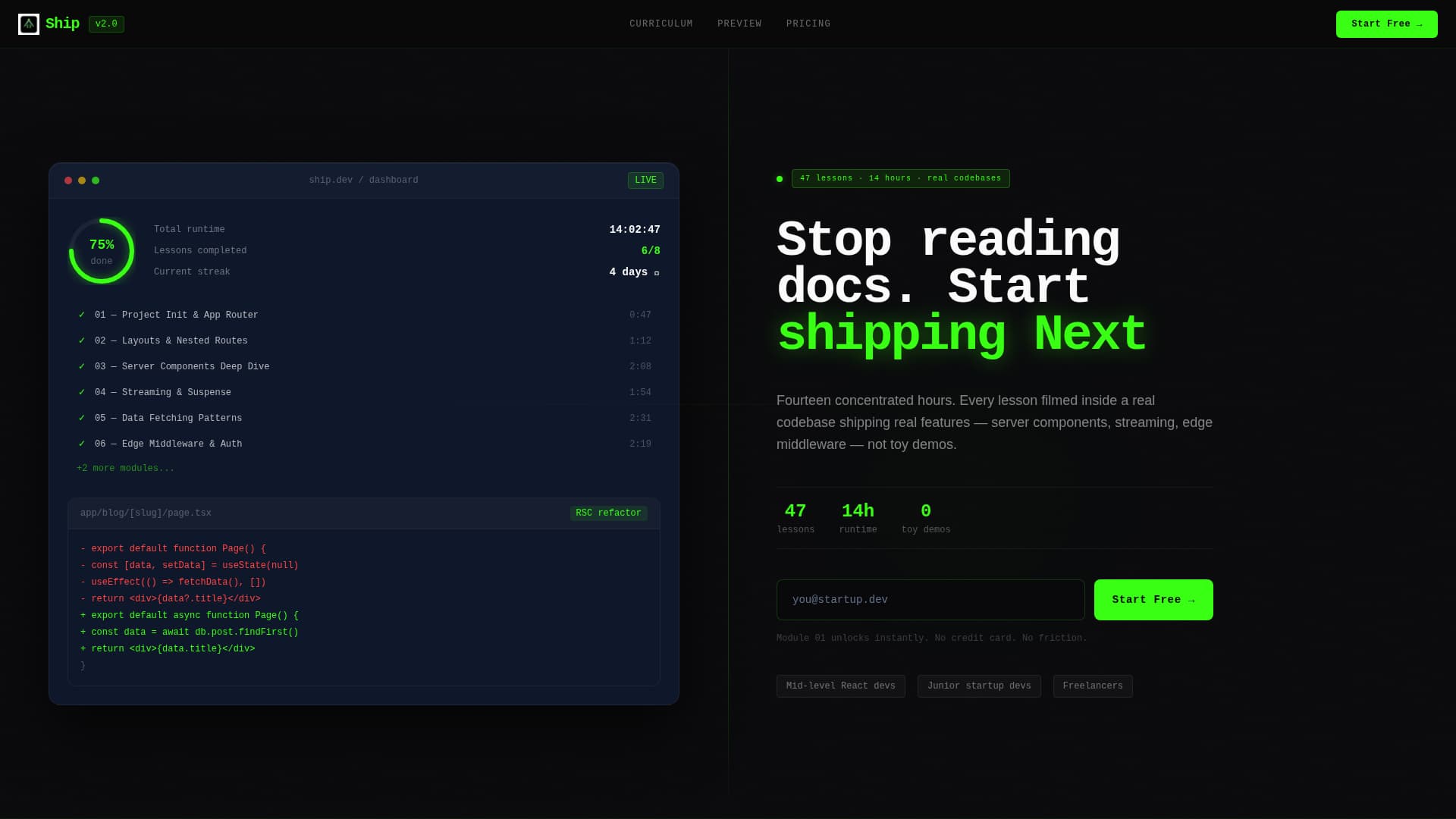
- A header section with a dashboard preview panel on the left and a headline, subline, and pulsing acid-green call to action button on the right
- A repeating split-screen section rhythm pairing code snippets and terminal output on the left with video lesson previews and play buttons on the right
- Two lead capture paths: a single-field email form for immediate course access and a two-field curriculum download form at the bottom
Feature list
This landing page template includes purpose-built components designed for technical course promotion. Each one is grounded in the source brief and delivers a specific job.
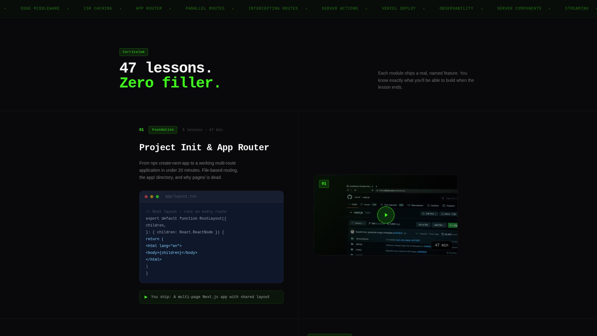
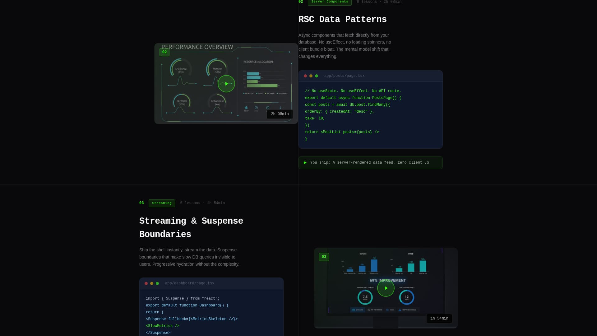
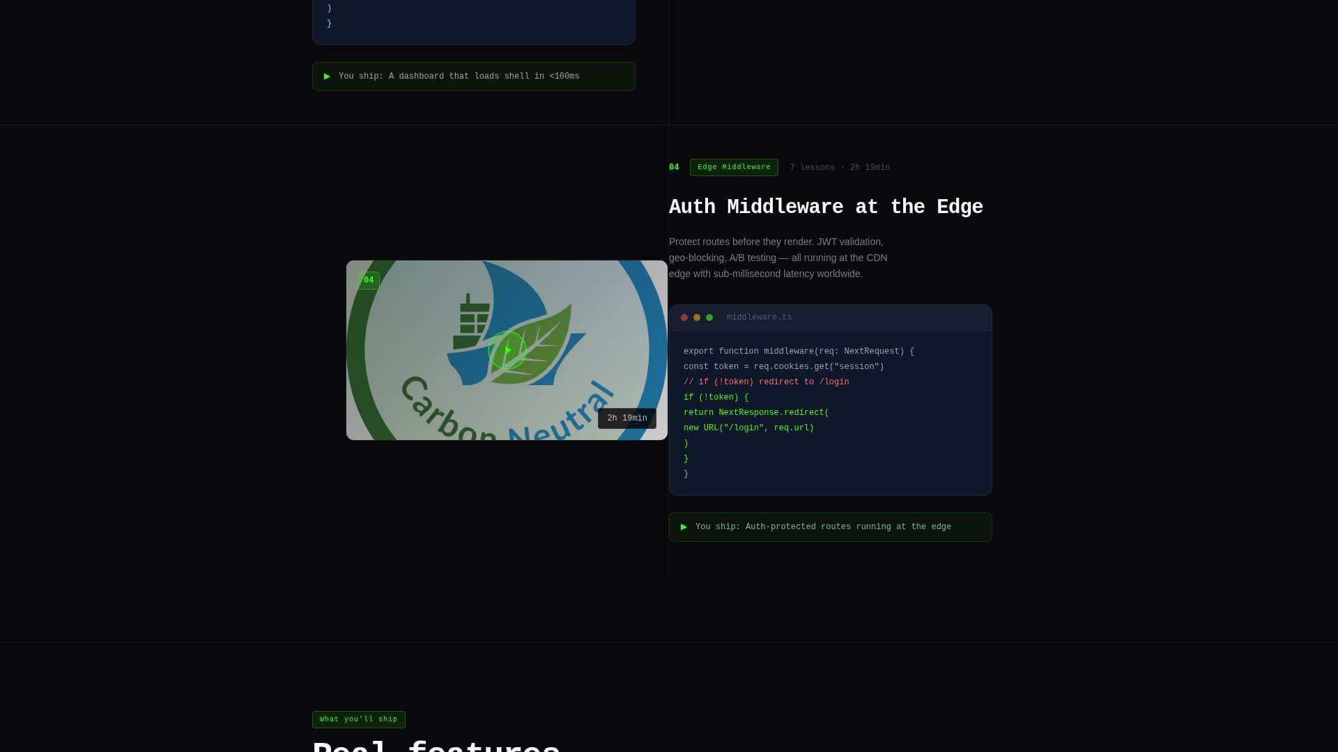
Split-Screen Section Layout
Every content section divides the viewport 50/50. The left panel holds a code snippet or terminal output. The right panel holds a video lesson preview with a play button and lesson duration. The rhythm repeats consistently down the page.
Live-Feel Dashboard Header
The header left panel shows a course progress interface. It includes module titles with partial checkmarks, a 67% completion ring, a before-and-after code diff for a refactored streaming server component, and timestamps beside each lesson. It looks like a live app, not a mockup.
Acid Green Pulsing call to action Button
The primary call-to-action button uses terminal phosphor green (#39FF14) and a pulse effect. It reads "Start the First Module Free" and appears in the header and repeats after every third section. This placement keeps the conversion prompt visible without interrupting the reading flow.
Dual Lead Capture Forms
The primary form asks for email only, one field, immediate access framing. The secondary form at the bottom adds a framework experience dropdown alongside the email field. Both forms reduce friction while segmenting visitors by experience level.
Launch Energy Section Escalation
The page is structured like a countdown. Early sections show project setup and routing. Middle sections reveal server components, auth middleware, and cache strategies. Final sections cover deployment and monitoring. Each section answers "what will I build?" with a named, specific feature.
Monospaced Headline Typography
The headline copy uses monospaced type to reinforce the terminal aesthetic. The type stacks over a subline that names the exact lesson count and total runtime, giving visitors specific, credible course details at first glance.
Page sections overview
| Section | Purpose |
|---|---|
| Split-screen header | Introduce the course with a dashboard preview and headline call to action |
| Project init section | Show stack setup: project init, routing, and layouts |
| Server components section | Demonstrate RSC data patterns with real code output |
| Auth middleware section | Reveal edge middleware and authentication logic |
| ISR cache section | Cover incremental static regeneration cache strategies |
| Deployment section | Show production deploy steps and terminal output |
| Monitoring section | Present post-deploy monitoring and course completion context |
| Curriculum download footer | Offer a secondary download call to action with a two-field form |
Design & branding system
The visual identity follows a Startup Velocity theme using the Acid Digital color system. It is designed to feel like coding at 2 AM, with every bright element appearing machine-rendered against deep black.
- Void black (#09090B) as the primary background, cool slate (#1E293B) for card surfaces and secondary panels, and overexposed white (#FAFAFA) for body text
- Terminal phosphor green (#39FF14) for all accents, interactive highlights, and the primary call to action button pulse
- Monospaced typeface for headlines, reinforcing the terminal and code aesthetic throughout the page
Mobile & speed optimization
The split-screen layout is structured to reflow clearly on smaller viewports. Each panel stacks vertically on mobile so code and video previews remain readable without horizontal scrolling.
- Code snippet panels and video lesson previews stack to full width on mobile screens
- The pulsing call to action button and email form remain prominent and accessible at all breakpoints
- Section transitions are kept short and direct to maintain the fast, relentless page rhythm on any device
How this template helps you convert
This template earns the click by showing real implementation detail before asking for anything. By the time a developer reaches the third section, they have already seen enough specific code output to trust the teaching quality.
- The header call to action appears immediately alongside a dashboard that looks like a live product, reducing skepticism before a single scroll
- The repeating code-plus-video section format lets visitors self-qualify by topic, so only the most interested developers reach the email form
- The dual form strategy captures both high-intent visitors ready to start and research-mode visitors who want the curriculum first
Other information about this template
This template is categorized under the Next.js video tutorial series niche and aligns with the Documentation and Support category for developer learning resources. It is a strong fit for any creator promoting a structured, production-focused coding course.
- The template style is Split Screen (50/50), a format proven to hold developer attention by pairing proof with narrative
- The header concept is Dashboard Preview, which establishes credibility through a realistic course interface rather than abstract hero imagery
- The creative direction is Launch Energy, meaning every scroll feels like escalating toward a working deployment rather than a passive marketing read
- The theme is Startup Velocity, communicating speed, precision, and real-world output as core course values
Theme
Startup Velocity
Creative direction
Launch Energy
Color system
Acid Digital
Style
Split Screen (50/50)
Direction
Lead Generation
Page Sections
Split-screen Section Layout
Live-feel Dashboard Header
Pulsing Acid Green Call to Action Button
Dual Lead Capture Forms
Launch Energy Section Escalation
Monospaced Headline Typography
Related questions
What kind of course is this landing page template designed for?
Can I use this template for a free course or a paid one?
How many lead capture forms does the template include?
Does the template include actual video player components?
Who is the ideal visitor this landing page is designed to convert?