Insuregrid - Instant Insurance Landing Page Template
Insuregrid is a dark-themed, data-driven insurance landing page template built for digital-first comparison. It presents six insurance categories in a 3x2 card grid, each showing live premium estimates and rate sparklines. A sticky "Compare My Rates" bar and a two-step progressive form turn every card tap into a qualified lead, fast.
by Rocket studio
Quick summary
Insuregrid is a single-page insurance comparison landing page that puts every plan front and center. Six category cards display lowest available premiums in oversized lime type, with micro-sparklines tracking rate trends. A sticky call-to-action bar and a two-step form make quote collection feel instant, not intrusive.
Who this template is for
This template is built for insurance brands, independent agents, and digital brokers who want to present multiple products without confusion. It works especially well for teams targeting younger, mobile-first buyers who compare options quickly.
- First-time insurance buyers in their mid-twenties shopping on a short break
- Freelancers balancing liability and health coverage on a single budget
- Young parents entering the market after a major life event
What problem this template solves
Most insurance pages bury their products under hero images and marketing text. Visitors leave before they reach a quote. This template replaces that pattern with a data grid that loads with answers already visible.
- Visitors see category pricing before they interact with any element
- The comparison flow builds trust without requiring personal data upfront
- The two-step form collects only what is needed, reducing drop-off
What you get with this template
You get a fully structured, single-page insurance landing page with a clear visual hierarchy and a conversion path baked into the layout. Every section has a specific job, and no section wastes space on decorative filler.
- A 3x2 insurance category card grid with premium display and sparkline trend visuals
- An expandable comparison table with toggle filters for deductible, coverage limit, and payment frequency
- A sticky bottom bar with a primary call-to-action that activates after card interaction
- A two-step progressive form pre-filled from the card the visitor tapped
- A carrier side-by-side spec sheet triggered without requiring any personal data entry
Feature list
This landing page packs several purpose-built components into one focused layout.
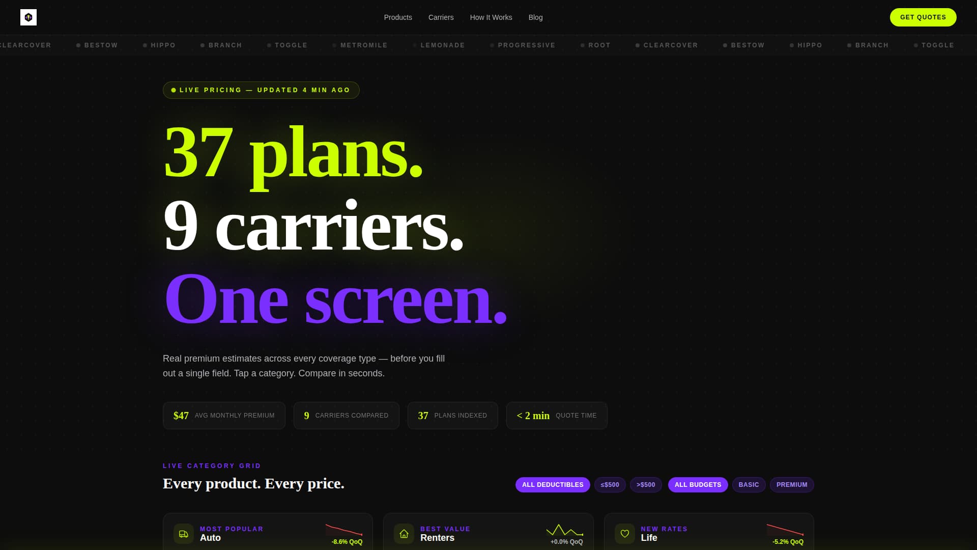
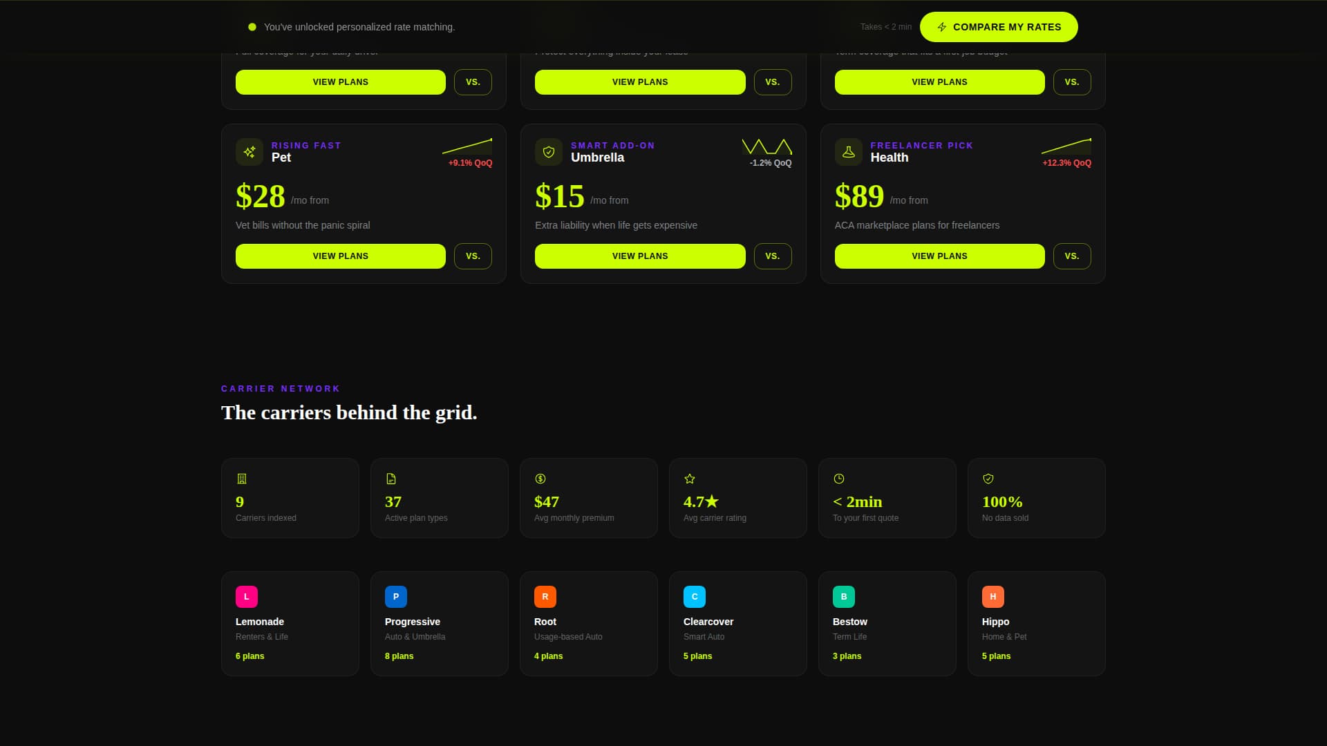
Live Category Card Grid
Six insurance categories sit in a 3x2 matrix. Each card shows a category icon, the lowest available monthly premium in large lime numerals, and a micro-sparkline of rate trends from the past quarter. The layout lets visitors scan all options at once without scrolling past decorative content.
Expandable Comparison Tables
Clicking any category card expands it into a full comparison table. Visitors can use toggle filters to sort by deductible level, coverage limit, and payment frequency. This progressive depth keeps the page from feeling overwhelming at first glance.
Sticky "Compare My Rates" Bar
A bottom bar stays fixed on screen once a visitor interacts with any card. It holds the primary call-to-action button and keeps the conversion path visible at every scroll depth without interrupting the browsing experience.
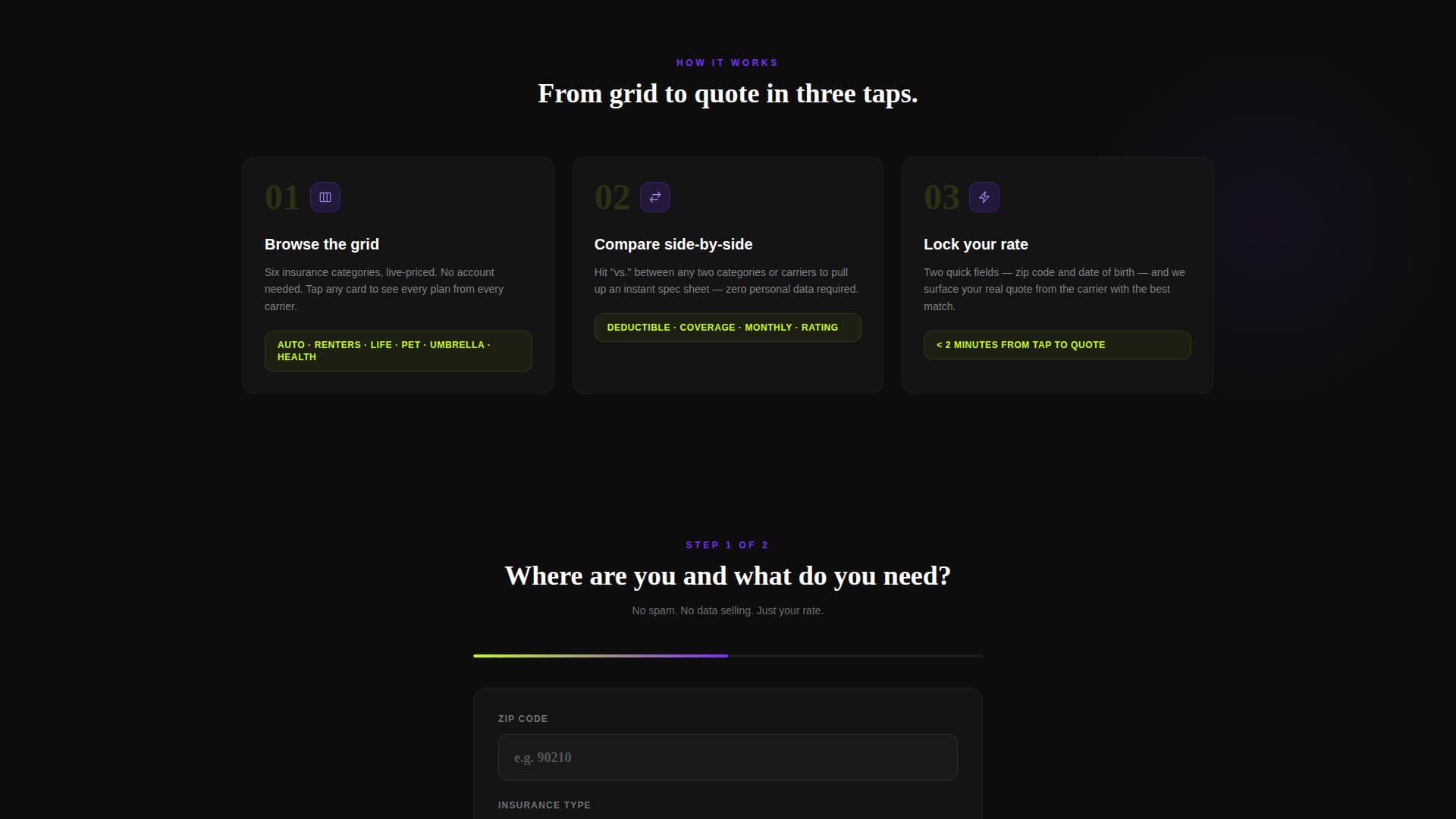
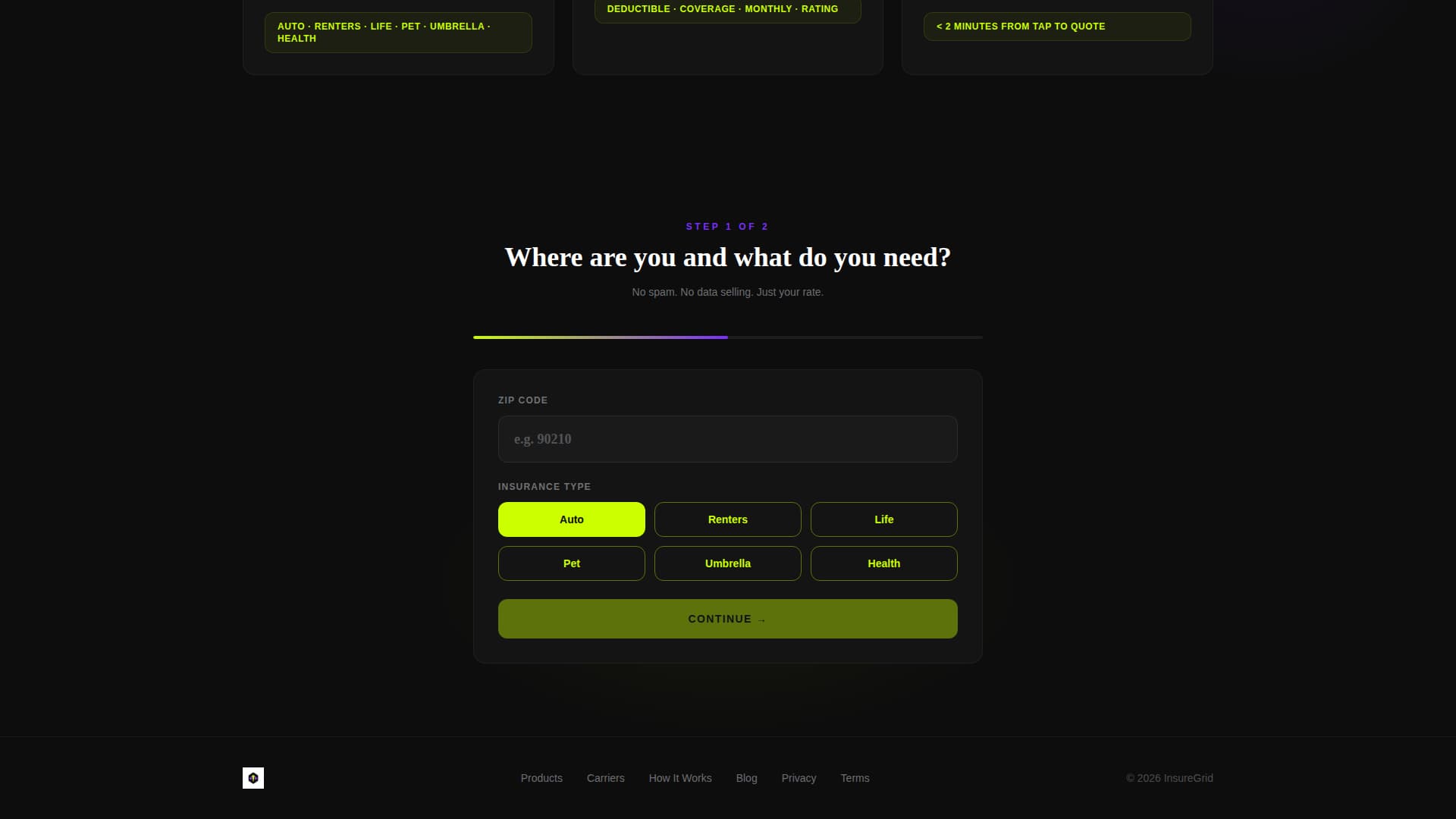
Two-Step Progressive Form
The quote form splits into two focused steps. Step one asks for zip code and insurance type, pre-filled from the card tapped. Step two asks for date of birth and coverage preference. Shorter steps reduce hesitation and keep form completion rates high.
Carrier Side-by-Side Spec Sheet
Visitors can tap a "versus." trigger between any two carrier cards to open an instant spec sheet comparison. No personal data entry is required for this step. It lets visitors build confidence before committing to the full quote form.
Scrolling Carrier Logo Bar
The header includes a slim, looping ribbon of carrier logos rendered in monochrome gray. Hovering over any logo floods it with the carrier's brand color. The loop runs continuously, signaling breadth of carrier coverage without a word of copy.
Page sections overview
| Section | Purpose |
|---|---|
| Scrolling Logo Bar | Displays carrier range at the top |
| Stat Impact Header | Anchors trust with hard data |
| Category Card Grid | Shows all insurance options at a glance |
| Expanded Comparison Table | Lets visitors filter plans in depth |
| Carrier Spec Sheet | Enables side-by-side plan review |
| Sticky call to action Bar | Keeps quote action always visible |
| Two-Step Quote Form | Collects lead data progressively |
Design & branding system
The visual system is built around an Acid Digital color palette on a Startup Velocity energy theme. The result feels like a live financial dashboard, not a static brochure.
- Void black (#0D0D0D) fills the background grid and anchors every element against a dark field
- Electric lime (#CCFF00) drives all interactive surfaces, live data numerals, and hover states so clickable elements pulse visibly
- Synthetic violet (#7B2FFF) marks category headers and toggle switches, giving structure to the data hierarchy
- Cool interface gray (#B0B3B8) handles body text and divider lines, keeping secondary content readable without competing with lime accents
Mobile & speed optimization
The layout is designed to translate the dashboard grid into a usable mobile experience. Touch targets are prominent and the sticky bar stays accessible on small screens.
- The 3x2 card grid reflows to a single-column scroll on narrow viewports, keeping premium data visible without horizontal scrolling
- The sticky "Compare My Rates" bar remains fixed at the bottom of the viewport on mobile, matching native app interaction patterns
- The two-step form uses large tap targets and pre-filled fields to reduce friction on touchscreens
How this template helps you convert
The page is engineered around a Comparison/Versus conversion strategy. Every design and layout decision pushes visitors toward the quote form through progressive engagement rather than aggressive prompting.
- The category card grid presents pricing immediately, giving visitors a reason to stay and explore before any form appears
- The no-data-required spec sheet comparison builds trust at zero cost, making visitors more willing to complete the two-step form afterward
- The sticky call-to-action bar activates only after card interaction, so it appears at the exact moment intent is highest
Other information about this template
This template sits at the intersection of insurance digital presence and technology-forward design. It is built for the insurance digital menu use case, where the goal is to display multiple products as clearly as a pricing screen, not a document.
- The template style is Dashboard/Data Grid, meaning the layout prioritizes scannable data over narrative copy
- The creative direction is Stats-First Impact, so numbers and live data carry the visual weight that hero images would in other templates
- The header concept is a Logo Bar, a horizontal looping ribbon that signals carrier range without requiring a dedicated section
- The landing page direction is Comparison/Versus, structuring the entire scroll as a decision-support tool
- Carrier logos referenced in the brief include names such as Lemonade, Progressive, Root, Clearcover, and Bestow, which represent the kind of modern digital carriers this template is designed to present
Theme
Startup Velocity
Creative direction
Stats-First Impact
Color system
Acid Digital
Style
Dashboard/Data Grid
Direction
Comparison/Versus
Page Sections
Live Category Card Grid
Expandable Plan Comparison Table
Sticky Quote Action Bar
Two-step Progressive Quote Form
Carrier Side-by-side Spec Sheet
Looping Carrier Logo Ribbon
Related questions
Can I edit the insurance categories shown in the card grid?
Does the comparison table require a live data feed to work?
What information does the two-step form collect?
Is the sticky call-to-action bar always on screen?
Is this template suitable for selling only one insurance product?