Infralab - Brutal DevOps Landing Page Template
Infralab is a bold brutalist landing page template built for hands-on DevOps lab environments. It uses a hub-and-spoke anchor navigation structure, a void-black and electric indigo color system, and a problem-to-solution scroll arc. Each section surfaces a real failure scenario, then presents the sandbox where engineers can reproduce and resolve it safely.
by Rocket studio
Quick summary
Infralab is a single-page landing page template designed for hands-on infrastructure lab platforms. It combines a bold brutalist visual identity with a hub-and-spoke anchor navigation layout. The page walks visitors through real failure scenarios and pairs each one with a sandboxed lab environment. The primary call to action, "Launch a Free Lab," drives visitors toward a GitHub single sign-on signup flow.
Who this template is for
This template is built for teams and individuals who learn by breaking things. It speaks directly to practitioners who live in the command line and need a platform that matches their mindset.
- DevOps leads who run chaos experiments before high-stakes production deploys
- Bootcamp graduates looking for hands-on practice beyond sanitized tutorial environments
- Platform engineering teams validating infrastructure changes against real failure conditions
What problem this template solves
Most lab platform landing pages look like documentation portals. They list features but never recreate the visceral urgency that makes engineers actually sign up. Infralab solves this by leading with dread and resolving it with capability.
- Visitors see their own past incidents reflected in each anchor section, which builds immediate trust
- Generic training pages bury the practical value; this template surfaces it in every scroll step
- No form friction on the page means the path from recognition to signup stays frictionless
What you get with this template
You get a complete, styled, single-page landing page ready to represent a hands-on lab environment. Every visual and structural decision in this template serves the goal of converting skeptical engineers into active users.
- A scrolling logo bar header featuring integration and platform icons in monochrome
- Four hub-and-spoke anchor sections, each named after a real failure scenario
- A persistent bottom bar and in-page call-to-action placements for "Launch a Free Lab"
Feature list
This template ships with a focused set of components. Each one is purpose-built for the hands-on lab use case and the bold brutalist design language.
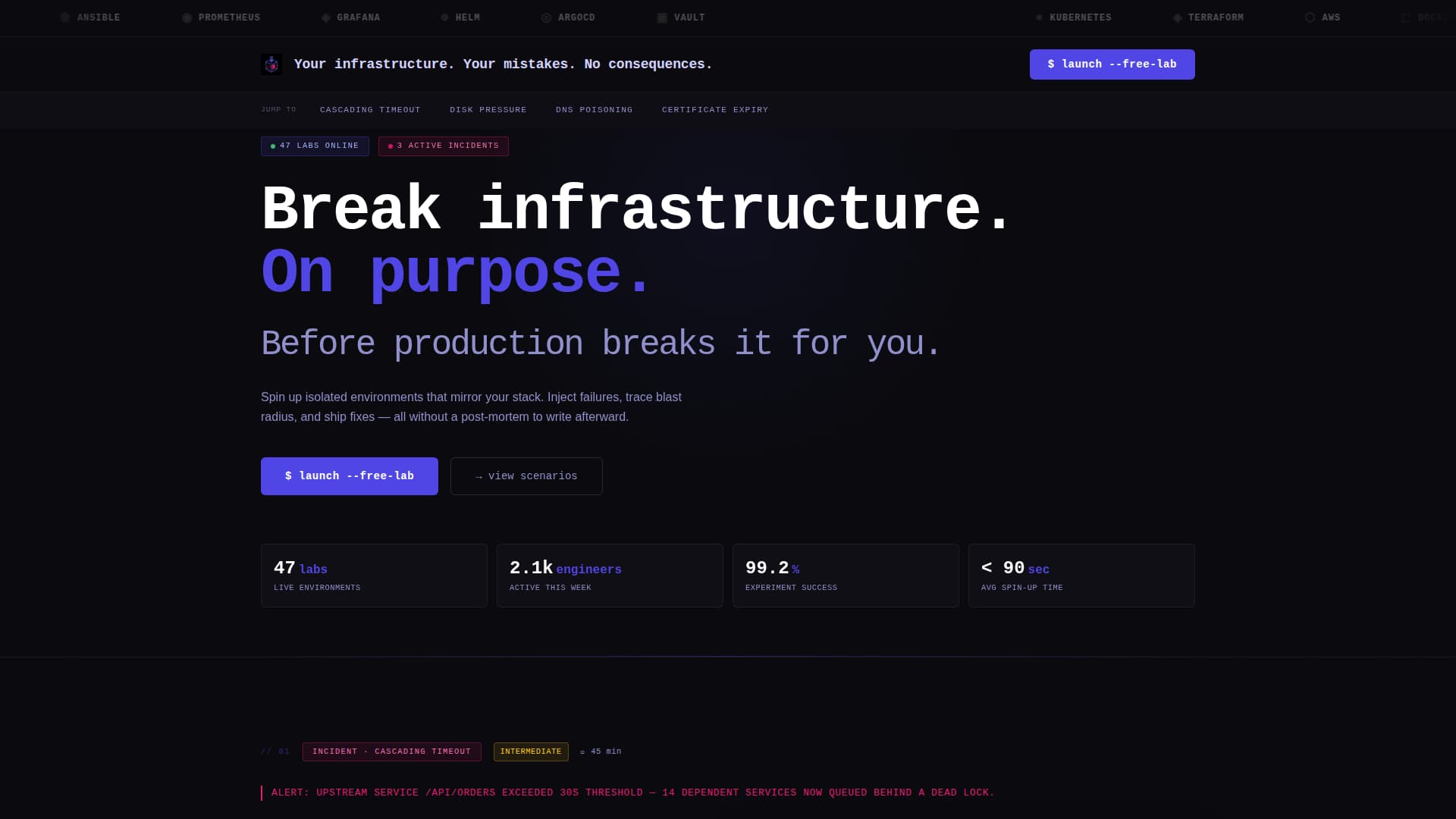
Typing Animation Headline
The header displays a monospaced headline that types character by character on load. The effect reads: "Your infrastructure. Your mistakes. No consequences." It signals to visitors that a session is already initializing, setting the tone before any copy is read.
Scrolling Integration Logo Bar
A horizontal ticker scrolls a row of platform and integration logos in monochrome against the void-black background. The slow scroll mimics an airport departure board, establishing tool credibility immediately and silently.
Hub and Spoke Anchor Navigation
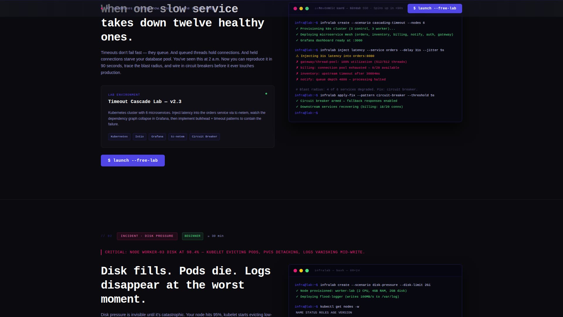
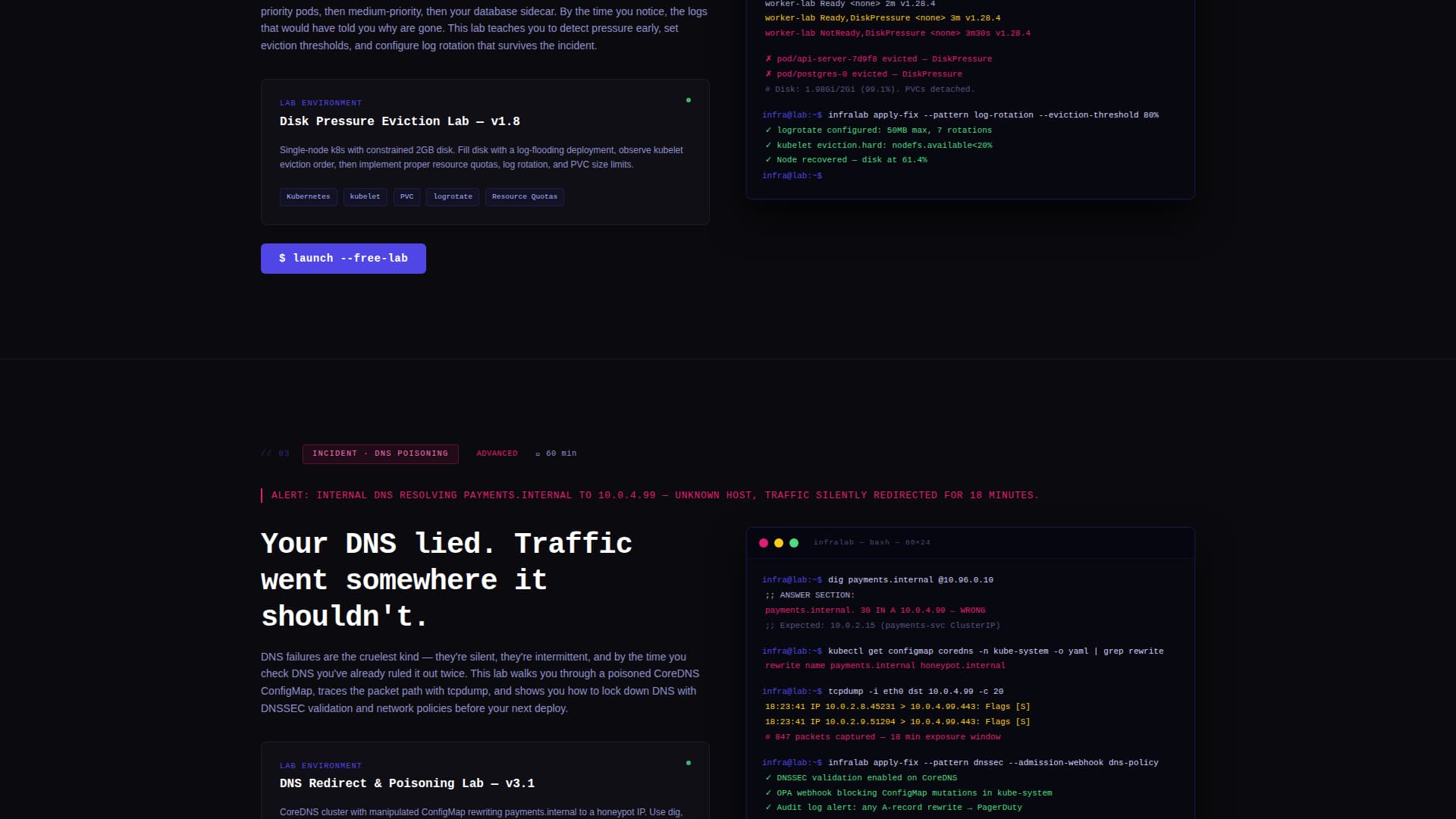
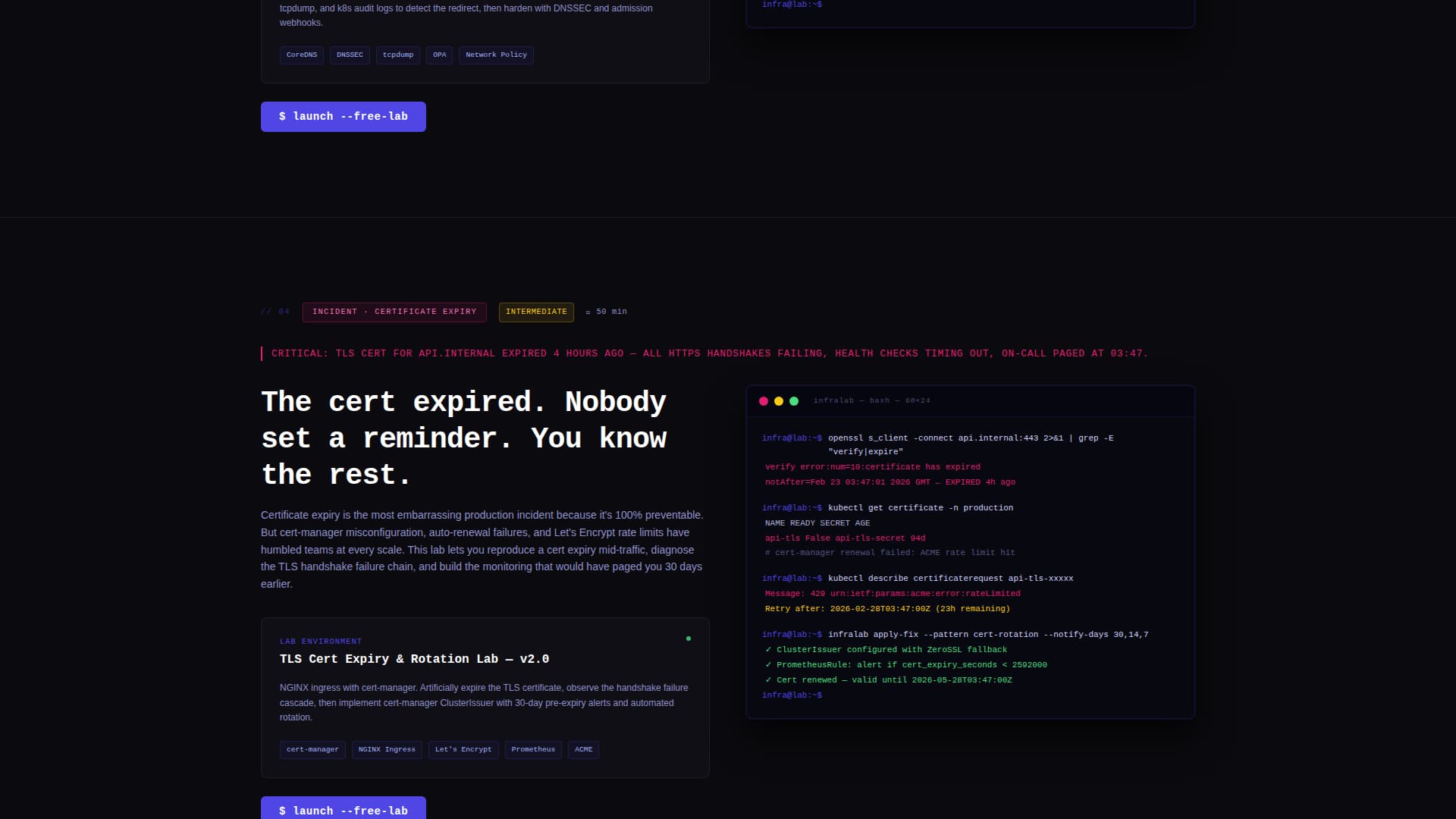
A sticky navigation bar holds four anchor links named after real failure modes: Cascading Timeout, Disk Pressure, DNS Poisoning, and Certificate Expiry. Active states are highlighted in electric indigo, letting visitors jump directly to the failure scenario most relevant to their experience.
Problem-to-Solution Scroll Arc
Each spoke section opens with a brutal one-line incident description rendered in fault-line magenta. It then reveals the lab environment that lets the visitor reproduce, diagnose, and resolve that specific failure, complete with an embedded terminal screenshot showing actual command output.
Persistent Call-to-Action Bar
The "Launch a Free Lab" call to action appears first below the logo bar in the header. It then resurfaces as a persistent bottom bar at the close of every spoke section. There is no form on the page; the click routes directly to a GitHub single sign-on signup flow.
Fault-Line Accent System
Fault-line magenta is reserved exclusively for destructive-action accents and error-state callouts. This strict color discipline means every magenta element carries real signal weight, making incident descriptions and critical prompts impossible to ignore.
Page sections overview
| Section | Purpose |
|---|---|
| Header Logo Bar | Establish platform credibility with scrolling integration logos and typing headline |
| Sticky Anchor Nav | Let visitors jump to the failure scenario most relevant to them |
| Cascading Timeout Spoke | Reproduce and resolve cascading service timeout failures in a sandbox |
| Disk Pressure Spoke | Practice diagnosing and clearing disk pressure incidents hands-on |
| DNS Poisoning Spoke | Walk through a DNS poisoning scenario from trigger to resolution |
| Certificate Expiry Spoke | Simulate certificate expiry failures and practice the fix in real time |
| Persistent call to action Bar | Surface "Launch a Free Lab" at every decision point without a form |
Design & branding system
The visual identity follows a bold brutalist theme. Every color in the system earns its place by signaling something functional, nothing exists purely for decoration.
- Void black (#0B0B0F) fills the dominant background, creating the atmosphere of a dark server room
- Electric indigo (#4F46E5) marks anchor navigation highlights and active states across the sticky nav
- Terminal phosphor (#D4D4FF) is used for body text, giving copy a faint glow against the dark field
- Fault-line magenta (#E11D74) appears only on destructive-action accents and error-state callouts
Mobile & speed optimization
The template is structured to present cleanly across screen sizes. The bold brutalist layout relies on strong typographic hierarchy and high-contrast color, which scales naturally to smaller viewports.
- The sticky anchor navigation collapses gracefully so mobile visitors can still jump between spoke sections
- Terminal screenshot embeds and the scrolling logo bar are contained within responsive layout boundaries
How this template helps you convert
Infralab is built around a single conversion goal: get engineers to click "Launch a Free Lab." Every structural and visual decision supports that outcome.
- The typing animation headline and scrolling logo bar establish credibility and atmosphere within seconds of the page loading, holding attention before the visitor reads a single line of copy.
- The problem-to-solution arc in each spoke section mirrors the visitor's own experience. By the third spoke section, most visitors will have recognized a real incident they have lived through, creating the emotional momentum that drives the click.
- The persistent bottom bar and in-header call-to-action placement means the signup prompt is always visible without interrupting the scroll narrative, keeping the path to conversion open at every moment.
Other information about this template
This template is designed specifically for the training and certification subcategory within documentation and support platforms. It is a strong fit for any hands-on lab environment that wants to position itself as a serious practitioner tool rather than a beginner tutorial site.
- The no-form conversion model routes directly to a GitHub single sign-on flow, reducing signup friction for developer audiences
- The bold brutalist theme and electric indigo color system differentiate this template visually from conventional SaaS landing page styles
- The hub-and-spoke anchor navigation structure makes it easy to add or swap out failure scenario spoke sections as a platform's lab catalog grows
- This template suits platforms built around tools commonly found in infrastructure engineering workflows, such as container orchestration systems, infrastructure-as-code tools, cloud provider environments, configuration management platforms, and containerization runtimes
Theme
Bold Brutalist
Creative direction
Problem→Solution Arc
Color system
Electric Indigo
Style
Hub & Spoke (Anchor Nav)
Direction
Click-Through
Page Sections
Typing Animation Headline
Scrolling Integration Logo Bar
Hub and Spoke Anchor Navigation
Problem-to-solution Scroll Arc
Persistent Call-to-action Placement
Fault-line Accent Color System
Related questions
Who is this landing page template designed for?
Does the page include a signup form?
Can I change the failure scenario names in the anchor navigation?
How many times does the call to action appear on the page?
Is this template suited for a platform targeting professional engineers?