High-Stakes Advisory Impact Metrics Website Template
Catalyst is a scroll-reveal consulting landing page built for high-stakes advisory firms. An animated metrics header quantifies impact before a single word is read. A progressive feature matrix then diagnoses the visitor's current state against a transformed future, row by row, in a sharp Tech Glass visual system designed to earn trust and drive diagnostic requests.
by Rocket studio
Quick summary
Catalyst is a single-page consulting landing page template built around a scrolling feature matrix and a live-feel metrics header. It is designed for firms that solve complex operational and technology challenges. Every section reveals progressively as the visitor scrolls, building a clear case before the call to action ever appears.
Who this template is for
This template is built for consulting firms that sell transformation, not retainers. It speaks to practices where the work is specific, the stakes are high, and the client needs proof before they pick up the phone.
- Strategy and operations consultancies serving senior executives such as Chief Technology Officers and Chief Operating Officers
- Technology advisory firms working with private equity-backed portfolio companies on rapid performance improvements
- Boutique consulting practices that need a landing page reflecting the precision and authority of their actual work
What problem this template solves
Most consulting landing pages lead with credentials and end with a contact form. The visitor never sees themselves in the page. Catalyst flips that sequence by showing the client's current inefficiency first, then revealing the improvement alongside it.
- Visitors leave before forming intent because the page never diagnoses their specific pain
- Generic hero sections fail to communicate the quantified value a firm actually delivers
- Standard contact forms appear before trust is established, reducing the likelihood of a qualified request
What you get with this template
You get a complete, scroll-driven consulting landing page that builds its case section by section. The layout is structured to move a skeptical senior buyer from recognition to request without rushing the journey.
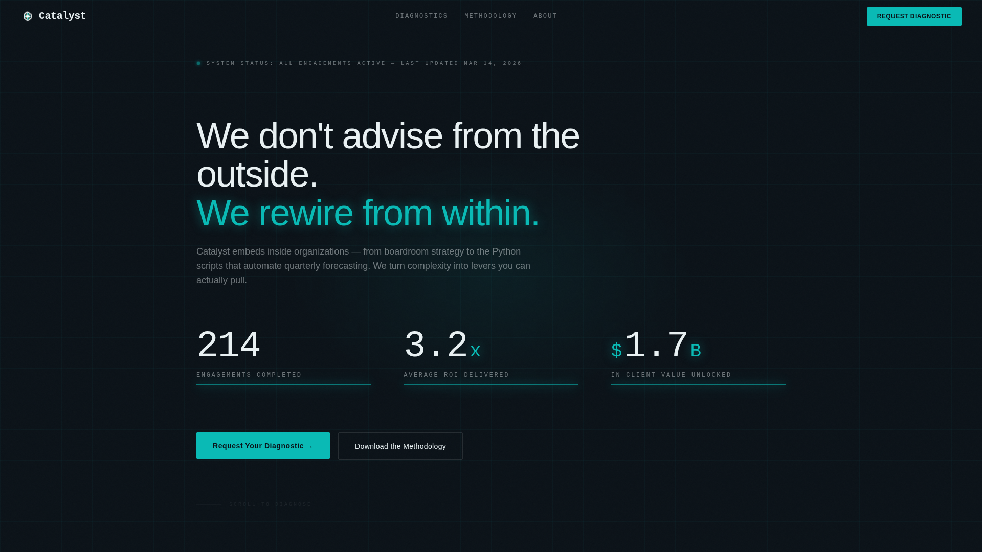
- An animated metrics header that counts up live-feel statistics to establish credibility immediately
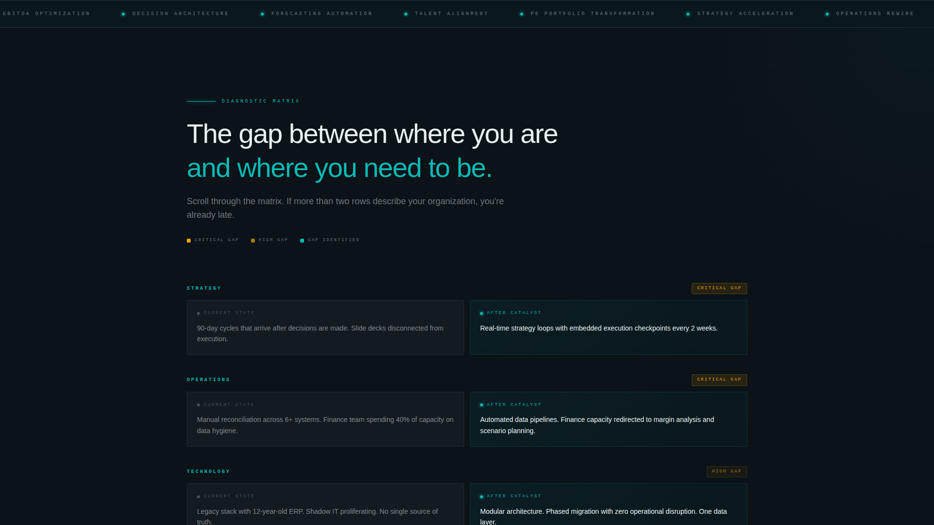
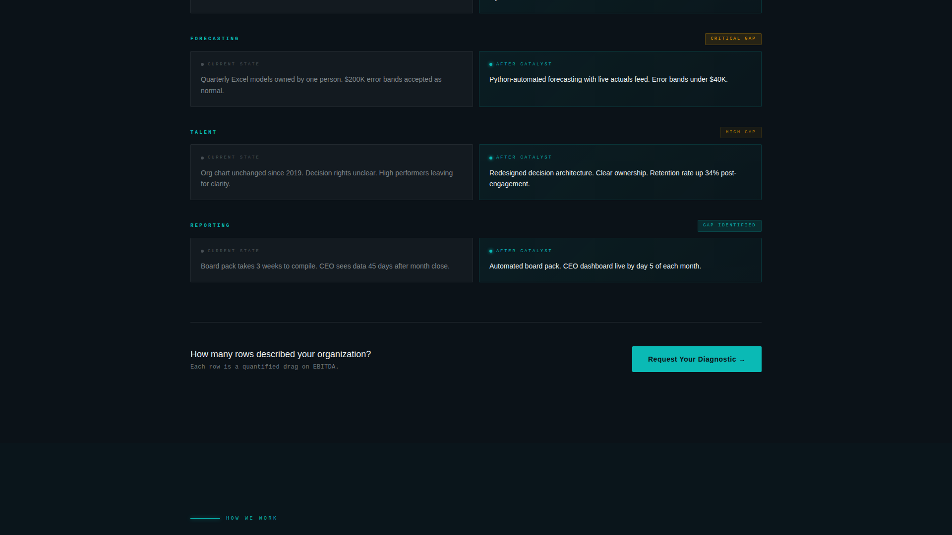
- A progressive feature matrix that compares the client's current state against the improved state, with each row animating into view on scroll
- A two-step diagnostic request form and a secondary single-field email gate for visitors who prefer to start with a resource download
Feature list
This template includes purpose-built components tied directly to consulting firm conversion needs. Each one serves a specific role in the scroll-driven persuasion flow.
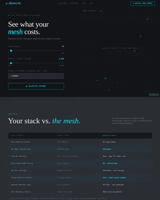
Animated Metrics Dashboard Header
The page opens with a full-viewport metrics wall. Counters tick upward with eased motion, displaying figures such as completed engagements, average return on investment, and total client value. There is no hero image. The numbers do the talking.
Progressive Scroll-Reveal Matrix
The feature matrix builds itself as the visitor scrolls. The first panel shows the current pain state. The second panel splits to reveal the firm's methodology alongside it. By the third scroll position, a full before-and-after comparison is assembled across strategy, operations, technology, and talent dimensions.
Amber Accent Highlight System
Signal amber is used exclusively to flag the widest performance gaps in the comparison matrix. It appears only where contrast is highest, drawing the eye to the rows where transformation value is most obvious. This restraint makes every amber element feel urgent and intentional.
Two-Step Diagnostic Request Form
The primary call to action opens a two-step form. Step one collects company size, industry, and the specific capability gap that brought the visitor to the page. Step two captures name, role, and email. The sequence mirrors the matrix structure, making the form feel like a natural continuation of the diagnosis.
Secondary Methodology Download Gate
Visitors not ready to request a consultation can access a downloadable methodology document behind a single email field. This path captures intent from buyers earlier in their decision process without requiring a full form commitment.
Floating and Anchored Call-to-Action Placement
The primary call-to-action button appears first as a floating element after the metrics header, then anchors again at the base of the completed comparison matrix. This dual placement ensures the next step is always visible at the two highest-intent moments on the page.
Page sections overview
| Section | Purpose |
|---|---|
| Metrics Header Wall | Establishes credibility with animated, quantified engagement statistics |
| Current State Card | Presents the visitor's pain state in a frosted glass panel before offering solutions |
| Methodology Reveal | Splits the card to introduce the firm's approach column by column on scroll |
| Full Comparison Matrix | Assembles the complete before-and-after view across four capability dimensions |
| Floating call to action Button | Provides an immediate next step after the metrics section without disrupting scroll |
| Diagnostic Request Form | Captures company context and capability gap in a structured two-step sequence |
| Methodology Download Gate | Offers a lower-commitment entry point for visitors earlier in the buying process |
| Anchored call to action Block | Reinforces the primary call to action at the base of the completed matrix |
Design & branding system
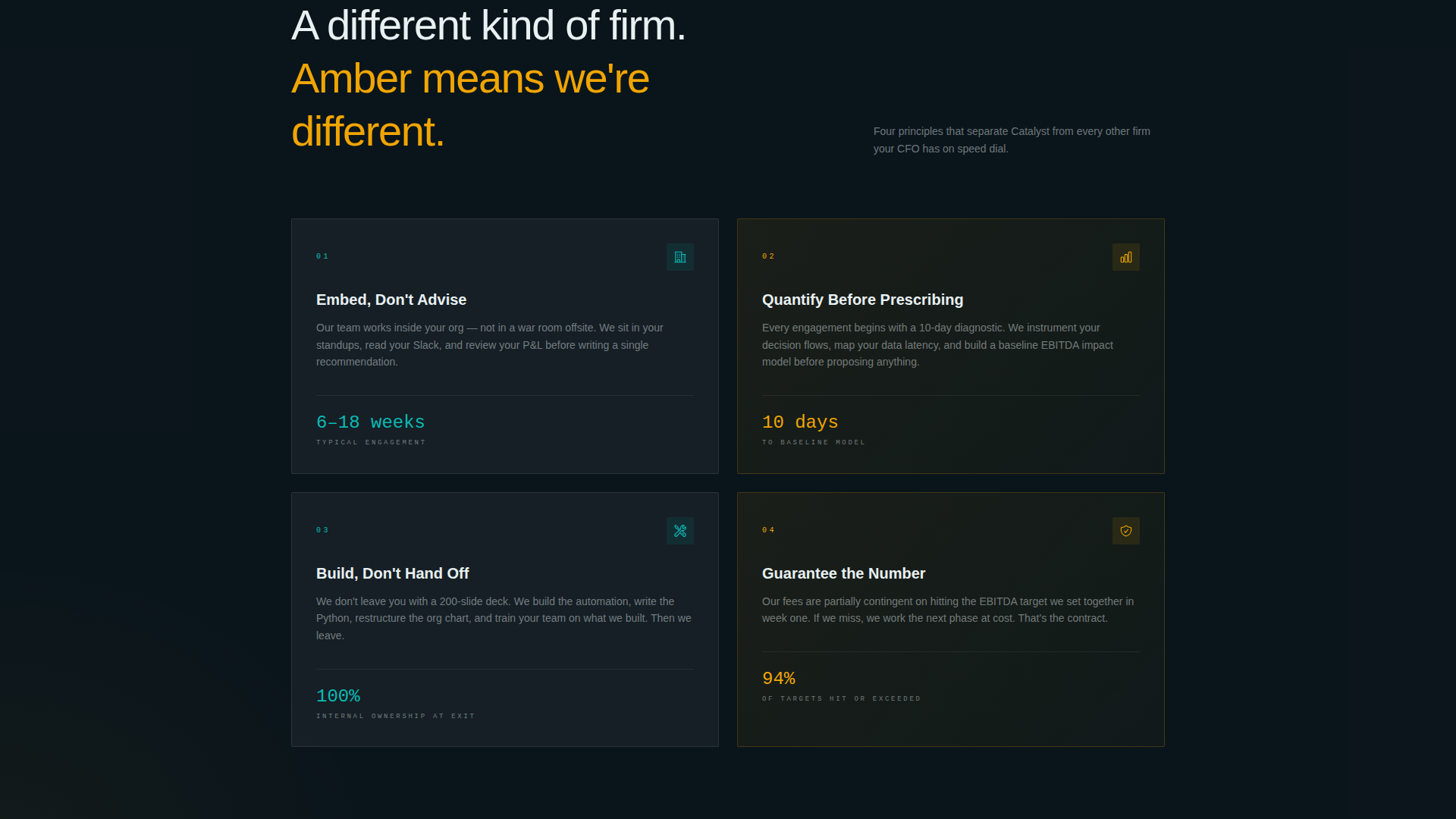
The visual identity uses a Tech Glass theme built around the Teal Catalyst color system. Every color choice is purposeful, and the palette functions more like a dashboard interface than a marketing brochure.
- Deep command-center black (#0B1218) forms the base layer, with frosted glass panels in (#E8F0F2) floating above it and translucent teal (#0ABAB5) bleeding softly behind active cards like backlit acrylic
- Signal amber (#F0A500) is reserved exclusively for comparison highlights and differentiator callouts, ensuring it never competes with the primary palette and always signals critical information
- Typography uses a thin monospace typeface for metrics and data labels, reinforcing the command-center aesthetic throughout the header and matrix sections
Mobile & speed optimization
The scroll-reveal structure and glassmorphism layers are built to perform cleanly across screen sizes. The progressive reveal works on touch-based scrolling as well as desktop, so the diagnostic journey holds together on any device.
- Glassmorphism panel effects and teal backlight treatments are implemented with CSS-layer efficiency to keep visual weight low on mobile viewports
- The animated metrics counters and scroll-triggered matrix reveals are designed with eased, non-blocking motion so the page feels live without delaying content visibility
How this template helps you convert
Catalyst is structured as a persuasion sequence, not a brochure. Every layout decision is made to reduce friction at the moment the visitor is most ready to act.
- The metrics header front-loads proof, so the visitor arrives at the matrix already primed with evidence of real results rather than claims they need to evaluate
- The comparison matrix makes the visitor's own inefficiency visible and quantified before the call to action appears, so the request form feels like a logical next step rather than a cold ask
Other information about this template
Catalyst is a strong fit for firms that need a consulting firm services page capable of handling a senior, skeptical audience. The template is built on a scroll-reveal structure that suits single-page deployment.
- The template is categorized under Technology and sits within the Consulting Firm Website Templates subcategory, making it a focused solution for technology-adjacent advisory practices
- The Teal Catalyst color system and Tech Glass theme are consistent with the visual language that senior technology and operations buyers associate with precision tooling and command-level data
- The Comparison/Versus landing page direction is deliberately chosen: the matrix format mirrors how experienced buyers evaluate change, making the page feel less like marketing and more like a structured briefing
- The template style is Scroll Reveal (Progressive), which means content is withheld and released in sequence, keeping attention focused and reducing the tendency to skim past critical proof points
- The header concept is Stats/Metrics, replacing the typical hero image with a live-feel data wall that communicates scale and track record within the first few seconds of load
Theme
Tech Glass
Creative direction
Feature Matrix
Color system
Teal Catalyst
Style
Scroll Reveal (Progressive)
Direction
Comparison/Versus
Page Sections
Animated Metrics Dashboard Header
Progressive Scroll-reveal Feature Matrix
Amber Accent Highlight System
Two-step Diagnostic Request Form
Secondary Methodology Download Gate
Floating and Anchored Call to Action Placement
Related questions
Who is this template designed for?
Can I customize the metrics shown in the header?
How does the two-step diagnostic form work?
What is the methodology download gate?
Does the scroll-reveal animation work on mobile devices?