Guarantee — Smart Insurance Solutions Landing Page Template
Underwrite is a dark-themed, dashboard-style landing page template built for insurance AI chatbot products. It follows a Problem-to-Solution scroll arc, moves through live-metric comparisons, integration maps, and conversation replays, and drives Freemium or trial sign-ups through a two-step progressive form. The visual identity uses void black, holographic violet, and spectral teal to make data feel operational and alive.
by Rocket studio
Quick summary
Underwrite is a single-page, dashboard-style template for insurance AI chatbot platforms. It opens in operational darkness, walks visitors through a before-and-after carrier metrics comparison, and closes with a persistent conversion bar. The design language references a real-time operations center, built for buyers who need to feel the product working before they hand over their email.
Who this template is for
This template is built for teams selling or deploying AI-driven insurance automation tools to serious operational buyers. It skips the fluff and speaks directly to people managing backlogs, headcount constraints, and vendor fatigue.
- Mid-market property and casualty carriers dealing with first notice of loss backlogs
- Managing general agents scaling inquiry volume without growing their support teams
- InsurTech operations leaders evaluating AI tools against existing policy administration systems
What problem this template solves
Insurance buyers are overloaded with vendor demos and under-impressed by generic SaaS landing pages. They need to see real operational impact before they commit to a trial. A landing page that leads with abstract benefit claims loses them immediately.
- Carriers and MGAs need proof of performance, not promises, before signing up
- Visitors land with high skepticism and low patience for slow-building narratives
- Traditional landing pages fail to communicate technical credibility to operations-minded buyers
What you get with this template
You get a fully structured, single-page layout designed around the specific decision-making journey of insurance operations buyers. Every section earns the next scroll, and the page ends in conversion.
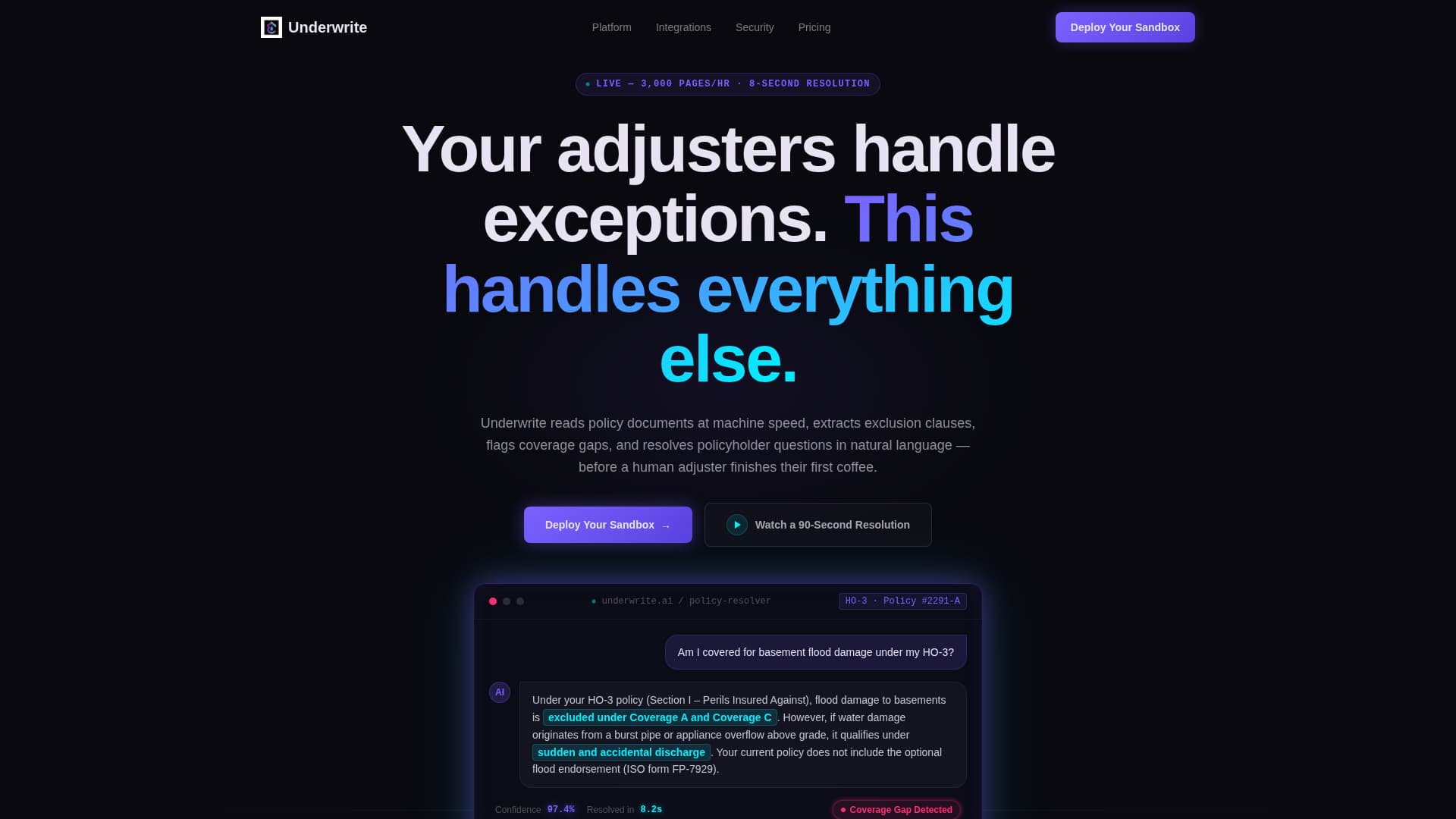
- A full-bleed dark header with a simulated AI chat thread showing a real policy question and a clause-specific answer
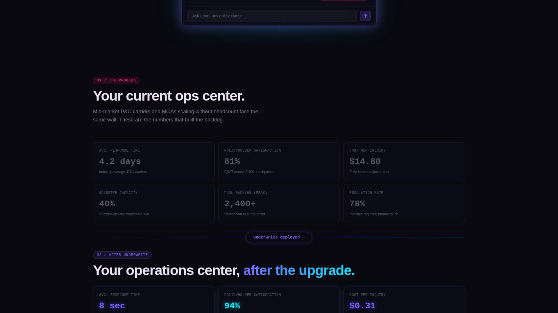
- A Problem-to-Solution metrics arc comparing pre-AI and post-AI carrier performance numbers side by side
- A two-step progressive conversion form, a secondary inline video demo trigger, and a persistent bottom conversion bar
Feature list
This template covers the full visual and structural toolkit needed to present an insurance AI chatbot to a technically minded, conversion-ready audience.
Simulated Chat Header with Confidence Display
The header centers a floating chat window showing a policyholder question and an AI-generated clause-specific answer. The relevant policy paragraph is highlighted in spectral teal. A confidence score pulses at 97.4 percent in holographic violet, making the product feel live and credible from the first second.
Before-and-After Carrier Metrics Grid
Two data grids sit on either side of a pulsing iridescent divider. The first shows deliberately muted, underwhelming carrier stats such as a 4.2-day average response time, 61 percent satisfaction, and a $14.80 cost per inquiry. The second mirrors the same grid powered by AI, with response time at 8 seconds, satisfaction at 94 percent, and cost at $0.31.
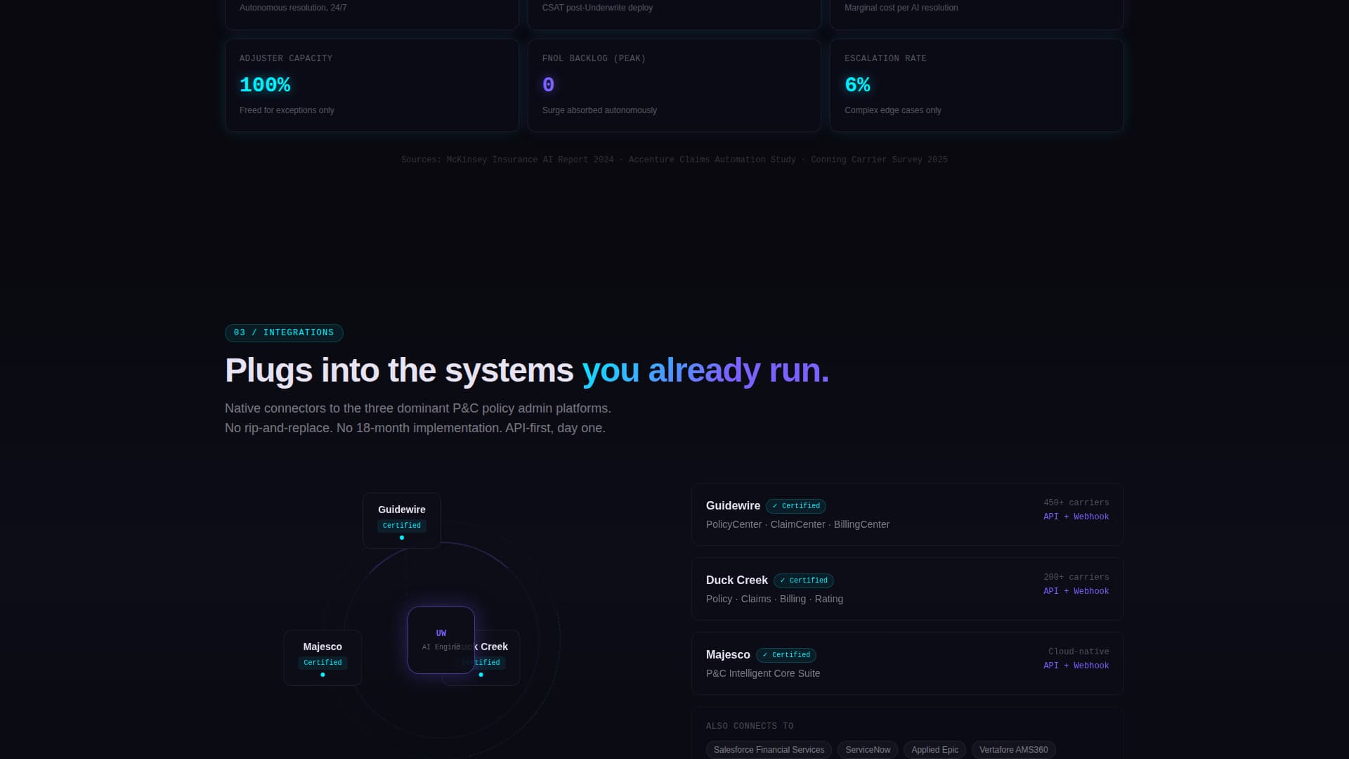
Integration Map Section
A visual map displays live-style connections to named policy administration platforms. This section addresses the top objection from operations buyers: whether the tool will actually connect to what they already use.
Conversation Replay Carousel
A scrollable carousel shows autonomous resolutions across claims, endorsements, and billing inquiries. Each replay card demonstrates the chatbot handling a different inquiry type, giving buyers confidence across their actual use cases.
Compliance and Audit Trail Module
A dedicated section surfaces audit trail records and regulatory flag indicators. This gives compliance-aware buyers a visible signal that the platform supports oversight requirements.
Two-Step Progressive Conversion Form
Step one asks only for work email and carrier name. Step two, shown after the initial click, collects policy administration system, monthly inquiry volume range, and top use case. This reduces entry friction while qualifying leads in the same flow.
Page sections overview
| Section | Purpose |
|---|---|
| Dark Chat Header | Opens with simulated AI resolution and headline |
| Pre-AI Metrics Grid | Establishes operational pain with real carrier data |
| Iridescent Divider | Marks the transition from problem to solution |
| Post-AI Metrics Grid | Shows AI-powered performance improvement |
| Integration Map | Addresses policy admin system compatibility objections |
| Conversation Replay Carousel | Demonstrates resolution across multiple inquiry types |
| Compliance Audit Module | Shows regulatory flagging and audit trail support |
| Progressive Sign-Up Form | Captures lead data in two low-friction steps |
| Inline Video Demo Trigger | Provides secondary path for undecided visitors |
| Persistent Bottom Bar | Repeats primary call to action after 60 percent scroll |
Design & branding system
The visual identity is built around a Data Command theme. The palette reads like light refracting through a prism onto a matte-black surface, clinical darkness cut through by streaks of impossible color.
- Void black (#09090F) as the primary canvas, holographic violet (#7B61FF) for primary actions and data highlights, spectral teal (#00F0FF) for secondary metrics and graph lines, soft iridescent pearl (#E8E3F3) for body text, and deep signal magenta (#FF2D78) reserved for alert states and urgency badges only
- No stock photography and no human faces appear anywhere; the only visuals are the product interface, working in context
- The header chat window uses a slow-breathing iridescent border glow; the divider between metric grids pulses with iridescent light; alert states use magenta exclusively to maintain visual hierarchy and signal urgency
Mobile & speed optimization
The template is structured to stay readable and visually coherent at smaller screen sizes. The data grid and carousel layouts are designed to reflow without losing the command-center aesthetic.
- The chat header and metric grids scale to single-column layouts on mobile without losing the before-and-after visual contrast
- The persistent bottom conversion bar and progressive form steps are designed to remain accessible and functional on touch screens
- The inline video demo trigger is positioned as a secondary call to action that does not compete with the primary form flow on any screen size
How this template helps you convert
The page is built around a Freemium and trial conversion strategy. Every design choice moves a skeptical operations buyer toward the "Deploy Your Sandbox" action without pressure or vague promises.
- The primary call to action, "Deploy Your Sandbox," appears at the header fold, again after the metrics comparison section, and as a persistent bottom bar triggered at 60 percent scroll depth, so it meets visitors wherever they are in their decision.
- The secondary path, "Watch a 90-Second Resolution," triggers an inline video demo for visitors who are not ready to commit, capturing intent without requiring a form submission and keeping them on the page.
- The two-step progressive form reduces sign-up friction by asking only for work email and carrier name in step one, then collecting qualification details in step two after the visitor has already clicked through.
Other information about this template
This template is categorized under Technology, specifically within the AI for Insurance subcategory, and is built around the insurance AI chatbot niche. It is a strong match for teams building or marketing tools that automate policy document reading, exclusion clause extraction, coverage gap detection, and natural language policyholder responses.
- The template style is Dashboard and Data Grid, making it suitable for products where operational metrics and live data states are core to the value proposition
- The creative direction follows a strict Problem-to-Solution Arc, starting the scroll in visible pain and accelerating toward a confident, data-dense resolution by the final section
- The header concept is Dark Full-Bleed with Glow, designed to feel like an operations center at night rather than a standard SaaS hero banner

Theme
Data Command
Creative direction
Problem→Solution Arc
Color system
AI Iridescent
Style
Dashboard/Data Grid
Direction
Freemium/Trial
Page Sections
Simulated AI Chat Header
Before-and-after Metrics Grid
Policy Admin Integration Map
Conversation Replay Carousel
Compliance and Audit Trail Module
Two-step Progressive Sign-up Form
Related questions
What kind of product is this template designed to showcase?
Can I edit the carrier metrics and chat thread content in the template?
Does this template include the two-step form and video demo trigger?
Is this template suitable for a product that integrates with specific policy administration systems?
How many times does the primary call to action appear on the page?