Folio - Analytical Real Estate Landing Page Template
Folio is a hub-and-spoke landing page template built for a premium real estate investing monthly publication. It guides analytically minded readers through a full deal cycle across four narrative spokes, earning their email address only after demonstrating genuine depth. The design draws from an Atelier Studio and Japanese Zen editorial aesthetic, pairing warm washi tones with sumi ink typography.
by Rocket studio
Quick summary
Folio is a single-page editorial template for a monthly real estate investing publication. It uses a fixed anchor navigation and a Day-in-the-Life creative direction to walk readers through one deal cycle from morning lead to evening decision. The design is quiet and intentional, built to earn trust before it asks for anything.
Who this template is for
This template suits publishers and independent writers who produce analytical real estate content at a professional level. It is designed for creators whose audience already holds investment properties and wants institutional-grade deal breakdowns, not beginner tutorials.
- Mid-career real estate investors evaluating syndications and secondary markets
- Editorial creators producing long-form, research-driven monthly publications
- Real estate professionals building a subscriber-supported deep-dive newsletter
What problem this template solves
Most editorial templates are built for blogs or news feeds, where fast scanning and high volume are the goals. Folio solves the opposite problem: how to slow a sophisticated reader down, build credibility section by section, and earn an email address only after demonstrating real analytical value.
- Typical landing pages push the call to action too early, before trust is established
- Generic newsletter templates lack the structure needed to present pro formas, photo essays, and audio transcripts together
- Most designs do not support the rhythm of alternating between reading and interacting that analytical content requires
What you get with this template
You get a fully structured, single-page editorial layout built around five content spokes and a fixed anchor navigation system. Every section serves a specific role in the reader journey, from narrative journalism to an annotated pro forma table to a scroll-earned email gate.
- A full-bleed hero section with vertical issue-number typography and a workspace photo concept
- Four content spokes labeled as hours of the day, each with a distinct content format
- A scroll-triggered email gate that appears only after the reader has moved through the first two spokes
Feature list
This template is built around a set of purposeful components. Each one serves the editorial experience directly.
Fixed Anchor Navigation with Hour Labels
The left-aligned anchor navigation stays fixed as readers scroll. Each link is labeled as a time of day rather than a generic section title, reinforcing the Day-in-the-Life creative direction and giving readers a clear sense of where they are in the deal story.
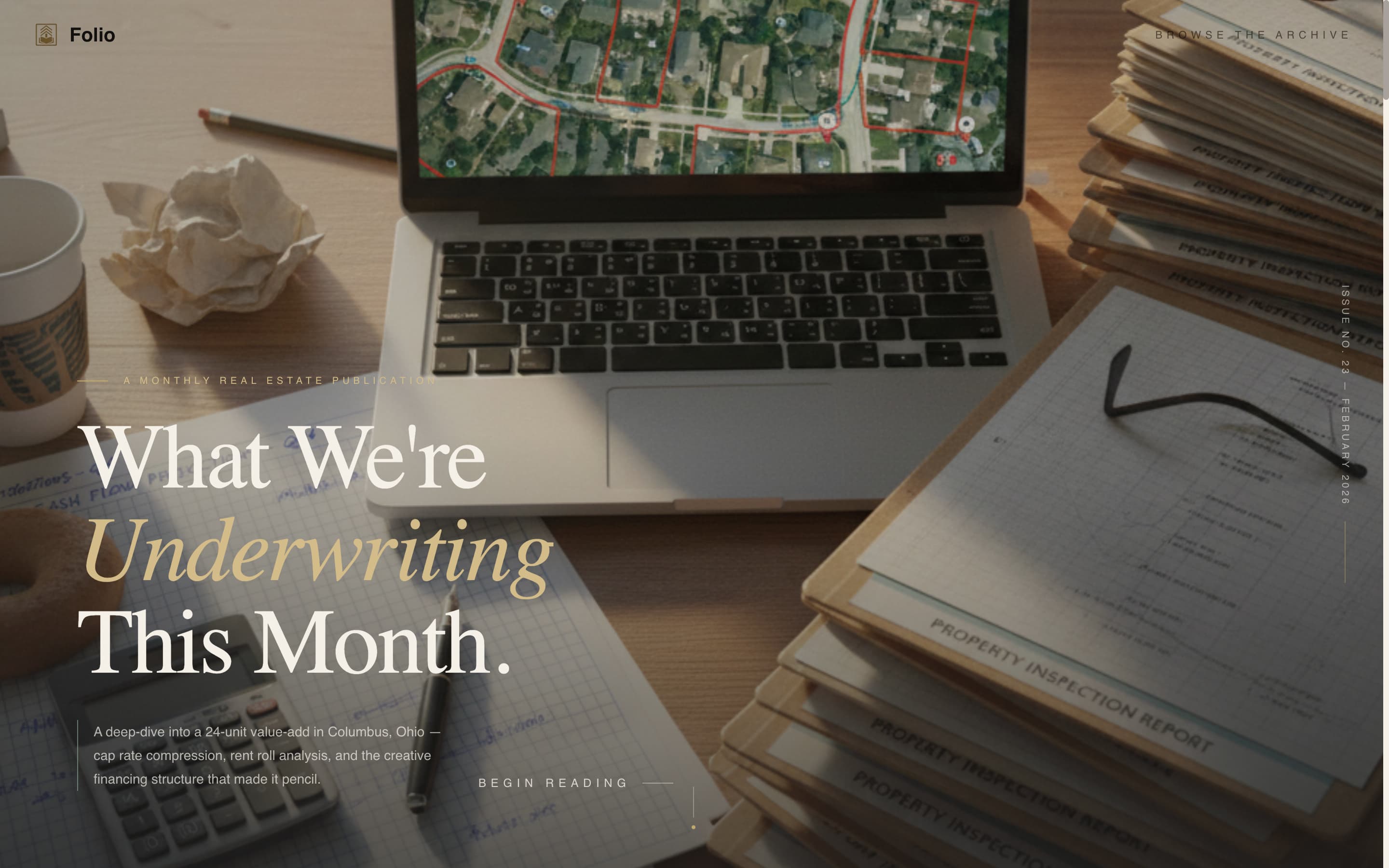
Full-Bleed Hero with Vertical Typography
The hero section uses an overhead workspace photo concept with morning light and visible desk details. A vertical Japanese-inspired typographic element along the right edge carries the current issue number, and the main headline reads as an editorial statement rather than a marketing claim.
Alternating Content Format Spokes
Each of the four spokes delivers a different content format. The morning spoke is narrative journalism with pull quotes. The midday spoke is an interactive pro forma table. The afternoon spoke is a photo essay with annotated observations. The evening spoke includes a roundtable transcript alongside the earned email gate.
Scroll-Earned Email Gate
The primary call to action, which invites readers to access the full current issue, appears only after they have scrolled past the first two content spokes. This placement ensures the ask is made after the reader has already experienced the publication's depth and voice.
Archive Browse Path
A secondary navigation option labeled "Browse the Archive" sits persistently in the anchor nav. It leads to an ungated index of past issue summaries, giving first-time visitors a way to verify the publication's consistency and track record before subscribing.
GSAP ScrollTrigger Animations and Parallax Layers
Section reveals are driven by GSAP ScrollTrigger, creating smooth entrance animations as readers move through each spoke. Parallax layering on the hero and a marquee element add motion without disrupting the quiet, deliberate reading pace the design establishes.
Page sections overview
| Section | Purpose |
|---|---|
| Hero: Full-Bleed | Establish editorial identity with workspace photo, vertical issue number, and headline |
| Morning: The Lead | Deliver long-form narrative journalism excerpt with styled pull quotes |
| Midday: The Numbers | Present an annotated interactive pro forma table for deal analysis |
| Afternoon: The Walk-Through | Show a photo essay with handwritten-style annotated observations |
| Evening: The Decision | Host roundtable transcript and trigger the scroll-earned email gate |
| Footer: Minimal Flow | Close with an ultra-minimal horizontal footer pattern |
Design & branding system
The visual identity follows an Atelier Studio approach filtered through a Japanese Zen color system. Every color choice and typographic decision is made to feel unhurried and precise, like a well-organized desk in a quiet studio.
- Color palette: washi warm white (#F5F0E8) backgrounds, sumi ink (#1A1A1A) for long-form text, tatami gold (#C4A86B) for section dividers and issue number accents, and celadon glaze (#8FAF9A) for active navigation states and pull-quote borders
- Typography: Fraunces serif for headlines and editorial display text, DM Sans for body copy and interface elements
- Visual texture: generous leading on body text, foil-stamp-style gold accents, and a no-stock-polish photo direction that keeps grain, coffee rings, and handwritten notes visible
Mobile & speed optimization
The template is designed desktop-first to serve analytical readers working at a desk, with a responsive layout that adapts for mobile viewing. Performance is supported through a split rendering approach described in the brief.
- Desktop-first layout prioritizes the wide-screen reading experience for pro forma tables and photo essays
- Server Components handle static content sections; Client Components manage the anchor navigation and animation layers
- Responsive breakpoints ensure the hub-and-spoke layout remains navigable and legible on smaller screens
How this template helps you convert
Folio converts by making the reader feel respected before it makes any request. The page earns attention first, then asks for an email address at the point of maximum demonstrated value.
- The scroll-earned email gate withholds the call to action until the reader has moved through two full content spokes, meaning the ask arrives when curiosity and trust are already established.
- The ungated archive browse path lets skeptical first-time visitors explore past issue summaries freely, which builds confidence in the publication's consistency without requiring any commitment.
Other information about this template
This template is designed for creators who want their publication to feel like a professional desk reference, not a lead-generation funnel. A few additional details are worth noting.
- Social proof elements include specific reader quotes with deal credentials, a visible archive issue count, and a subscriber count display
- Localization defaults are set for English language, United States dollar formatting, and US date format
- The animation complexity is set to medium, using GSAP ScrollTrigger reveals, a marquee element, and parallax layers on the hero
- Interactivity level is high, covering the anchor navigation, interactive pro forma table, and the conditional scroll-earned call to action logic
- The footer follows a Vercel Horizontal Flow pattern kept ultra-minimal to close the page without distraction


Theme
Atelier Studio
Creative direction
Day-in-the-Life
Color system
Japanese Zen
Style
Hub & Spoke (Anchor Nav)
Direction
Content/Resource
Page Sections
Fixed Anchor Navigation with Hour Labels
Full-bleed Hero with Vertical Issue Typography
Alternating Content Format Spokes
Scroll-earned Email Gate
Ungated Archive Browse Path
GSAP Scrolltrigger Reveals and Parallax Layers
Related questions
Who is the Folio template designed for?
What makes the email gate different from a standard newsletter sign-up?
Can this template be adapted for a different editorial niche?
What animation and interactivity does this template include?
Is the archive browse path included in the landing page?