Directorypro - Powerful SaaS Landing Page Template
Directorypro is a bold brutalist SaaS landing page built for B2B software directories. It drops visitors straight into a live comparison engine, two dropdowns, an instant feature grid, and a sticky app download call to action. The electric indigo and charcoal palette gives it industrial authority. It is designed for procurement teams, startup founders, and ops leads who need answers fast.
by Rocket studio
Quick summary
Directorypro is a single-page B2B SaaS directory landing page that leads with function over pitch. Visitors land inside a working comparison engine, filter by tool category and team size, and get a brutalist feature grid in seconds. The bold indigo-and-charcoal design system reinforces trust with every interaction.
Who this template is for
This template is built for founders, product marketers, and developers who want to launch a credible B2B software directory fast. It suits teams who need a comparison-first experience rather than a traditional hero section.
- Procurement managers who need a defensible vendor shortlist before a quarterly review
- Startup founders and engineering leads hunting for tools late at night with no time to waste
- Agency operations leads building structured comparison views they can present on a Monday
What problem this template solves
Most directory landing pages bury the comparison tool behind a wall of marketing copy. Visitors leave before they find value. Directorypro flips that sequence by opening directly on the tool itself.
- Visitors arrive and immediately interact, reducing drop-off before the first scroll
- The comparison engine earns trust before asking for any action, including the app download
- The structured layout removes guesswork for buyers comparing multiple vendors at once
What you get with this template
You get a complete, ready-to-customize comparison landing page built around a functioning tool-first experience. Every section is designed to progress the visitor naturally from discovery to decision.
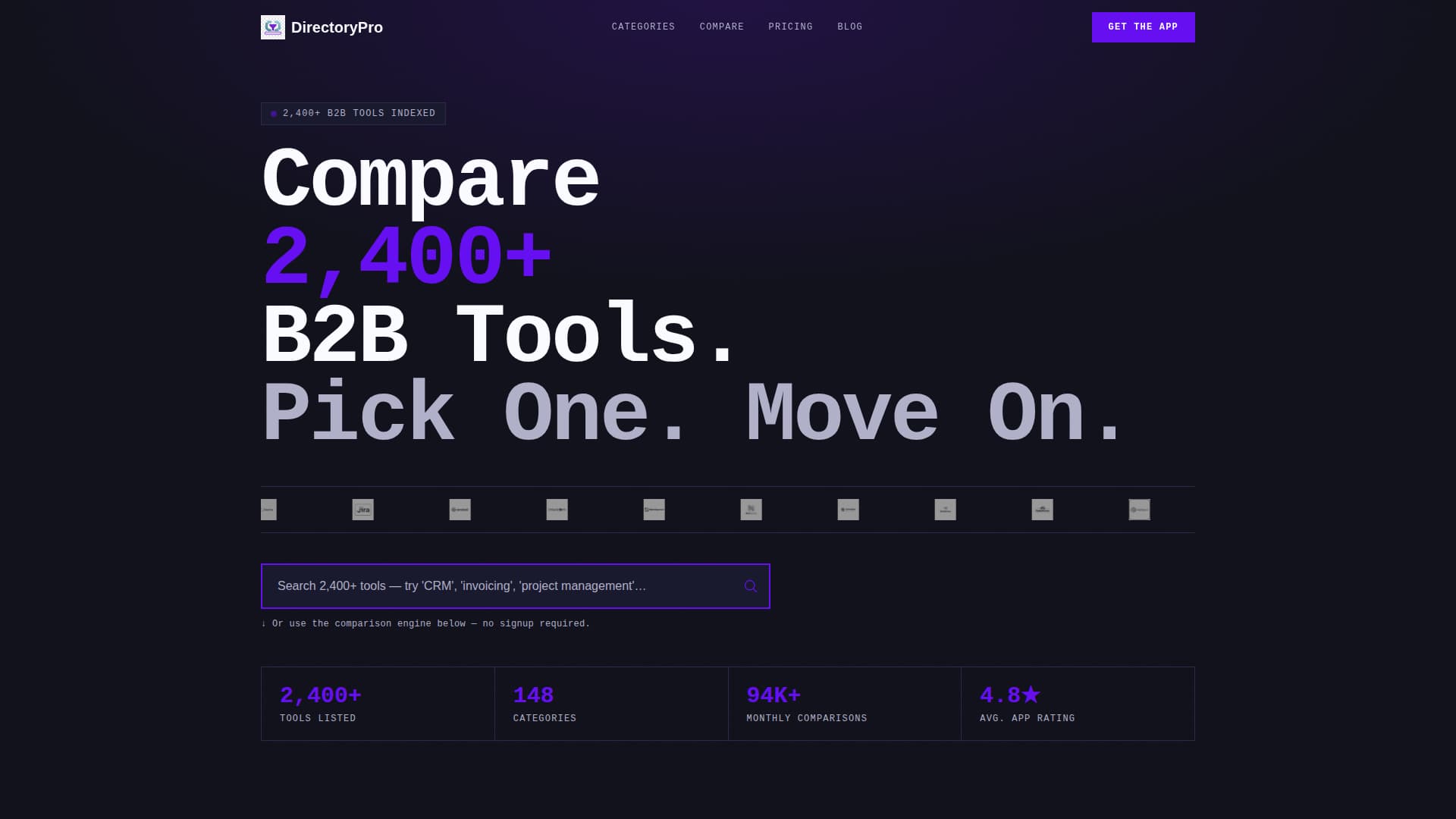
- An oversized logo bar with 30-plus SaaS brand marks, infinite scroll animation, and a hover-to-color effect
- A live search field, two dropdown selectors, and a dynamic brutalist comparison table with feature rows and vendor columns
- A sticky app download button, paired app store badges, and an SMS shortlist delivery panel
Feature list
This section covers the core functional and design capabilities built into the Directorypro template.
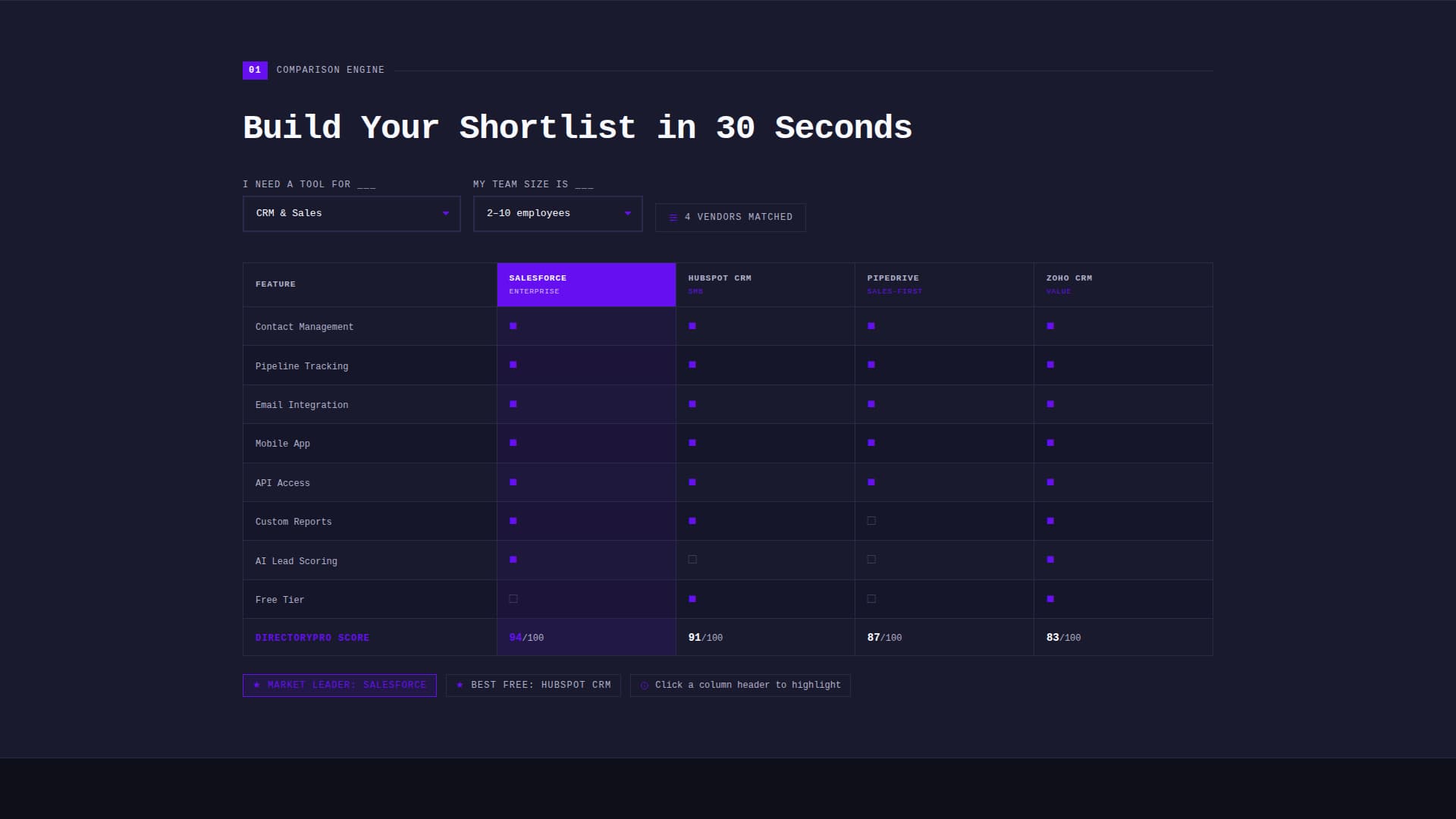
Brutalist Comparison Table Engine
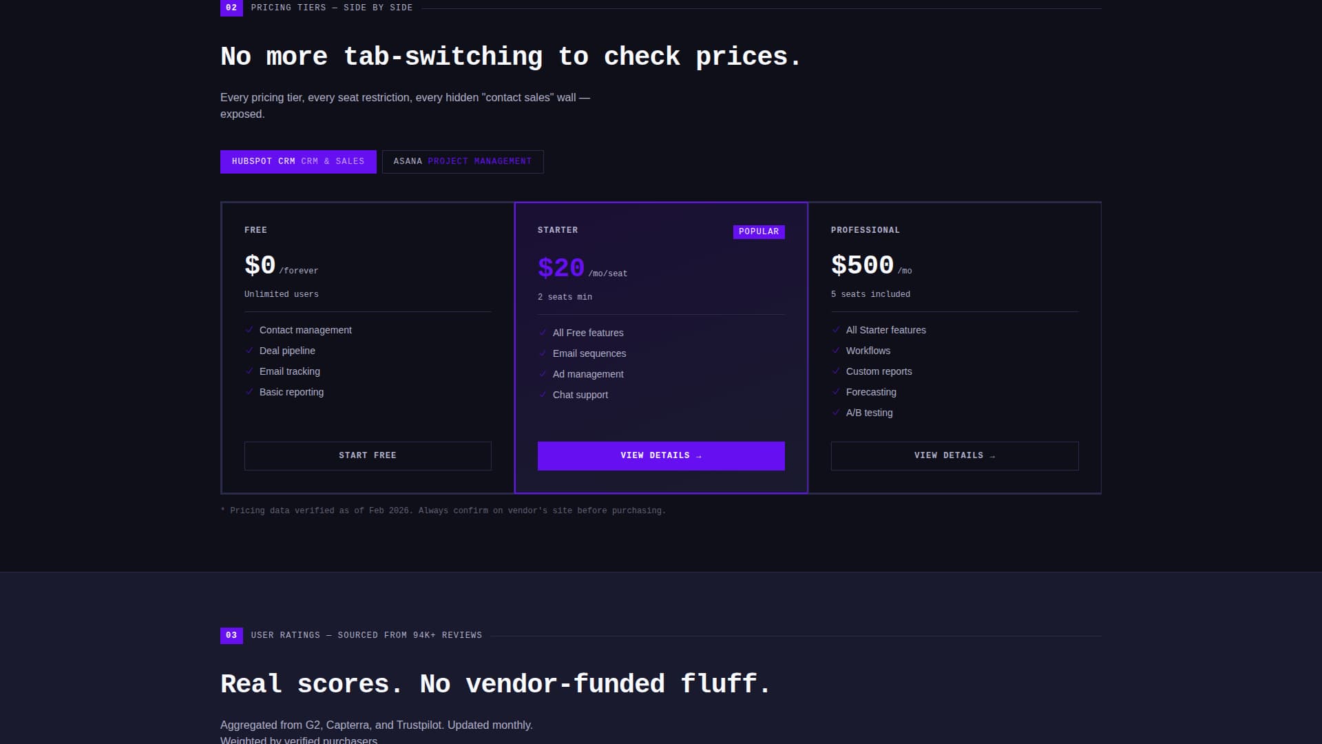
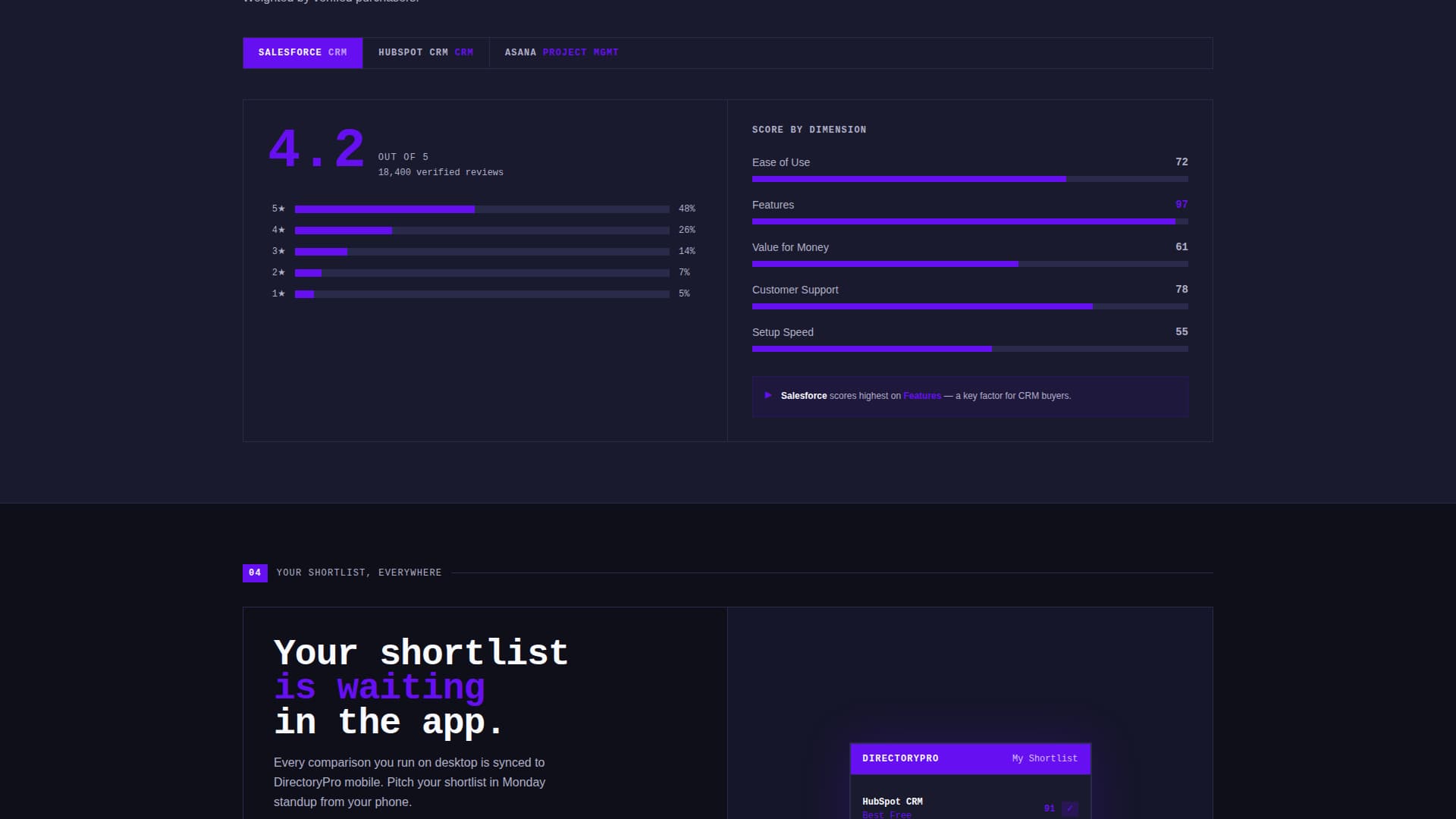
Two dropdown selectors let visitors define their tool category and team size. The template instantly renders a feature-row, vendor-column comparison grid with bold geometric checkmarks and cross marks. Each scroll section escalates the detail level, moving from feature grids to pricing tiers to bar-chart user-rating histograms.
Logo Bar with Hover Color Activation
A dense horizontal strip displays 30-plus SaaS brand logos in a slow, infinite scroll across the full viewport width. Logos appear monochrome and desaturated at rest. On hover, each logo snaps to full color with a hard-edge brutalist transition, no fade or soft animation.
Live Search with Indigo Pulse Effect
A prominent search field sits below the logo bar with a thick electric indigo border. The field pulses once on page load to draw immediate attention. It is designed to feel like a direct command input rather than a passive form element.
Sticky App Download Call to Action
A fat indigo pill button labeled "Get the App, Compare Anywhere" pins to the bottom of the viewport after the visitor's first scroll. It remains visible throughout the session without interrupting the comparison flow above it.
SMS Shortlist Delivery Panel
After a visitor completes one comparison, a slide-up panel reveals the same comparison rendered inside a mobile app interface. The panel includes a phone-number field that sends a direct download link via SMS, connecting the desktop session to mobile use.
Paired App Store Badges
Secondary calls to action appear as App Store and Play Store download badges. They surface after the visitor completes at least one comparison, making the ask contextual rather than premature.
Page sections overview
| Section | Purpose |
|---|---|
| Logo Bar Header | Display 30-plus brand logos in an animated infinite scroll strip |
| Oversized Headline | State the directory value with one bold mono-weight line |
| Live Search Field | Let visitors type a tool need immediately on arrival |
| Dropdown Selectors | Filter by tool category and team size before comparing |
| Feature Comparison Grid | Show vendors as columns and features as rows in a brutalist table |
| Pricing Tier View | Place subscription tiers side by side for direct cost comparison |
| Rating Histograms | Visualize user ratings as blocky bar charts per vendor |
| Sticky Download Button | Keep the app download call to action visible after the first scroll |
| SMS Shortlist Panel | Slide up after a comparison and deliver the shortlist to mobile |
Design & branding system
The visual identity is Bold Brutalist. Every element is built for weight, contrast, and directness. There is no decorative softness anywhere in the layout.
- Color system: deep slab charcoal (#1A1A2E) for background panels, electric indigo (#6610F2) for buttons, toggles, and active table headers, cool zinc (#E0E0EC) for table rows and data cells, and hot white (#FAFBFF) for all primary typography
- Typography: mono-weight, oversized headline treatment with terminal-style white text that reads clearly on dark backgrounds at every viewport size
- Interaction style: hard-edge transitions on hover states, no soft fades, bold geometric glyphs for checkmarks and cross marks inside comparison cells
Mobile & speed optimization
The template is designed with mobile conversion as a structural goal, not an afterthought. The SMS delivery panel and sticky call to action button are both built to close the gap between desktop discovery and mobile use.
- The sticky indigo download button remains pinned to the viewport bottom across screen sizes after the first scroll
- The slide-up SMS panel bridges the desktop comparison session directly to a phone download, removing friction from the switch between devices
- The comparison table layout is structured to remain readable and scannable as viewport width changes
How this template helps you convert
Directorypro earns the conversion before it asks for it. The page proves its own value through the tool, then presents the download when the visitor is already invested.
- The comparison engine activates immediately on arrival, so visitors experience value in the first ten seconds without reading a single line of marketing copy
- The sticky app download button and SMS shortlist panel appear only after the visitor has filtered or compared, making the call to action feel earned rather than intrusive
Other information about this template
This template is part of the Directorypro design system, a set of brutalist SaaS landing page components built for high-intent B2B audiences. The template style is a Comparison Table layout and the creative direction follows a Calculator and Tool First approach, meaning the interactive tool is the first thing visitors use rather than read.
- The header concept is a Logo Bar, a pattern well-suited to directory and listing sites that need to establish breadth and credibility at a glance
- The landing page direction is App Download, making it a strong fit for SaaS directory products that have a companion mobile application
- The Electric Indigo color system is intentional for B2B technology contexts, where the palette signals precision and authority without relying on soft consumer-facing gradients
- The template sits within the SaaS B2B Digital Presence subcategory and is optimized for the SaaS B2B Directory and Listing Site niche
Theme
Bold Brutalist
Creative direction
Calculator/Tool First
Color system
Electric Indigo
Style
Comparison Table
Direction
App Download
Page Sections
Live Comparison Table Engine
Animated Logo Bar Header
Pulsing Live Search Field
Sticky App Download Button
SMS Shortlist Delivery Panel
Contextual App Store Badges
Related questions
What type of page is this template?
Can I customize the dropdown categories and vendor data?
Does the template include the mobile app or SMS functionality out of the box?
Who is the primary audience this page is designed to reach?
Is the Bold Brutalist design style appropriate for enterprise B2B audiences?