Deploy - Brutalist Implementation Landing Page Template
Deploy is a bold brutalist landing page template built for implementation guide platforms. It leads with a live stats wall, a side-by-side documentation comparison grid, and an interactive guide preview. Designed for engineering leads, DevOps managers, and CTOs, it turns scattered deployment docs into a conversion-ready showcase built around data, not decoration.
by Rocket studio
Quick summary
Deploy is a single-page brutalist landing page template for implementation guide platforms. It opens with a full-width metrics wall, moves through a diagnostic comparison grid, and closes with a live guide preview and benchmark diagnostic. The design runs on void black, phosphor green, and high-voltage yellow, zero decoration, every element working.
Who this template is for
This template is built for technical teams and platform builders who need to sell the value of structured implementation guides to skeptical engineering audiences. It speaks directly to people who have watched documentation fail in practice.
- Engineering leads onboarding new teams onto complex stacks
- DevOps managers standardizing deployment workflows across organizations
- CTOs and technical founders who have experienced migration failures caused by undocumented processes
What problem this template solves
Most documentation tools produce content that nobody follows past sprint two. Confluence pages go stale. Scattered README files go unread. Tribal knowledge walks out the door with the engineer who wrote it. This template is built to expose that gap visually and make the case for a better approach.
- Traditional docs have measurably high abandonment rates and poor adoption across teams
- Onboarding delays and repeated support tickets signal a documentation structure problem, not a people problem
- Engineering organizations lose velocity when guides live in someone's head instead of a structured, executable format
What you get with this template
You get a complete, conversion-ready landing page layout with every section pre-built around a problem-to-solution narrative arc. The layout escalates from individual frustration to team-level velocity loss to organization-wide technical debt, building urgency at every scroll.
- A full-width live stats header with animated counters and monospaced data cells
- A side-by-side comparison grid with red slash styling on the losing column
- An interactive guide preview letting visitors click through three steps, plus two conversion paths: a benchmark diagnostic and a downloadable teardown report
Feature list
This template is built on a tight set of purposeful components. Each one serves the argument the page is making.
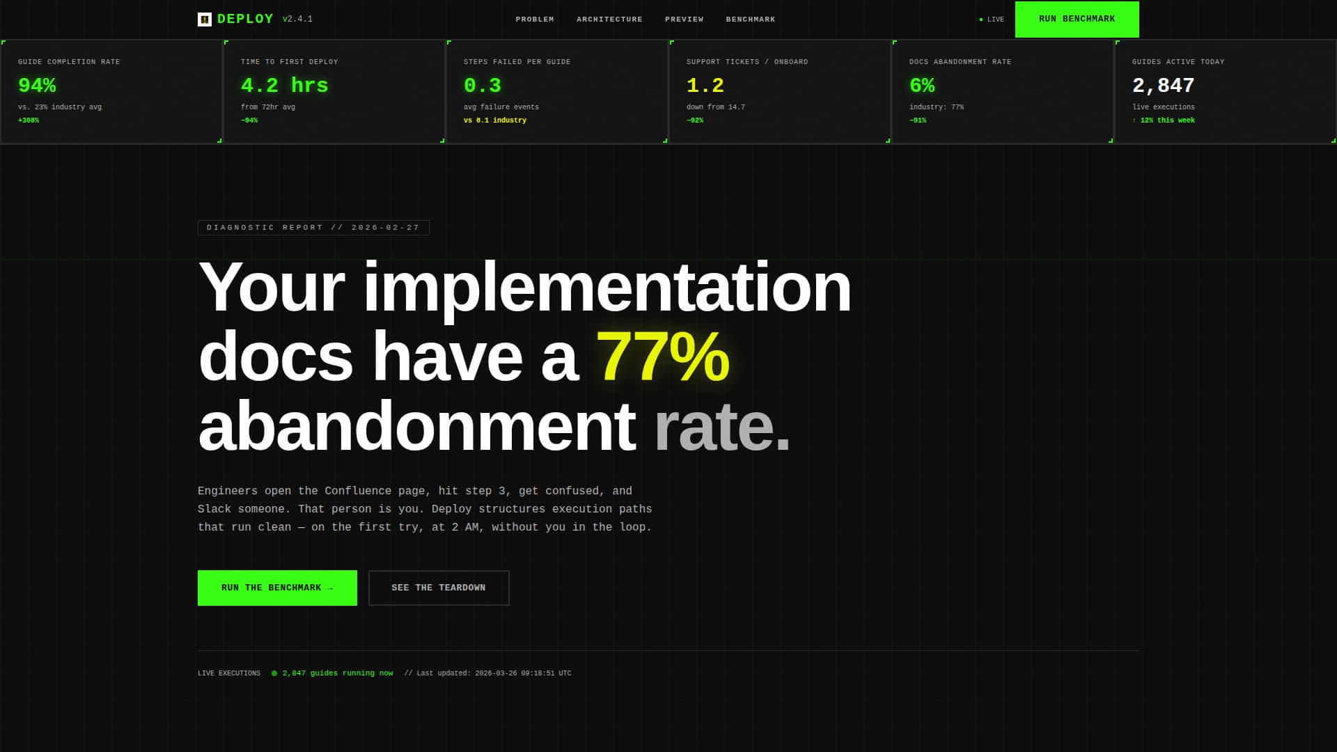
Live Metrics Header Wall
The header is a full-width data grid displaying real performance numbers in monospaced type. Cells use 2px solid brutalist borders and subtle counter animations. Numbers like "94% completion rate versus. 23% industry average" and "Time to first deploy: 4.2 hrs" become the visual centerpiece. No hero image is needed because the data carries the weight.
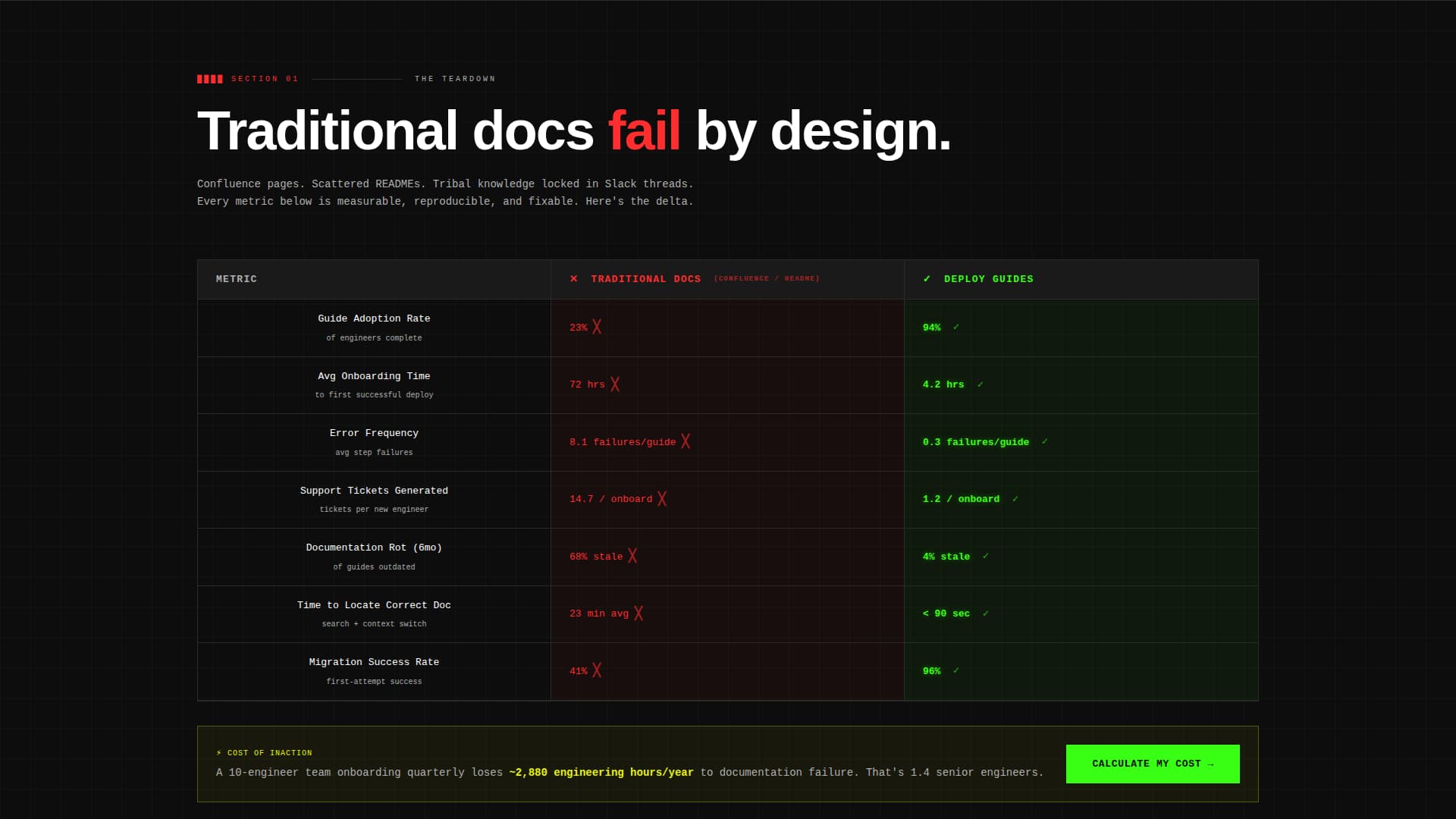
Documentation Comparison Grid
A structured side-by-side grid compares traditional documentation approaches against structured implementation guides across measurable rows. Metrics include adoption rate, error frequency, onboarding time, and support tickets generated. Red slash styling marks the losing column, making the performance gap impossible to ignore.
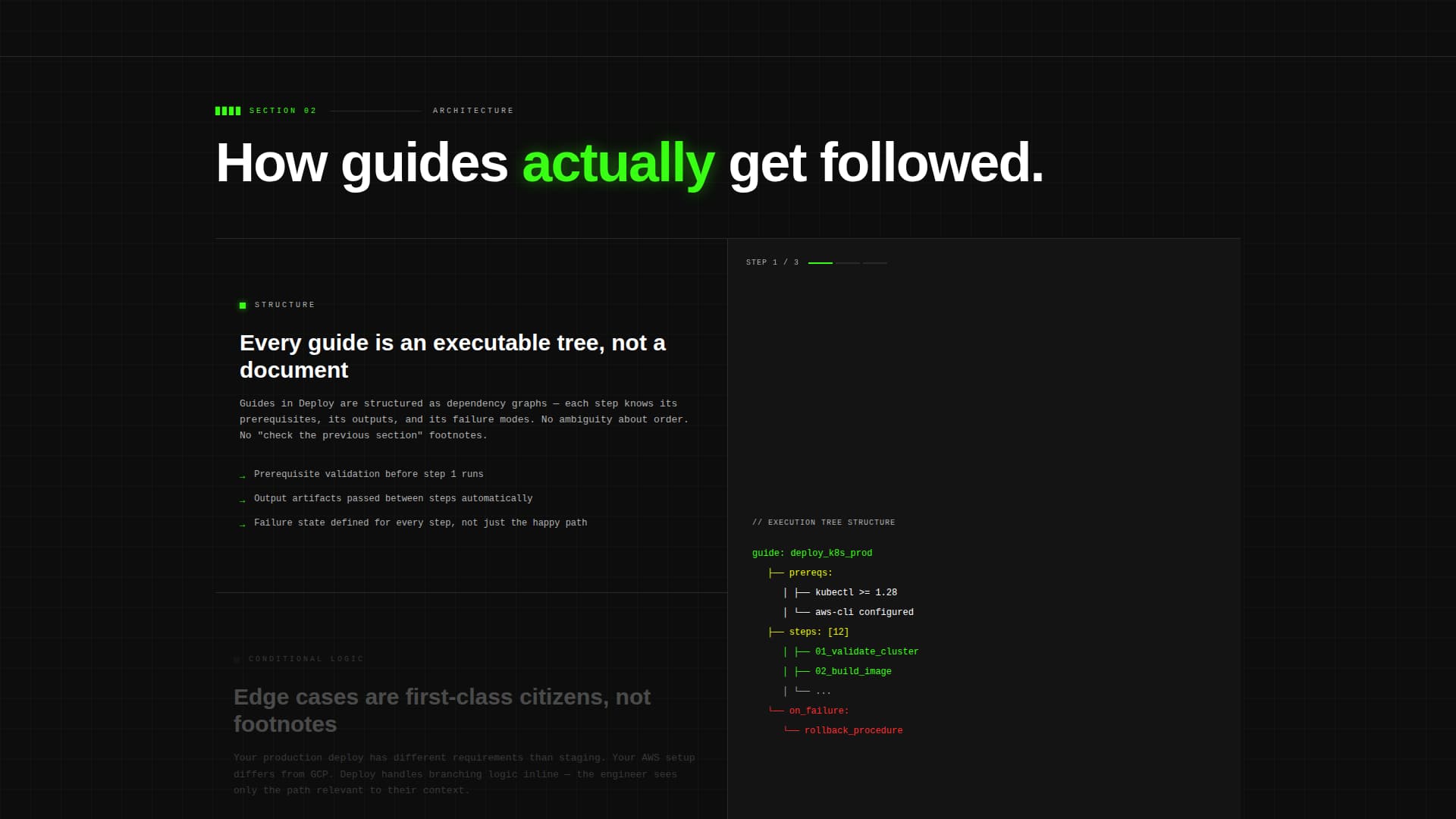
Conditional Logic Architecture Section
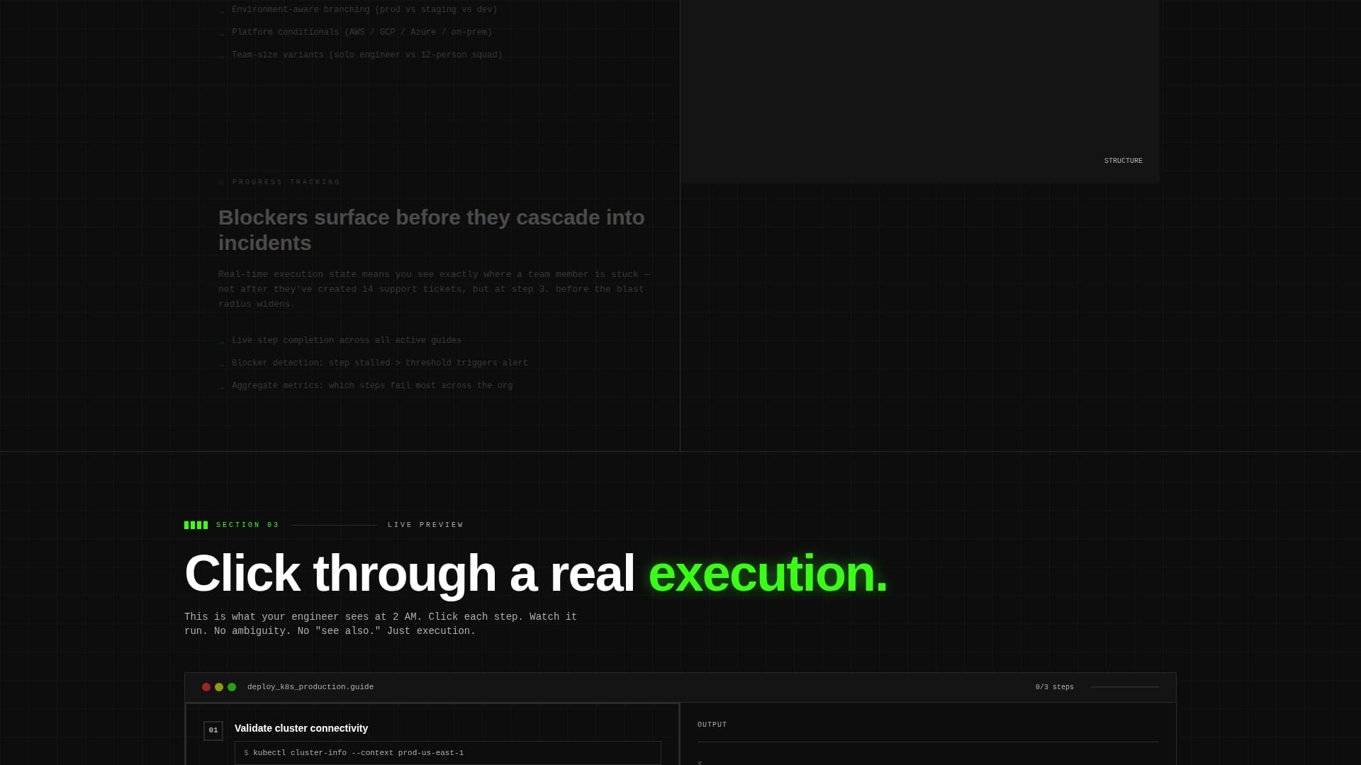
A dedicated mid-page section explains how implementation guides handle edge cases through conditional logic and progress tracking. It surfaces how blockers are identified before they cascade into larger failures. This section moves the page from diagnosis into solution architecture.
Interactive Guide Preview
The final content section shows a live implementation guide in execution mode. Visitors can click through three sequential steps, experiencing the structured format firsthand. This turns an abstract product claim into a direct demonstration.
Benchmark Diagnostic call to action
The primary conversion path is a lightweight three-question diagnostic. It collects current documentation tool, team size, and average onboarding time. Results instantly render a personalized comparison grid showing projected improvements, making the value proposition feel specific and earned.
Downloadable Teardown Report
A secondary conversion path offers a downloadable PDF that compares five documentation approaches across twelve metrics. It provides a tangible research asset for buyers who need more evidence before committing, extending the page's reach beyond a single session.
Page sections overview
| Section | Purpose |
|---|---|
| Live Stats Header | Opens with animated performance metrics as the primary visual |
| Problem Teardown Grid | Compares traditional docs against structured guides row by row |
| Architecture Walkthrough | Explains guide structure, conditional logic, and progress tracking |
| Escalating Stakes Copy | Builds urgency from individual friction to org-wide technical debt |
| Interactive Guide Preview | Lets visitors click through a live three-step guide execution |
| Benchmark Diagnostic call to action | Collects three inputs and renders a personalized comparison result |
| Teardown Report Offer | Secondary path to a downloadable five-method comparison PDF |
Design & branding system
The visual system is built on an Acid Digital color palette applied through a Bold Brutalist framework. Black dominates roughly 80% of the canvas. Every other color serves a defined functional role and nothing else.
- Void black (#0D0D0D) as the dominant background, phosphor green (#39FF14) for primary actions and live data indicators, high-voltage yellow (#E8F505) for warnings and comparison differentiators
- Raw concrete gray (#B0B0B0) for secondary text and structural divider lines, keeping the grid readable without competing with active elements
- Oversized condensed typography for headlines, monospaced type for all data cells and metric displays, zero decorative illustration throughout
Mobile & speed optimization
The dashboard layout is designed with a structural grid that adapts naturally to smaller viewports. Data grids stack vertically on mobile without losing their brutalist visual logic.
- Comparison grid rows remain scannable at smaller widths, with metric labels and values preserving their alignment
- Counter animations and interactive preview elements are scoped to be lightweight in execution, keeping the page responsive across devices
How this template helps you convert
The page earns conversion by proving its thesis with data before asking for anything. Every section builds the case that structured implementation guides outperform traditional documentation in measurable ways.
- The live stats header opens with a direct provocation: a 77% abandonment rate headline backed by real benchmark numbers, creating immediate recognition for the target reader
- The benchmark diagnostic personalizes the value proposition by rendering projected improvements specific to the visitor's team size and current tooling, making the call to action feel like a useful tool rather than a form
Other information about this template
This template fits naturally within the Documentation and Support category, specifically aligned with the implementation guide niche and white paper or research subcategory. It is suited for platforms that position their product through evidence-based comparisons rather than feature lists.
- The Comparison and Versus conversion direction means the page is structured to win by contrast, not by assertion alone
- The Dashboard and Data Grid template style makes it well suited for technical audiences who respond to structured, scannable information over narrative prose
- The Problem-to-Solution Arc creative direction ensures the page creates progressive urgency, moving from a documented pain point through diagnosis and into a clear resolution
Theme
Bold Brutalist
Creative direction
Problem→Solution Arc
Color system
Acid Digital
Style
Dashboard/Data Grid
Direction
Comparison/Versus
Page Sections
Live Metrics Header Wall
Documentation Comparison Grid
Interactive Guide Preview
Benchmark Diagnostic Call to Action
Downloadable Teardown Report Path
Escalating Problem-to-solution Arc
Related questions
Who is this landing page template designed for?
Can I customize the benchmark metrics shown in the header?
What are the two conversion paths included on this page?
Does this template include the interactive guide preview section?
What makes this template different from a standard product landing page?