Cultivar - Precision Hydroponics Landing Page Template
Cultivar is a bold brutalist hydroponics analytics dashboard landing page template built for commercial vertical farm operators, research agronomists, and AgTech investors. It uses a hub-and-spoke anchor navigation layout with five spoke sections, a three-tab feature switcher header, and a lead-generation flow that shows real sensor data patterns before asking for anything.
by Rocket studio
Quick summary
Cultivar is a single-page hydroponics analytics dashboard template designed for high-stakes grow operations. It pairs a Feature Tab Switcher header with five anchor-nav spoke sections and a conversion-focused form block. The visual system is bold brutalist with a carbon fiber palette. Every scroll step builds toward a lead capture that earns the click first.
Who this template is for
This template is built for professionals who manage or invest in data-driven grow operations. If you need to communicate precision, scale, and profitability at a glance, this page speaks your language.
- Commercial grow-op managers running large-scale, multi-light vertical farm facilities
- Research and development agronomists testing nutrient formulas across clone batches
- Venture-backed AgTech founders and CEOs who need investor-ready yield dashboards quickly
What problem this template solves
Most landing pages for hydroponics software look like generic SaaS templates. They fail to communicate the real-time, high-stakes environment that grow-op professionals live in. Cultivar solves that disconnect directly.
- Raw sensor data (pH drift, electrical conductivity fluctuations, dissolved oxygen curves) is invisible on generic pages
- Decision-makers in vertical farms need to see their own problems visualized before they trust a product
- Investor-facing dashboards require a page that feels credible, engineered, and data-native from the first scroll
What you get with this template
You get a complete, single-page hub-and-spoke landing page with a locked anchor navigation system and five fully structured spoke sections. Every section has a defined purpose, a visual component, and a conversion role.
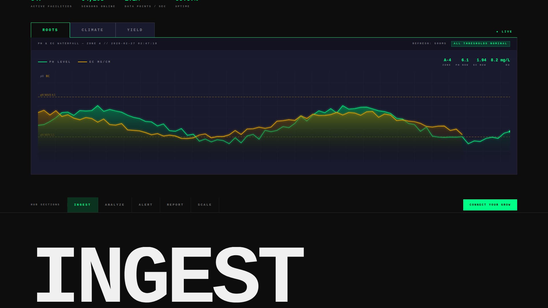
- A three-tab Feature Tab Switcher header displaying ROOTS, CLIMATE, and YIELD views with animated data visualizations
- Five anchor-nav spoke sections: Ingest, Analyze, Alert, Report, and Scale, each with a scroll-triggered data animation
- A dual-path lead generation block with a three-field primary form and a secondary sandbox demo path
Feature list
This template is built around a focused set of high-impact components drawn directly from the source brief.
Three-Tab Dashboard Header
The header renders a near-actual-scale dashboard mockup with three massive tab labels: ROOTS, CLIMATE, and YIELD. Each tab snaps a different live-data view into frame using hard-cut transitions. ROOTS shows a pH and electrical conductivity waterfall chart with pulsing threshold bands. CLIMATE reveals a psychrometric grid mapping vapor pressure deficit against canopy temperature. YIELD displays a harvest projection timeline with per-rack biomass estimates.
Hub and Spoke Anchor Navigation
A sticky anchor navigation bar locks to the top of the page after the header. Five spoke labels (Ingest, Analyze, Alert, Report, Scale) link directly to their corresponding sections. This structure lets visitors jump to the data story that matters most to them without losing context.
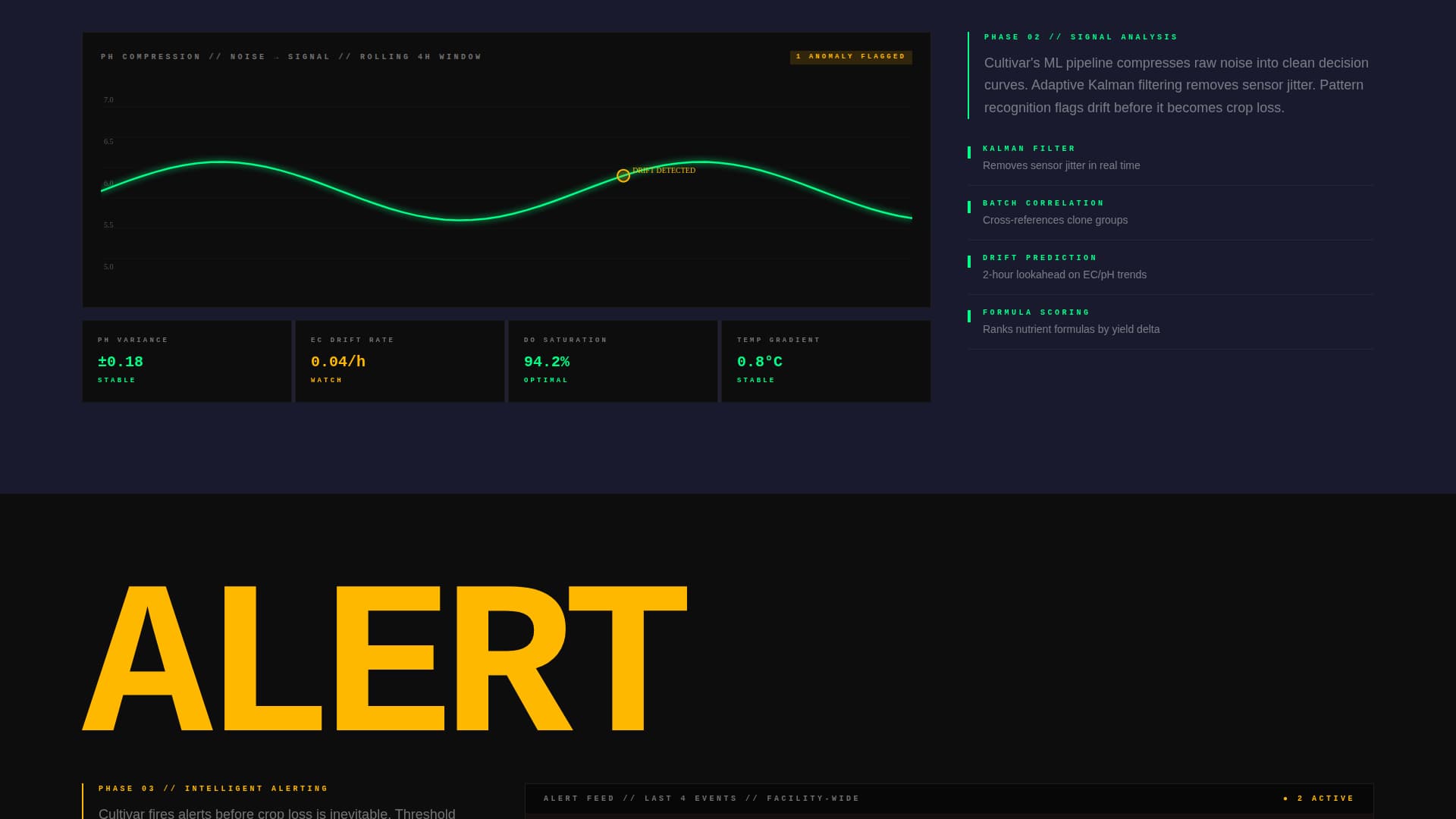
Scroll-Triggered Data Animations
Each spoke section opens with a full-viewport-width single-word heading followed by a data visualization that builds itself as the visitor scrolls in. The sequence escalates deliberately: raw sensor noise compresses into clean curves, a simulated push notification fires mid-scroll, a report preview assembles in real time, and a single rack multiplies into a facility-wide heatmap.
Dual-Path Lead Generation Block
After the Scale section, a full-width brutalist call to action block presents the primary form. It asks for facility type, number of active sensors, and work email. A secondary path labeled "See Raw Demo Data" opens an interactive sandbox with sample sensor feeds and captures email on exit.
Bold Brutalist Visual System
The entire page is built on a bold brutalist grid with oversized, monospaced typography slammed flush-left against structural grid lines. Carbon black dominates backgrounds. Nutrient-solution green pulses through data points, active nav states, and call-to-action borders. Sensor-alert amber appears only for warnings and hover states.
Launch Energy Scroll Rhythm
The creative direction treats the page like a countdown sequence. Each section earns the next by escalating in data density and visual intensity. The rhythm is deliberate and relentless, designed to keep a technically sophisticated audience engaged from first load to form submission.
Page sections overview
| Section | Purpose |
|---|---|
| Feature Tab Header | Introduces ROOTS, CLIMATE, YIELD dashboard views |
| Sticky Anchor Nav | Links hub to five spoke sections |
| Ingest Section | Displays raw sensor feed visualization |
| Analyze Section | Compresses sensor noise into clean data curves |
| Alert Section | Fires a simulated push notification mid-scroll |
| Report Section | Assembles a live PDF report preview |
| Scale Section | Multiplies one rack into a facility-wide heatmap |
| Primary call to action Block | Three-field lead capture form |
| Demo Sandbox Path | Secondary email capture via interactive data sandbox |
Design & branding system
The design language is bold brutalist, engineered to feel like a matte-black racing chassis under fluorescent grow lights. Every visual decision is intentional and unapologetic.
- Color palette: deep carbon black (#0D0D0D) for backgrounds, woven graphite (#1A1A2E) for section divides, nutrient-solution green (#00FF87) as the primary accent, and sensor-alert amber (#FFB800) reserved for warnings and hover states
- Typography: oversized, monospaced typefaces aligned flush-left against heavy brutalist grid lines, with section headings scaled to fill the full viewport width
- Transitions between tab views use hard cuts rather than fades, reinforcing the control-room aesthetic throughout the header
Mobile & speed optimization
The template is designed with a scroll-driven experience that adapts across device sizes. The brutalist grid and oversized typography are structured to remain legible and impactful on smaller screens.
- Anchor navigation remains sticky and functional on mobile viewports, keeping the five spoke sections accessible at all times
- Scroll-triggered animations are scoped to each section's entry point, so the build-in effect fires correctly regardless of screen height or scroll speed
How this template helps you convert
Cultivar earns the lead before asking for it. The conversion architecture is built into the scroll sequence itself, not bolted on at the end.
- The Feature Tab Switcher shows real data patterns (pH drift, vapor pressure deficit, biomass projections) before any form appears, building credibility with a technically sophisticated audience
- The simulated alert and real-time report assembly in the Analyze and Report sections let visitors see their own operational problems visualized and resolved, reducing friction at the point of form submission
- The secondary "See Raw Demo Data" path captures email from visitors who are not yet ready to commit, providing a lower-stakes conversion option without weakening the primary call to action
Other information about this template
This template is categorized under Technology, specifically in the Hydroponics Vertical SaaS subcategory, and is designed for the hydroponics analytics dashboard niche. It is a strong fit for AgTech product teams who need a credible, data-forward page to support sales outreach, investor demos, or product launches.
- Template style: Hub and Spoke with anchor navigation, making it well-suited for products with multiple distinct feature areas
- Theme: Bold Brutalist, matched with a Carbon Fiber color system for a high-contrast, industrial visual identity
- Creative direction: Launch Energy, which drives scroll momentum through escalating data density and visual intensity
- Header concept: Feature Tab Switcher, ideal for showcasing multiple dashboard views without requiring multiple pages
- Landing page direction: Lead Generation, with a three-field form and a sandboxed demo path as a secondary conversion route
- This template can support AgTech SaaS product launches, vertical farming software demos, and investor-facing product pages where data credibility is essential from the first scroll


Theme
Bold Brutalist
Creative direction
Launch Energy
Color system
Carbon Fiber
Style
Hub & Spoke (Anchor Nav)
Direction
Lead Generation
Page Sections
Three-tab Feature Switcher Header
Sticky Hub and Spoke Anchor Nav
Scroll-triggered Data Visualizations
Dual-path Lead Capture System
Bold Brutalist Carbon Fiber Design
Launch Energy Scroll Sequence
Related questions
Who is the primary audience for this template?
Can I customize the tab labels and spoke section names?
How does the dual-path lead generation work?
Does the anchor navigation stay visible during the full scroll?
Is this template suitable for an investor demo or product launch page?