Specialist Consulting Digital Presence Comparison Website Template
Casecommand is a bento grid landing page template built for consulting course and training platforms. It combines a live dashboard preview header, an interactive readiness assessment tool, a structured comparison grid, and a data-dense visual identity. The result is a high-performance page that proves its value before asking for a single click.
by Rocket studio
Quick summary
Casecommand is a single-page bento grid template designed for consulting prep and training platforms. It opens with a live training cockpit, moves into an interactive offer probability tool, and builds trust through a transparent platform comparison. Every tile, color, and data point is arranged to feel like an active instrument panel rather than a brochure.
Who this template is for
This template is built for founders and teams running consulting course or training platforms that serve highly analytical, results-driven audiences. If your product requires you to earn trust before asking for a signup, this layout was designed around that exact challenge.
- Consulting prep platforms serving senior analysts, MBA candidates, and career switchers from fields like engineering or medicine
- Course creators who want their landing page to demonstrate platform depth rather than just describe it
- Training businesses that compete on measurable outcomes and need a data-forward first impression
What problem this template solves
Most training platform landing pages read like marketing copy. They list features, show testimonials, and ask for the click. For a consulting prep audience, that approach fails immediately. These visitors are analytical, skeptical, and trained to spot weak arguments.
- Generic layouts cannot signal credibility to an audience that evaluates everything like a case study
- Static pages give no sense of what the product actually feels like to use
- Competing against free resources like prep books and video walkthroughs requires more than a feature list
What you get with this template
This template delivers a complete single-page layout structured around the Calculator/Tool First creative direction. The visitor encounters real utility before any selling begins. Each bento cell reveals a different layer of the platform in a way that feels like using the product, not reading about it.
- A live Dashboard Preview header showing a fully rendered training cockpit with specific in-progress metrics
- An interactive readiness assessment tile as the first content block below the header
- A structured comparison grid that places the platform against generic alternatives across seven measurable dimensions
Feature list
This template includes purpose-built components that align with how a high-performance consulting prep platform needs to present itself. Each feature below is grounded directly in the template brief.
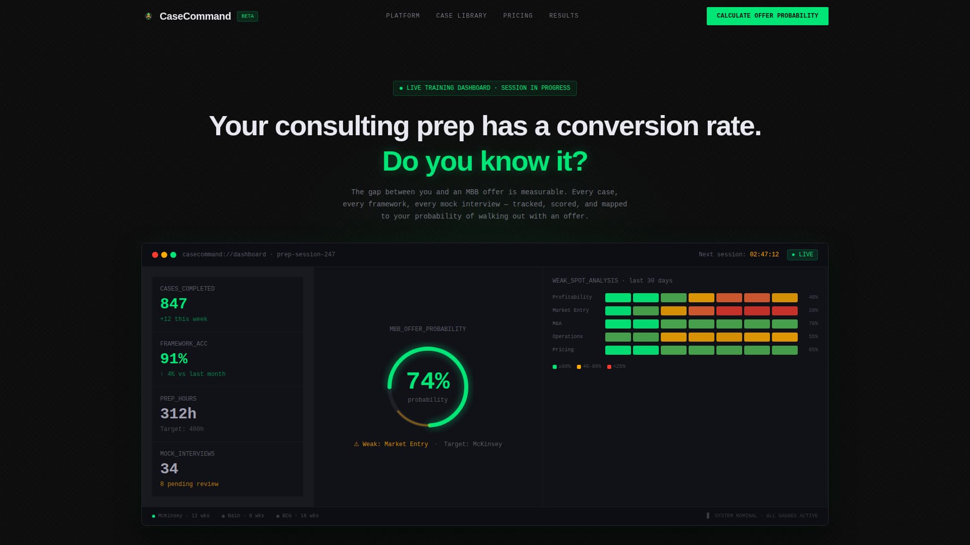
Live Training Cockpit Header
The header renders a fully detailed dashboard showing a user mid-preparation. It displays 847 cases completed, framework accuracy at 91 percent, estimated offer probability at 74 percent, a weak-spot heat map, and a next-session countdown timer. No stock photography appears here; only instrument-panel data that signals serious preparation in progress.
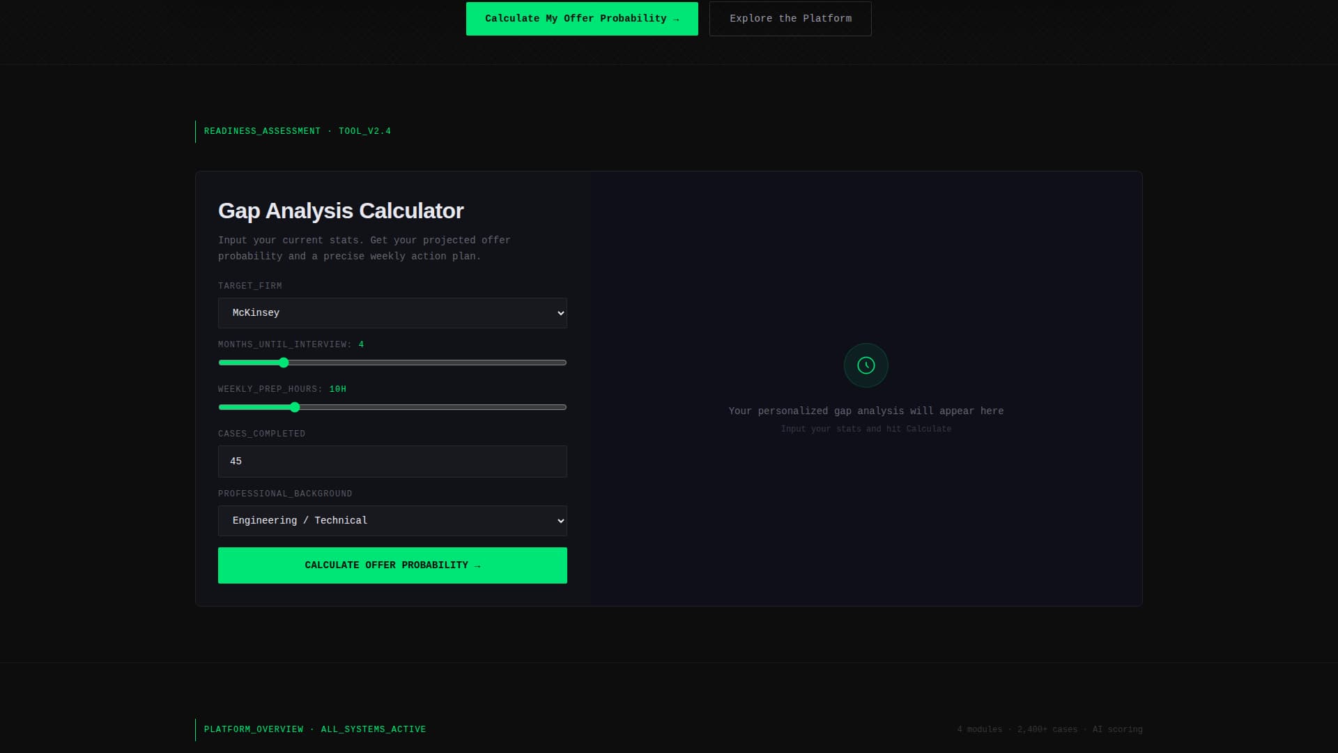
Interactive Readiness Assessment Tile
The first bento tile below the header embeds a readiness tool directly into the page. Visitors input their target firm, months until interviews, weekly prep hours, and cases completed. The tool returns a personalized gap analysis and a projected offer probability, earning attention and generating engagement before any selling begins.
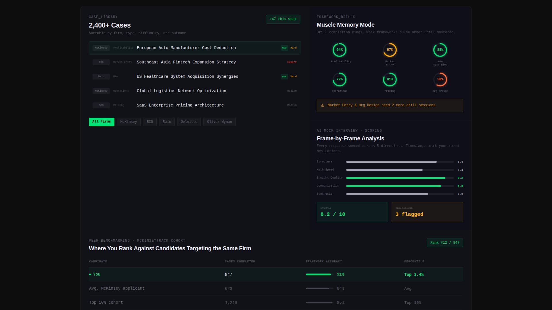
Bento Grid Case Library Tile
A dedicated tile surfaces the case library, showing 2,400 or more cases sortable by firm and type. The layout gives visitors a clear sense of depth and specificity without requiring them to sign up first.
Frameworks and Mock Interview Tiles
Separate bento cells show framework drill completion rings and an AI scoring breakdown for mock interviews. Each tile functions as a window into a specific product feature, making the grid feel like a product preview rather than a marketing asset.
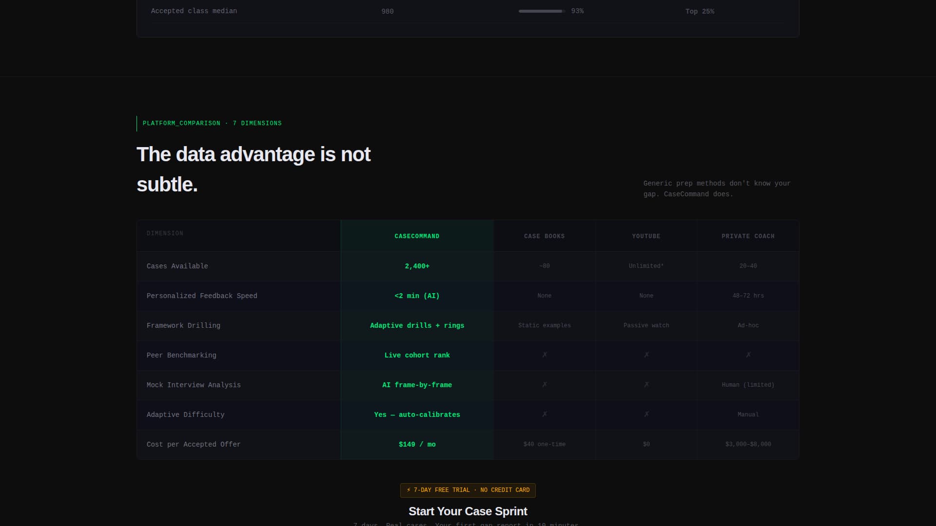
Platform Comparison Grid
A full bento row compares the platform against prep books, video walkthroughs, and traditional coaching across seven dimensions. The platform column is highlighted in signal green while competitors remain in muted carbon gray, making the advantage immediately visible without a single marketing claim.
Peer Benchmarking Tile
A dedicated cell shows where a candidate ranks against other users targeting the same firm. This reinforces the platform's data advantage and adds a layer of social proof grounded in live performance data rather than testimonials.
Page sections overview
| Section | Purpose |
|---|---|
| Dashboard Cockpit Header | Opens with a live training preview and the headline "Your consulting prep has a conversion rate. Do you know it?" |
| Readiness Assessment Tile | Embeds an interactive offer probability tool as the first content block |
| Case Library Tile | Shows 2,400+ cases sortable by firm and case type |
| Frameworks Drill Tile | Displays completion rings and drill progress for core consulting frameworks |
| Mock Interview Tile | Previews AI scoring breakdowns from recorded mock interview sessions |
| Peer Benchmarking Tile | Shows candidate rank relative to others targeting the same firm |
| Comparison Grid Row | Compares platform against books, videos, and coaching across seven dimensions |
| Primary call to action Block | "Calculate Your Offer Probability" tied to the email-gated full report |
| Secondary call to action Block | "Start Your Case Sprint" for a 7-day free trial entry via email and target firm |
Design & branding system
The visual identity follows a Data Command theme using a Carbon Fiber color system. The palette is modeled after a performance vehicle's instrument cluster at night: dark, precise, and information-dense. Every glow is intentional.
- Core colors include deep cockpit black (#0D0D0D), woven carbon gray (#1A1A2E), brushed aluminum (#A0A0B0), signal green (#00E676), and a single strategic hit of warning amber (#FFAB00) on urgency elements
- Backgrounds are layered blacks; text runs aluminum on dark cards and carbon on light cards; signal green appears only where data moves or progress is measured
- Typography and spacing reinforce an instrument-panel aesthetic: tight, readable, and structured for information density rather than whitespace comfort
Mobile & speed optimization
The bento grid layout is structured for readability at multiple viewport sizes. Each tile is self-contained, which supports graceful reflow when the grid adapts from desktop to smaller screens.
- Individual bento cells maintain their data-display hierarchy on mobile, keeping key metrics visible without requiring horizontal scrolling
- The dark, layered color system naturally reduces visual noise on smaller screens, keeping the focus on the metrics and tools that matter most
How this template helps you convert
This template is built around one principle: earn the click before you ask for it. Every layout decision is sequenced to generate trust through product demonstration rather than marketing language.
- The interactive readiness tool at the top of the page delivers personalized value immediately, creating a reason to stay and a reason to return for the full report, which is gated behind an email address
- The comparison grid arrives after the visitor has already used the product once, so the platform's advantages feel verified rather than claimed, making the "Start Your Case Sprint" call to action feel like a natural next step
Other information about this template
This template is well suited for platforms that serve audiences in competitive, high-stakes preparation contexts. It is also adaptable for adjacent use cases where data-forward credibility is the primary sales challenge.
- The template style is bento grid, which allows individual sections to be reordered or resized to match a platform's specific feature set
- The warning amber (#FFAB00) accent is reserved for urgency elements, making it easy to highlight limited-time offers, enrollment deadlines, or trial expiration notices
- This template can support content from consulting prep platforms that position against free or low-cost alternatives, including prep books, self-guided video courses, and hourly coaching engagements
- The Calculator/Tool First creative direction is particularly effective for audiences who need to feel understood before they feel sold to
Theme
Data Command
Creative direction
Calculator/Tool First
Color system
Carbon Fiber
Style
Bento Grid
Direction
Comparison/Versus
Page Sections
Live Training Cockpit Header
Interactive Readiness Assessment
2,400+ Case Library Tile
Framework Drill and Mock Interview Tiles
Platform Comparison Grid
Peer Benchmarking Tile
Related questions
Who is this landing page template designed for?
Can I update the metrics shown in the dashboard header?
What are the two calls to action included in this template?
Does the interactive readiness tool work out of the box?
Can this template work for training platforms outside of consulting prep?