Airwave - Artisan Ecommerce Landing Page Template
Airwave is a single-page landing page template built for e-commerce podcast and editorial brands. It uses an asymmetric 60/40 grid, a warm broadsheet aesthetic, and a deliberate scroll flow to turn first-time visitors into listeners and email subscribers. The design feels tactile and lo-fi, built for founders who want real stories, not polished press releases.
by Rocket studio
Quick summary
Airwave is a landing page template for weekly e-commerce podcast and media brands. It pairs a newspaper broadsheet header with a warm artisan visual identity, guiding independent brand founders and store owners from a compelling editorial headline all the way through to a podcast listen or email sign-up.
Who this template is for
This template is designed for media creators and editorial brands inside the independent e-commerce world. If you produce a podcast, newsletter, or founder-focused editorial platform, Airwave gives you a page that earns trust before it asks for attention.
- E-commerce podcast hosts and indie media brands publishing weekly founder stories
- Sourcing managers and brand operators who run content alongside their store work
- Newsletter creators targeting Shopify store owners in the $10K to $200K monthly revenue range
What problem this template solves
Most podcast landing pages ask visitors to press play before they have any reason to care. Airwave flips that order. It leads with editorial substance so that by the time a call to action appears, the visitor already feels like a reader.
- Generic podcast pages lack editorial voice and fail to communicate the show's specific point of view
- Single-field email captures sit on blank pages with no surrounding context to justify the sign-up
- Founders and operators need a page that reflects the same raw, tactical tone their audience already trusts
What you get with this template
You get a fully structured single-page layout with six purpose-built sections, each one designed to build credibility and move visitors toward a clear next action. The layout never rushes the visitor and never wastes their time.
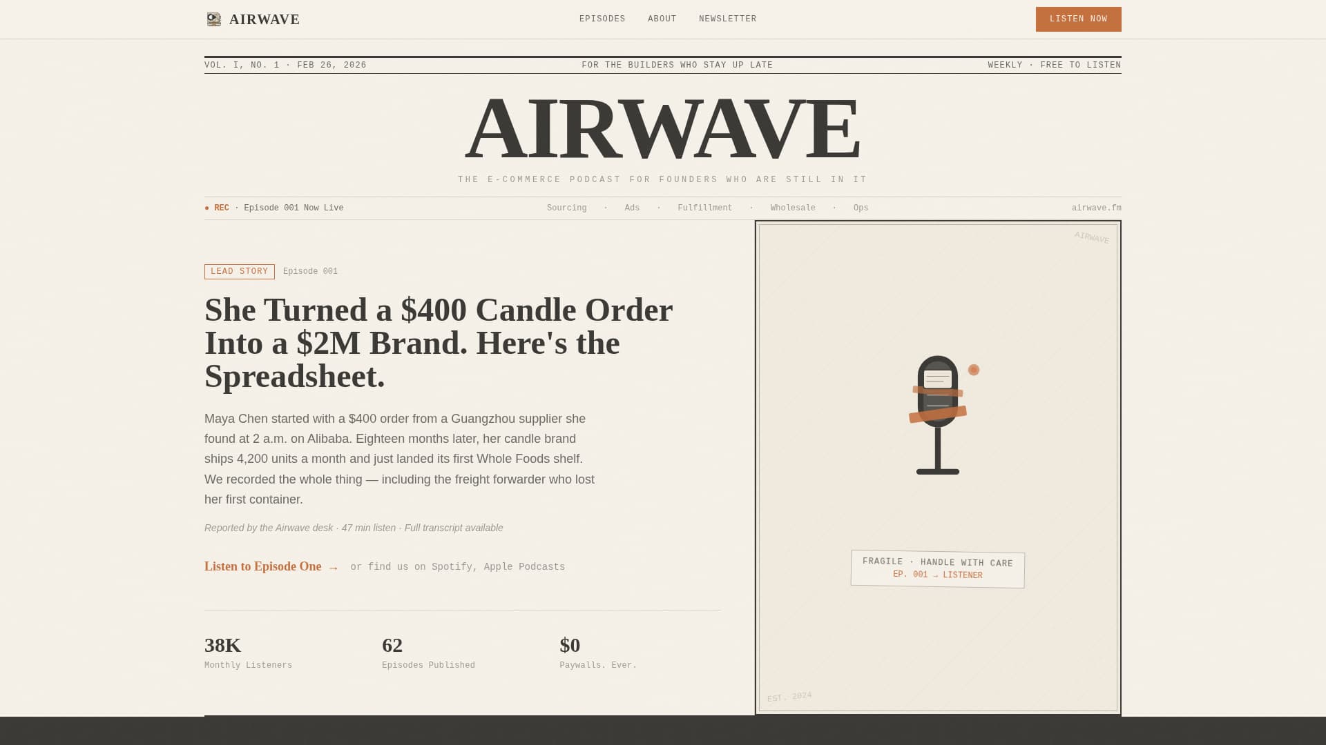
- A broadsheet-style hero with a 60/40 asymmetric grid, editorial headline, and woodcut microphone illustration column
- A scrolling wire ticker, manifesto pull-quote section, and an Editor's Picks episode trio with waveform cards
- A Friday Debrief email capture section with editorial microcopy and a single input field, plus a sticky bottom bar that activates after 60 percent scroll depth
Feature list
This template includes six core features drawn directly from the source brief and layout specification.
Asymmetric 60/40 Grid Layout
The page uses a deliberate 60/40 column split across the hero section. The wider column holds the episode lede text and primary call to action. The narrower column carries the woodcut-style microphone illustration. This creates visual weight without symmetrical rigidity.
Newspaper Broadsheet Masthead
The header is styled as a publication front page. A bold serif masthead displays the show name, a hand-drawn dateline marks the latest episode number, and the lead headline is written in editorial column style. Visitors read before they listen, which builds intent.
Manifesto Pull-Quote Section
An oversized single-belief statement anchors the scroll. The manifesto section uses large display typography to declare the show's editorial values. It sets the tone clearly and gives the brand a voice that typical podcast pages never establish.
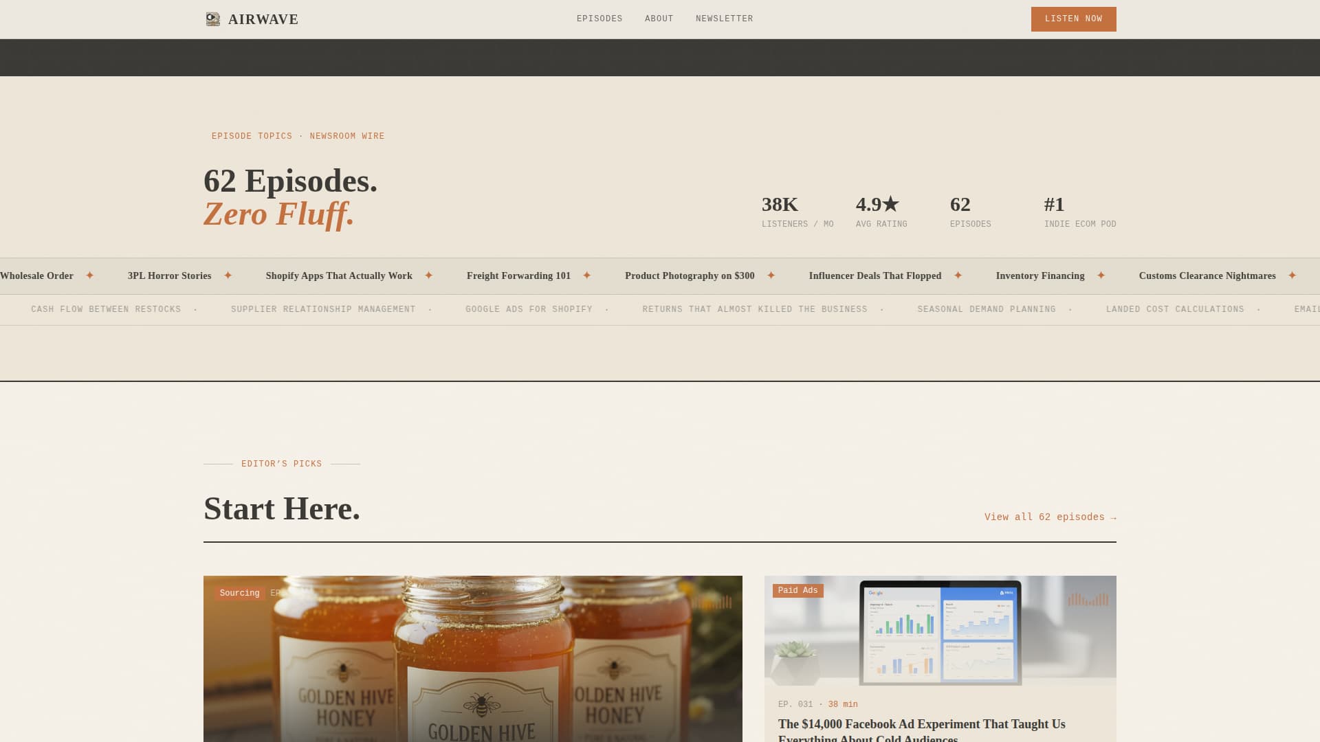
Scrolling Wire Ticker and Stats
A horizontal scrolling ticker feeds every episode topic across the screen like a newsroom wire. Listener counts and credibility numbers appear in the same section, giving the brand social proof without interrupting the editorial rhythm.
Editor's Picks Episode Cards
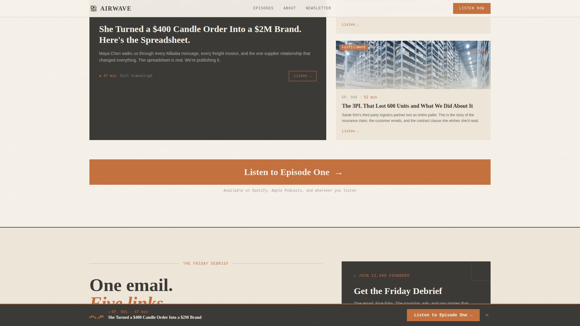
Three featured episodes are laid out in an asymmetric trio with waveform-style thumbnails. A full-width clay-orange call-to-action button follows the cards, giving visitors a clear path to the podcast player after they have sampled the content range.
Sticky Bottom Bar with Scroll Trigger
A bottom bar slides into view after the visitor has scrolled through 60 percent of the page. It carries the primary call to action and stays visible as a persistent nudge without blocking content during the early reading experience.
Page sections overview
| Section | Purpose |
|---|---|
| Broadsheet Hero | Introduce the show with an editorial headline and asymmetric grid |
| Manifesto Pull Quote | Declare the brand's editorial values with oversized display type |
| Wire Ticker and Stats | Stream episode topics and surface listener credibility numbers |
| Editor's Picks | Showcase three featured episodes with waveform cards and a call to action |
| Friday Debrief Capture | Collect email addresses with a single field and editorial microcopy |
| Footer Row | Close the page with a linear single-row footer pattern |
Design & branding system
The visual identity follows a Warm Artisan theme built around the Cloud Canvas color system. Every color, typeface, and texture choice reinforces the feeling of a linen-bound notebook open on a reclaimed-wood desk.
- Color palette: soft parchment (#F5F0E8) as the base, pencil-sketch charcoal (#3B3A36) for text, kiln-fired clay (#C4703F) for accent links and call-to-action elements, and muted cream (#EDE6D8) for section break backgrounds
- Typography stack: Fraunces for display serif headings, DM Sans for body copy, and JetBrains Mono for accent labels and dateline details
- Visual texture: woodcut-style illustration, broadsheet column structure, and lo-fi editorial rhythm that feels tactile against a digital context
Mobile & speed optimization
The template is built desktop-first to match how podcast and media content is consumed, with full responsiveness carried through to smaller screens. Interactive components are scoped so they do not interrupt the static reading experience on any device.
- Static sections use server-rendered components to keep the base page lightweight and fast to load
- Client-side components are isolated to the sticky bottom bar and scroll-depth trigger, keeping interactive logic minimal
- The asymmetric grid and broadsheet layout reflow cleanly for tablet and mobile viewports without losing editorial hierarchy
How this template helps you convert
The page earns the click by giving away real editorial substance before asking for anything in return. Every call to action placement is deliberate and timed to visitor engagement level.
- The primary call to action, "Listen to Episode One," appears first as a subtle text link beneath the masthead headline, then again as a full-width clay-orange button after the Editor's Picks section, giving two natural on-ramps at different scroll depths.
- The secondary conversion path, "Get the Friday Debrief," uses a single email field with specific microcopy about what the subscriber receives, lowering the barrier to sign-up with clarity instead of vague promises.
- The sticky bottom bar slides in after 60 percent scroll depth, re-presenting the primary call to action to visitors who are clearly engaged but have not yet clicked.
Other information about this template
This template is categorized under Blog and Editorial with a subcategory of E-Commerce Blog and Media. It is designed specifically for the e-commerce podcast and media niche, with a North American English context and USD-referenced content framing throughout.
- The intersection match score for this template's category, subcategory, and niche alignment is 13, indicating a strong purpose-built fit for this use case
- Animation level is set to medium: scroll reveals, staggered entrance effects, and the ticker scroll are included without overwhelming the editorial reading pace
- The footer uses a linear single-row pattern consistent with the clean, unhurried page rhythm established in the sections above

Theme
Warm Artisan
Creative direction
Manifesto
Color system
Cloud Canvas
Style
Asymmetric Grid (60/40)
Direction
Click-Through
Page Sections
Asymmetric 60/40 Grid Hero
Broadsheet Masthead Header
Manifesto Pull-quote Block
Wire Ticker and Credibility Stats
Editor's Picks with Waveform Cards
Sticky Scroll-depth Bottom Bar
Related questions
What type of brand is this landing page built for?
Can I use this template for a newsletter-only brand without a podcast?
How many calls to action does this template include?
What makes the scroll flow different from a standard podcast page?
Is this template suitable for a brand just launching its first season?